


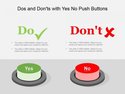
Dos and donts with yes no push buttons powerpoint templates




Try Before you Buy Download Free Sample Product
 Impress Your
 Audience
 100%
100% Editable
 Save Hours
 of Time


Do the tango with our Dos And Donts With Yes No Push Buttons Powerpoint Templates. Your moves will enthrall the audience.
People who downloaded this PowerPoint presentation also viewed the following :
Dos and donts with yes no push buttons powerpoint templates with all 5 slides:
Generate fruitful economic activity with our Dos And Donts With Yes No Push Buttons Powerpoint Templates. They guarantee an excellent harvest.
FAQs for Dos and donts with yes no push
Oh yeah, those are basically interactive slides where people can click "Yes" or "No" buttons on their phones during your presentation. The responses pop up instantly as charts or percentages - honestly way cooler than I expected when I first tried it. Works great for polls, quick feedback, or group decisions. Instead of everyone just staring at you for an hour, they're actually participating. I'd throw one in every 10-15 minutes to keep things lively. Super easy to set up and people seem to love having something to do with their hands besides scroll Instagram.
Yeah, they're actually pretty great! Instead of asking "Do you agree?" and getting that weird silence, you'll get real-time feedback that keeps people awake. There's something about clicking buttons that people just love - turns your whole presentation into this mini interactive thing. Use the responses to check if they're following along or do quick polls. Honestly, you can even switch up your content based on what they're telling you. Throw in 2-3 of these moments throughout your deck. You'll be surprised how much more people actually pay attention when they know they might need to click something.
Make your buttons big enough that people don't accidentally tap the wrong one - learned that the hard way! At least 44px works well. Green for yes, red for no is pretty standard, but whatever matches your brand is fine. Keep the text super simple. "Yes/No" or "Accept/Decline" - don't overthink it. Position them the same way across all your templates so users know where to look. Add hover effects so it's obvious when someone's about to click. Oh, and definitely test on real phones before you launch anything. Desktop previews lie.
PowerPoint's actually perfect for this - their action buttons work way better than most people realize. You could also go with Google Forms or Typeform if you want it web-based. HTML/CSS works too if you're into that. I swear, people always overcomplicate this stuff and build these massive systems when PowerPoint handles like 90% of what they need. Just pick whatever your team can actually update themselves. Nothing worse than needing a developer every time you want to change a button color or something.
Honestly, Yes No buttons are super underrated for making presentations way more engaging. Drop them at crucial moments where the audience picks what happens next - like "Should our protagonist take that risky investment?" or whatever fits your story. People get weirdly invested when they're actually controlling the narrative instead of just sitting there. I've found it works best with case studies or when you're walking through different scenarios. Don't go overboard though - maybe 2-3 decision points max or you'll lose them. Just make sure you've got solid content ready for whichever path they choose!
Oh this is actually pretty straightforward! Keep button text super short - "Delete" beats "Remove Item" every time. Make your "yes" button way more prominent than "no" with contrasting colors. I usually put yes on the right, no on left (though honestly some apps flip this and it drives me nuts). Give them tons of white space so people don't fat-finger the wrong choice. The destructive stuff like "Cancel" should look totally different from your positive actions. But seriously, just test it with actual humans because you'll be shocked what confuses people.
Honestly, yes/no buttons are a game changer for reading the room. Real-time responses mean you actually know if people are tuned in or zoning out - no more talking into the void wondering if anyone's listening. Plus you can pivot if something's not clicking. The visual feedback is weirdly reassuring too, like proof people aren't just sitting there scrolling their phones. I'd suggest throwing in some easy warm-up questions first to get the ball rolling, then hit them with your main stuff once everyone's participating.
Binary stuff works great when you actually need a hard yes or no. Like approval workflows, consent forms, turning features on/off - you know, the clear-cut decisions. They're clutch for avoiding that whole "um, maybe?" spiral people get into. But here's the thing - I see way too many designers cramming messy, complicated choices into yes/no buttons and it just breaks everyone's brain. Save them for the obvious stuff. "Want notifications?" Perfect. "Approve this?" Great. The simpler it is underneath, the better these buttons work.
Oh totally! Those yes/no buttons are game-changers because kids actually have to think instead of just zoning out. Like when you ask "Is this formula right?" they can't just sit there - they have to pick a side before you reveal the answer. Way better than me just talking at them for 45 minutes straight (learned that the hard way lol). You get instant feedback on who's lost, plus they stay way more engaged. I throw them in every 10 minutes or so for quick check-ins. Honestly wish I'd started using them sooner!
Yeah totally! Mentimeter and Poll Everywhere are perfect for this - people just click yes/no on their phones and boom, results pop up live on your screen. PowerPoint has polling built in too if you're already using that. I've found it's super helpful for quick gut checks during presentations, like "does this make sense?" or getting the room to weigh in on decisions. Just test it beforehand because tech always finds a way to be weird during important meetings. Throw in 2-3 polls throughout and you'll actually keep people awake for once.
Honestly, the biggest issue is they're way too rigid for messy real-life situations. People get annoyed when they can't fit their actual problem into your neat little yes/no boxes. You'll miss out on nuanced responses too - sometimes folks need middle ground options, you know? Watch your wording carefully because it's super easy to accidentally push people toward certain answers. I learned this the hard way once. Test with actual users first, and throw in comment fields so they can explain themselves when your categories don't work.
Most platforms like Mentimeter or Poll Everywhere save everything automatically - super convenient since you don't have to stress about it during your talk. Just grab the data from your analytics dashboard afterwards or export it as a CSV. Honestly, the timestamp feature is clutch for seeing when people responded. Drop it into Excel and you'll spot patterns pretty fast - response percentages, timing, opinion shifts if you asked multiple questions. Though I always forget to check the dashboard right after and end up scrambling later. Charts make everything way clearer for sharing results too.
Healthcare and customer service are huge for these - think patient forms or support tickets that need quick routing. E-commerce uses them constantly for product filters too. Education's another big one with quizzes and assessments. Manufacturing loves them for quality checklists, which honestly makes total sense when you think about it. The sweet spot is anywhere people need to make simple either/or choices fast. Skip the complex text fields when a yes/no will do the job. Map out where your users hit those binary decision points most often - that's where you'll want to jump in first.
Oh yeah, those button templates are actually pretty flexible once you mess around with them! First thing I'd do is match your brand colors - most templates let you swap out the button colors in the design settings. Fonts are usually customizable too. You can change the button shapes, add little icons if you want to get fancy. Just don't go crazy with it though - keep things readable and make sure they still look like actual buttons people will want to click. I always start with colors first, then work from there. The consistency thing matters but you probably already knew that!
Dude, color psychology is everything with Yes/No buttons! Green feels safe and makes people want to click "Yes" - it's that whole "go" vibe we're wired for. Red naturally screams danger, so it's perfect for "No" or anything destructive. Blue's good for neutral stuff since it feels trustworthy without being pushy. I've literally watched conversion rates tank just from switching colors around (learned that the hard way). The trick is matching what users expect with what'll actually happen. Green/red combo is usually your best bet, then you can mess around from there.
-
Excellent products for quick understanding.
-
Unique design & color.