


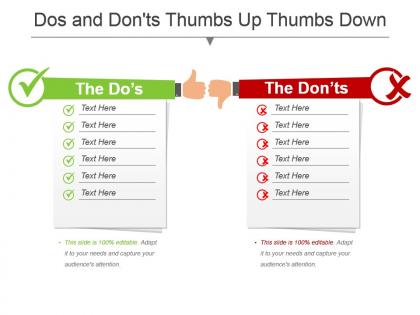
Dos and dontsthumbs up thumbs down powerpoint template




Try Before you Buy Download Free Sample Product
 Impress Your
 Audience
 100%
100% Editable
 Save Hours
 of Time


Pair up your thoughts with our Dos And Dontsthumbs Up Thumbs Down Powerpoint Template. They will have a great date.
People who downloaded this PowerPoint presentation also viewed the following :
Dos and dontsthumbs up thumbs down powerpoint template with all 5 slides:
Establish areas of common concern with our Dos And Dontsthumbs Up Thumbs Down Powerpoint Template. Help build grounds for consensus.
FAQs for Dos and dontsthumbs up thumbs
Key elements include clear visual contrast between dos and don'ts sections, consistent iconography like checkmarks and X symbols, concise bullet points, balanced layout with equal space allocation, and professional color coding. These design components work together by enhancing readability, reinforcing message clarity, and maintaining audience engagement, with many organizations finding that structured templates significantly improve policy communication and training effectiveness.
Visuals enhance "Dos and Don'ts" presentations by creating clear contrast between correct and incorrect practices, improving comprehension through icons, color coding, and infographics that make abstract concepts tangible. Through strategic visual design, organizations streamline training processes, reduce misunderstandings, and accelerate employee onboarding, with many companies finding that visual-heavy compliance presentations deliver 40% better retention rates and faster behavioral adoption.
Green and red combinations work best for dos and don'ts presentations, with green symbolizing positive actions and red indicating warnings or prohibitions. Many organizations enhance clarity by incorporating neutral backgrounds like white or gray, complementary accent colors for emphasis, and ensuring sufficient contrast ratios, ultimately delivering more effective visual communication and improved audience comprehension across training materials.
Maintaining an uncluttered yet informative dos and don'ts template requires strategic use of white space, concise bullet points, and visual hierarchy through consistent fonts and colors. Effective templates leverage icons, contrasting sections, and minimal text per slide, with many organizations finding that limiting each point to 6-8 words while using visual cues ultimately delivers clearer communication and better audience retention.
Recommended font styles for "Dos and Don'ts" presentations include clean sans-serif options like Arial, Calibri, Helvetica, Open Sans, and Montserrat for optimal readability. These fonts enhance comprehension by providing clear contrast between positive and negative points, ensuring consistent visual hierarchy, and maintaining professional credibility, with many organizations finding that simple typography choices ultimately deliver better audience engagement and message retention.
Icons enhance "Dos and Don'ts" clarity by providing instant visual recognition, reducing cognitive load, and creating consistent visual language across presentations. Strategic icon usage helps audiences quickly distinguish between recommended and discouraged actions, with many organizations finding that well-chosen symbols streamline comprehension, minimize text dependency, and ultimately deliver more engaging, memorable guidance presentations.
Healthcare, education, manufacturing, financial services, and retail industries benefit significantly from "Dos and Don'ts" PowerPoint templates for compliance training, safety protocols, and operational procedures. These templates streamline knowledge transfer by presenting clear guidelines, enhance employee understanding through visual contrast, and ultimately deliver consistent messaging across departments, with many organizations finding improved adherence to standards and reduced operational risks.
The ideal number is typically 5-7 dos and don'ts each, as this range maintains audience attention while providing comprehensive guidance without overwhelming viewers. This strategic balance enables presenters to cover essential points thoroughly, ensures information retention, and delivers actionable insights, with many organizations finding that focused lists ultimately enhance decision-making and implementation effectiveness.
Interactivity can be incorporated through clickable navigation buttons, animated reveals of dos and don'ts, polling slides for audience input, and interactive scenarios where viewers choose correct approaches. These features transform static presentations into engaging experiences by encouraging participation, enabling self-paced learning, and providing immediate feedback, ultimately delivering better knowledge retention and more memorable training outcomes.
Storytelling transforms dos and don'ts presentations by creating emotional connections, making abstract guidelines memorable through real scenarios, and demonstrating consequences through narrative arcs that resonate with audiences. Through compelling case studies, before-and-after scenarios, and relatable character journeys, organizations enhance comprehension, improve retention rates, and drive behavioral change, ultimately delivering more impactful training and communication outcomes.
Real-life examples can be integrated through industry-specific scenarios, case studies from recognizable companies, and sector-relevant situations that demonstrate clear outcomes. By incorporating examples from healthcare, retail, finance, and technology sectors, these templates transform abstract guidelines into practical applications, with many organizations finding that concrete scenarios significantly enhance audience engagement, improve knowledge retention, and accelerate implementation of best practices across teams.
Common mistakes include overcrowding slides with excessive text, using inconsistent formatting between dos and don'ts sections, poor color contrast, and unclear visual hierarchy that confuses the message flow. Many organizations find that cluttered layouts, misaligned elements, and generic stock imagery significantly reduce audience engagement, while clean, balanced designs with strategic white space and consistent typography ultimately deliver stronger comprehension and retention.
Audience feedback can be utilized to improve "Dos and Don'ts" presentations by analyzing questions raised, identifying unclear sections, updating examples based on real experiences, and refining the balance between positive and negative guidance. Through surveys, discussion sessions, and follow-up conversations, presenters can enhance clarity, add relevant case studies, and streamline content delivery, ultimately creating more engaging and actionable presentations.
**INPUT**: What are the best practices for aligning a "Dos and Don'ts" presentation with brand identity? **OUTPUT**: Best practices include incorporating brand colors, fonts, and logos consistently, using company-specific examples and scenarios, and maintaining your organization's established tone and messaging style. These elements enhance professional credibility and ensure seamless integration with existing corporate communications, with many organizations finding that branded compliance presentations deliver significantly higher employee engagement and retention rates.
A "Dos and Don'ts" PowerPoint template adapts through customized content depth, visual styling, industry-specific examples, and appropriate terminology for each audience's expertise level and context. Organizations enhance these templates by adjusting color schemes for brand alignment, incorporating sector-relevant scenarios like healthcare protocols or sales processes, and modifying language complexity, ultimately delivering targeted guidance that resonates with specific stakeholder groups.
-
Great designs, Easily Editable.
-
Out of the box and creative design.