


Education and research kpi dashboard snapshot showing enrolment and sap




Try Before you Buy Download Free Sample Product
 Impress Your
 Audience
 100%
100% Editable
 Save Hours
 of Time


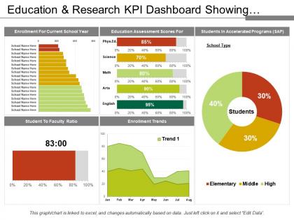
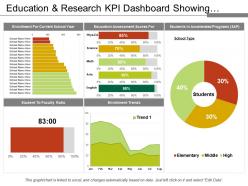
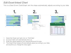
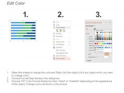
The enrolment and SAP analytic KPI dashboard PowerPoint template is perfect to provide a content library with packages of end-to-end business schemes for specific industries and lines of business. The SAP package KPI report slide is very useful to give an overview of business questions that needed to address. By taking help of the research SAP dashboard presentation slide, a user can share a list of technical objects that are essential for SAP analysis. The business research KPI report PPT slide is helpful to discuss benefits of business content. The business content KPI dashboard presentation template is very helpful for illustrating SAP analytics cloud and SAP digital boardroom tools which can provide a quick as well as easy starting point for individual analytics aspects. A user can use the SAP analytics cloud business content dashboard PowerPoint template to highlights various things including planning, smart assist, value-driver trees, and mobile design. You can explain a variety of key assets by taking help of the enrolment and SAP KPI report PPT slide such as end-to-end industry dashboards, re-usable line of business packages, content that customized to work with recommended SAP data sources, it also includes detailed documentation of KPIs, models as well as data flows and many more. The data content of the SAP analytic PowerPoint slide is editable and the user can display the content as per his own data because this slide associated with Excel. Handle intimidating elements with our Education And Research Kpi Dashboard Showing Enrolment And Sap. Cut down their ability to instil fear.
People who downloaded this PowerPoint presentation also viewed the following :
Education and research kpi dashboard snapshot showing enrolment and sap with all 6 slides:
Nailthe date with our Education And Research Kpi Dashboard Snapshot Showing Enrolment And Sap. Your thoughts will make it a red letter day.
FAQs for Education and research kpi dashboard snapshot showing
Track the obvious stuff first - graduation rates, test scores, course completion. Attendance and participation rates tell you if students are actually engaged (which honestly matters more than most people think). You'll want financial metrics too: cost per student, how you're burning through budget. Teacher retention and student-teacher ratios are huge indicators of school health. Oh, and don't go crazy with like 20 different metrics. Pick maybe 8-10 that actually matter to your specific goals. Start with what your board or stakeholders care most about, then add from there.
Honestly, the biggest game-changer is automating all that data collection - no more copying numbers from your LMS into spreadsheets like some kind of digital peasant. AI can catch patterns you'd totally miss, like which kids are about to drop out or what teaching methods actually stick. Real-time updates beat waiting around for monthly reports. You can even predict enrollment trends or figure out if your interventions are working. The trick is getting everything talking to each other in one dashboard so you're not jumping between five different systems when you need answers fast.
Dude, data viz seriously saves your sanity when dealing with education metrics. Those endless spreadsheets? Total nightmare. But throw that same data into charts and suddenly you can see what's actually happening. A line graph showing test scores dropping over three months hits different than scanning through rows of numbers. Plus you'll catch connections you'd totally miss otherwise - like maybe kids skipping class more often tanks their grades (shocking, I know). Bar charts are your friend for the big picture stuff. Start there and don't overthink it.
Honestly, these dashboards are game-changers for catching kids who're starting to slip. Track stuff like attendance, homework completion, test scores - you'll see patterns pop up fast. Like, students missing 3+ days monthly? Their pass rates drop 40%. Wild, right? Set up alerts so you're not glued to the screen all day checking everything manually (learned that the hard way). Once you spot the red flags, jump in with tutoring or call parents early. Don't go crazy though - pick maybe 3 or 4 metrics that actually matter for your kids and start there.
Honestly, just start with the basics that'll actually help you day-to-day - attendance rates, how kids are performing academically, and which teachers are crushing it. Real-time updates are key because stale data won't help when you need answers fast. Clean visuals matter more than you think - nobody wants to squint at messy charts between back-to-back meetings. Group similar stuff together and stick with the same colors so it's not confusing. Oh, and definitely make it work on your phone since you'll probably be checking it constantly. I'd say pick maybe 6 core things to track first, then add more later.
So K-12 is all about test scores, graduation rates, attendance - basically proving to the state you're doing your job. Higher ed? Totally different game. They care more about enrollment, retention, job placement rates, revenue stuff. Universities have way more freedom but honestly they're obsessed with ROI these days - gotta keep students and donors happy. K-12 dashboards are such a pain because there's constant state reporting requirements. Figure out if you need the compliance-heavy approach or the outcome-focused one first. That'll pretty much determine your whole setup.
Honestly, data silos are gonna be your biggest headache - student info gets stuck in like 5 different systems that never sync up. Teachers hate change too, which I get. They're already swamped and think you're just adding more work. Budget's always tight, and good luck finding someone who actually knows how to keep the thing running. Oh, and administrators worry you're gonna use it to spy on them or whatever. Start with just one department first. Get a few people excited about it early on. Show them something that actually saves time instead of creating more hassle.
Honestly, weekly updates are the sweet spot, but daily is even better for stuff like attendance and engagement. Test scores and graduation rates? Those don't change as fast, so monthly works fine. I've watched way too many dashboards turn into decorations because they're stuck showing data from three months ago - such a waste. Match your refresh schedule to how quickly things actually change and how often your team needs to check the numbers. Oh, and definitely automate whatever you can so you're not stuck updating spreadsheets manually every week like some kind of data entry robot.
Honestly, I'd go with Tableau or Power BI first - there's a reason everyone talks about them. They play really nice with student data and connect to most education systems without being a pain. Google Data Studio works too if money's tight, but it gets weird with bigger datasets. Power BI's interface feels more intuitive to me personally, but that's just my take. Sisense and Qlik are decent options if you're dealing with messy data integration stuff. Start with free trials of Tableau and Power BI. See which one your team actually wants to use - that matters more than features sometimes.
Dude, you NEED to talk to your stakeholders first - I can't stress this enough. Teachers want classroom stuff, admins need the big picture district data, and parents/students care about totally different things. So many dashboards crash and burn because people just build what they assume others want. Interview maybe 3-5 people from each group before you even touch the design. Figure out their actual pain points and test early prototypes with them. Seriously, save yourself the headache later. What you think matters probably isn't what they actually need day-to-day.
Look, KPI dashboards basically show you where kids are bombing vs crushing it. Like if 4th graders keep tanking math assessments, maybe those teaching methods aren't working? The data's pretty good at revealing which topics click fast too - you'll honestly be shocked sometimes. Engagement metrics help spot the units that are putting kids to sleep (we've all been there). Plus you can actually see if curriculum tweaks are helping or making things worse. Way better than just winging it in your next review meeting based on hunches.
Oh man, the worst thing you can do is track stuff that's easy to count but doesn't actually tell you anything - like attendance instead of whether kids are learning. Keep your metrics tight too, maybe 5-7 tops. More than that and people's eyes glaze over, trust me. Get your teachers involved from the start or they'll just ignore whatever you come up with. Also don't lump all students together - different groups need different ways to measure success. My advice? Start small with a few things that matter, see what sticks, then expand. Way better than drowning in data nobody uses.
Honestly, KPI dashboards are game-changers for schools. You'll actually see what's happening in real-time instead of waiting months for some useless annual report. Teachers, admin, everyone can track student progress and spot issues before they blow up. The transparency thing is huge - no more guessing which programs work or don't. Plus departments can't hide their problems anymore (which sounds harsh but whatever, it helps kids). Real-time data means you catch struggling students early and give props where it's deserved. Just automate the reporting so you're not drowning in spreadsheets every week.
Honestly, I'd start simple with like 3-4 things in each bucket. Student test scores and lesson completion rates are obvious ones for performance. Then throw in professional development hours and those admin evaluations. Satisfaction's trickier though - retention rates tell you a lot, plus absenteeism and basic "do you like your job" survey stuff. Oh, and workload metrics because burnout is real. Here's the thing - you don't want teachers feeling like they're being watched constantly. Maybe add some positive stuff too? Innovation projects, mentoring, that kind of thing. Makes it less about just checking boxes. Ask your teachers what actually matters to them before you lock anything in.
Start with your school's actual priorities and turn those into numbers you can track. Dashboard platforms are pretty flexible - you can weight different metrics based on what matters most. Say you're all about STEM - then math scores and AP results should get more focus than generic stuff. Honestly, less is more here because drowning in data helps nobody. Pick maybe 5-7 KPIs that actually show if you're winning or not. Most platforms let you create different views for different people too, which is clutch. Build your core set first, then add more later if you need them.
-
Design layout is very impressive.
-
Great experience, I would definitely use your services further.