


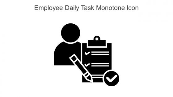
Employee Daily Task Monotone Icon In Powerpoint Pptx Png And Editable Eps Format




Try Before you Buy Download Free Sample Product
 Impress Your
 Audience
 100%
100% Editable
 Save Hours
 of Time


This Employee daily task monotone icon in powerpoint pptx png and editable eps format is a 100 percent editable icon. The downloaded file will have this icon in EPS, PNG and Powerpoint pptx format and is perfect for your next project. It has a simple yet stylish design.
People who downloaded this PowerPoint presentation also viewed the following :
Employee Daily Task Monotone Icon In Powerpoint Pptx Png And Editable Eps Format with all 6 slides:
Use our Employee Daily Task Monotone Icon In Powerpoint Pptx Png And Editable Eps Format to effectively help you save your valuable time. They are readymade to fit into any presentation structure.





FAQs for Employee Daily Task Monotone Icon In Powerpoint Pptx Png And
Go with something super obvious - clipboard, checklist, or a person with a gear. Honestly, people should get it instantly without having to think. Make sure it's clean and has good contrast because you'll probably end up shrinking it down for slides later. I'd stick with your brand colors but nothing too crazy bright that pulls attention away from your actual content. Oh, and definitely test it small first! I've seen so many icons that look amazing full-size but turn into weird blobs when you make them tiny. Trust me on that one.
Good icons actually save your team a ton of time. People won't waste mental energy trying to decode what stuff means. You want clear, consistent designs so everyone can scan their workload quickly. Color-coding by priority or department is clutch for this. I swear, it's wild how much brain power gets drained by confusing visuals throughout the day – you don't realize it until you fix it. Just keep the system simple and make sure everyone knows what each icon means from day one. Your productivity will jump.
Honestly, I'd go with blue or green for most of your task icons - they feel productive without being in your face. Red's useful but man, it can stress people out if you use it everywhere. Gray's perfect for stuff that's done or not urgent. The real trick is just being consistent with whatever system you pick. Your team should be able to glance at it and instantly know what's what. Oh, and make sure there's enough contrast with your background - nobody wants to squint at their screen all day. Definitely test it with a few people first before you make everyone switch over.
Oh yeah, totally doable! So basically you'll want to match the icons to whatever industry you're in. Like if it's healthcare, throw in some medical symbols. Construction? Hard hats and tools work great. Retail could use shopping carts or whatever makes sense. Colors matter too - you know how medical stuff is always blue and white? Same idea. I'd honestly keep them pretty simple though, nobody wants to squint at tiny details. The whole point is your team sees an icon and immediately knows what task it is. Oh and this might sound weird but it's actually kind of fun to design these once you get into it!
Oh man, icons are trickier than you'd think! Colors totally throw people off - red means danger here but it's lucky in China. That thumbs up you're using? Super offensive in parts of the Middle East, which I learned the hard way once. Right-to-left readers get confused by arrows pointing the "wrong" way too. Religious stuff and hand gestures are basically minefields. Honestly, your best move is testing with different groups of users first. Stick to boring, universal symbols when possible. Way less headache that way.
Honestly, those little employee task icons are game-changers for presentations. They're like visual shortcuts that instantly show who does what without drowning people in bullet points. Your audience can actually follow the workflow instead of reading paragraphs of text. I see way too many people skip these and just stick with boring lists. Keep the icon style consistent though - that part's key. Dense content becomes way more scannable when you swap some text for icons. Makes the whole process flow clearer. Trust me, try it next time and watch how much easier people follow along with your slides.
Oh totally, those icons make a huge difference! People can instantly see who's doing what instead of decoding some messy color system or squinting at initials. Way more scannable than boring tables - honestly, I don't know why more teams don't use them. Your stakeholders will get the workload distribution right away. Plus it just looks more professional and less like a spreadsheet dump. One thing though - keep the icon style consistent across everything or it gets confusing. Trust me, once your team gets used to it, they'll actually look forward to your project updates.
Size and style consistency is huge - makes everything look way more polished. Don't go crazy with them though (seriously, I've seen decks that look like emoji explosions). Place icons right next to relevant text or bullet points, and make sure they actually relate to what you're talking about. Your color scheme should match company branding obviously. Oh, and here's something that'll save you tons of time: set up a master template with your go-to task icons. You'll thank me later when you're not hunting around for the same damn icon every presentation.
Here's the thing - animated icons just work better. Your brain naturally tracks movement, so when an icon bounces or fades in, people actually notice it. I've seen this make a huge difference in getting users to click on stuff they'd normally ignore. The trick is keeping it subtle though. A gentle hover effect or quick loading animation does the job without being annoying. Honestly, some of the best task icons I've used barely move at all - just enough to catch your eye. Don't go crazy with it or you'll distract from the actual content.
Honestly, just start with the built-in editor - click "customize" in task settings and you can mess around with colors, shapes, text overlays. Works for most stuff and you don't need to be artsy or anything. If those look too basic (which... sometimes they kinda do), upload your own PNG or SVG files - just keep them under 50KB. There's also this library with like 200 pre-made icons if you want something middle-ground. I'd try the editor first though. Way easier than starting from scratch and it'll probably do what you need.
Oh, checkmarks and checkboxes are your go-to for completed stuff. Clock icons work for anything time-sensitive. Person silhouettes are perfect for assignments, and document icons are obvious for paperwork tasks. You'll probably want gear/cog icons for processes too. Email and calendar icons are pretty self-explanatory. Honestly? I've seen way too many companies go overboard with weird custom icons that confuse everyone. Just stick with symbols people actually recognize - your team shouldn't need a decoder ring to figure out what something means. Test a few options with real users first before you commit to anything company-wide.
Honestly, customizing those task icons is such a game-changer for brand consistency. Just match them to your company colors and style - same fonts, same visual vibe throughout the whole presentation. Your audience won't consciously notice, but they'll definitely feel like everything belongs together. Keep the sizing consistent too, otherwise it looks sloppy. I'd probably start by making a shared icon library so your whole team uses the same stuff. It's way easier than everyone doing their own thing. Makes you look way more professional without much extra work.
Keep your task icons simple - complex details disappear when they're small. Different task types need distinct colors and shapes, otherwise people get mixed up constantly. I've definitely seen too many weird abstract designs that literally mean nothing to anyone. Your whole system should have matching style and weight. Oh, and test these with real employees first! What seems obvious to you might be totally confusing to someone who's actually using it every day. Trust me, this saves so much headache later.
Look at your analytics to see which icons get clicked least - that's where to start. Track click rates, how long people hover (looking confused lol), and help desk complaints about specific tasks. Heat maps show exactly where users get stuck. Honestly, some icons are so cryptic they might as well be hieroglyphics. A/B test new designs against your current metrics to see what actually improves things. I'd grab your three worst performers and test clearer versions with a small group first before rolling anything out widely.
Honestly, the best way is watching people's faces during your presentation - you'll spot the confusion immediately when they're squinting at your slides. Post-presentation surveys work too, just ask directly about icon clarity. I'd definitely try A/B testing different styles with smaller groups first before going big. Quick pulse polls are clutch for virtual meetings ("Does this make sense?") and you get instant feedback. Oh, and those brief follow-ups afterward? Super helpful for figuring out which icons actually helped vs. made things worse. Real-time stuff is always more valuable than waiting.
-
SlideTeam is the best in the business. Their templates are engaging and customizable. You can rely on them.
-
Wonderful ideas and visuals. I'm really pleased with the templates, which are unique and up to date.