


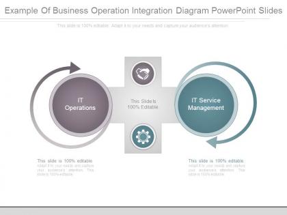
Example of business operation integration diagram powerpoint slides




Try Before you Buy Download Free Sample Product
 Impress Your
 Audience
 100%
100% Editable
 Save Hours
 of Time


Talented designers have developed our Example Of Business Operation Integration Diagram Powerpoint Slides to suit your needs. Brighten up your next presentation with thousands of their best works.
People who downloaded this PowerPoint presentation also viewed the following :
Example of business operation integration diagram powerpoint slides with all 7 slides:
Ensure continued focus of attention with our Example Of Business Operation Integration Diagram Powerpoint Slides. It helps handle integral aspects.


FAQs for Example of business operation integration
A business operation integration diagram is a visual framework that maps interconnected processes, systems, and workflows across departments, illustrating data flows, decision points, and operational dependencies. It enhances organizational transparency by identifying inefficiencies, streamlining communication between teams, and optimizing resource allocation, with many companies finding that these diagrams accelerate digital transformation initiatives while reducing operational costs.
Businesses identify key components by mapping critical processes, data flows, technology touchpoints, stakeholder interactions, and performance metrics across departments. Through stakeholder workshops and process audits, organizations can pinpoint integration points like CRM systems, supply chain networks, and customer service platforms, ultimately creating comprehensive diagrams that streamline operations and enhance cross-functional collaboration.
Common software tools for creating business operation integration diagrams include Microsoft Visio, Lucidchart, Draw.io, Creately, and specialized platforms like Bizagi and ARIS. These solutions streamline diagram creation by offering pre-built templates, real-time collaboration features, and integration capabilities, with many organizations finding that cloud-based tools enhance team productivity and operational transparency.
A well-structured integration diagram enhances interdepartmental communication by providing visual clarity of workflows, establishing standardized processes, and creating shared understanding of roles and dependencies. These diagrams streamline collaboration by eliminating information silos, reducing miscommunication errors, and enabling faster decision-making, with many organizations finding that visual documentation ultimately delivers improved operational efficiency and stronger cross-functional alignment.
Organizations face challenges including data silos across departments, complex system interdependencies, unclear process ownership, and resistance to change from stakeholders. These obstacles often result in fragmented workflows, miscommunication between teams, and inefficient resource allocation, with many companies finding that successful integration requires strong leadership commitment and comprehensive change management strategies.
Integration diagrams facilitate better decision-making by providing comprehensive visibility into process dependencies, data flows, and system interconnections across departments. These visual tools enable executives to identify bottlenecks, optimize resource allocation, and predict downstream impacts of operational changes, with many organizations finding that clear process mapping reduces decision-making time while improving strategic outcomes.
A business operation integration diagram serves as a visual roadmap during change management, mapping current processes, identifying integration points, and highlighting areas requiring transformation or alignment. These diagrams enable change managers to communicate complex transitions clearly, anticipate potential disruptions, and ensure seamless coordination across departments, ultimately delivering smoother implementations and greater stakeholder buy-in throughout organizational change initiatives.
Companies ensure integration diagrams remain relevant through regular review cycles, automated monitoring tools, and cross-functional collaboration between IT, operations, and business teams. By implementing version control systems, conducting quarterly assessments, and integrating diagram updates into change management processes, organizations maintain accuracy while adapting to evolving business requirements, ultimately delivering enhanced operational visibility and strategic alignment.
**INPUT**: What are some best practices for visually representing data in an integration diagram? **OUTPUT**: Best practices include using consistent color coding, clear directional arrows, standardized symbols, hierarchical layouts, and simplified data flow paths. These visual elements streamline comprehension by reducing cognitive load, enhancing stakeholder alignment, and enabling faster decision-making, with many organizations finding that well-designed integration diagrams accelerate project timelines and minimize implementation errors.
Integration diagrams support workflow optimization by visualizing data flows, identifying bottlenecks, and mapping system dependencies across departments and processes. Through clear visual representation, organizations can streamline operations, reduce redundancies, and enhance communication between teams, with many companies finding that these diagrams ultimately deliver faster decision-making and improved operational efficiency.
Integration diagrams significantly help identify operational bottlenecks by visualizing process flows, data exchanges, system dependencies, and resource allocation points across business operations. Through mapping interconnected workflows, organizations can pinpoint delays in manufacturing, banking transaction processing, and retail supply chains, while revealing inefficient handoffs and resource constraints, ultimately enabling strategic process optimization and enhanced operational efficiency.
Different industries customize their integration diagrams by emphasizing sector-specific workflows, compliance requirements, data flows, and stakeholder interactions. Financial services focus on regulatory reporting and risk management pathways, while manufacturing emphasizes supply chain coordination and quality control processes, and healthcare prioritizes patient data security and care delivery sequences, ultimately enabling each sector to streamline operations while meeting industry-specific standards and regulatory demands.
Integration diagrams enhance customer satisfaction by visualizing process flows, identifying bottlenecks, and streamlining touchpoints across departments like sales, support, and fulfillment. Through clear mapping of customer interactions, organizations can eliminate redundancies, reduce response times, and ensure seamless experiences, with many retail and financial services companies finding that optimized workflows ultimately deliver faster resolutions and more consistent service quality.
Key metrics include process cycle time, error rates, resource utilization, handoff efficiency, bottleneck identification, and cross-functional collaboration scores. These KPIs enable organizations to measure integration effectiveness by tracking workflow optimization, cost reduction, and operational transparency, with many companies finding that regular diagram analysis delivers faster decision-making and improved strategic alignment.
Sharing operation integration diagrams across teams enhances collaboration by creating unified understanding of workflows, dependencies, and touchpoints, while enabling cross-functional problem-solving and knowledge transfer. These visual tools streamline communication between departments like IT, operations, and strategy, with many organizations finding that shared diagrams accelerate innovation cycles, reduce silos, and ultimately deliver faster project implementations and improved operational efficiency.
-
Best way of representation of the topic.
-
Easily Editable.