


KPI Dashboard For Tracking Employee Attrition




Try Before you Buy Download Free Sample Product
 Impress Your
 Audience
 100%
100% Editable
 Save Hours
 of Time


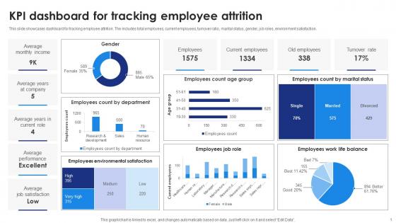
This slide showcases dashboard for tracking employee attrition. The includes total employees, current employees, turnover ratio, marital status, gender, job roles, environment satisfaction.
People who downloaded this PowerPoint presentation also viewed the following :
KPI Dashboard For Tracking Employee Attrition with all 10 slides:
Use our KPI Dashboard For Tracking Employee Attrition to effectively help you save your valuable time. They are readymade to fit into any presentation structure.








FAQs for KPI Dashboard For
Honestly, start with your core KPIs - maybe 5-7 max that actually tie to what your team cares about. Real-time data visualization is clutch, plus you want it designed so trends and weird outliers jump out immediately. Fast loading is non-negotiable because waiting around for dashboards is the worst. Drill-down features are super helpful when someone spots something interesting and wants to investigate. I'd avoid the temptation to cram every metric you can think of onto one screen though - that just creates noise. Focus on what'll actually drive decisions for your specific team.
Start with your main business goals and work backward from there. What metrics actually show you're making progress? I'd stick to maybe 5-7 KPIs tops - seriously, I've seen way too many dashboards that are just complete information overload. Nobody knows what to focus on. Ask yourself this: if one of these numbers changed dramatically tomorrow, would you actually do something about it? If not, toss it. Also definitely get input from whoever's going to be using this stuff daily. They'll tell you what actually matters versus what sounds good in theory.
Honestly, data visualization is what transforms your KPI dashboard from boring spreadsheet hell into something actually useful. You'll spot trends instantly with line charts instead of squinting at endless number rows. Bar charts make performance comparisons super obvious. Scatter plots? Great for catching weird outliers that might signal problems (or opportunities, depending). Charts tell the whole story in seconds - executives eat that stuff up. Just don't be that person who forces pie charts everywhere when they don't fit. Figure out which metrics need your immediate attention versus long-term tracking, then pick your visuals accordingly.
Honestly, weekly updates are the minimum I'd go with, but daily is way better if you're tracking stuff that moves fast like sales numbers. Monthly? That's basically useless unless you're in some super slow industry. Match it to how quickly things change in your business. If your team's looking at the dashboard every morning (which they should be), then you need data that's actually current enough to do something about it. I'd start weekly and see how it goes - you can always ramp up if people are asking for fresher numbers.
Honestly, it totally depends on what you're working with and how tech-savvy you are. Power BI and Tableau are great if you've got Excel or Google Sheets data, but they'll take some time to learn. Google Data Studio is free and way easier to pick up - though it can feel pretty basic sometimes. Built-in dashboards might be your best friend if you're already using stuff like Salesforce or HubSpot. I'd probably start by figuring out where all your data lives first, then just go with whatever connects to those sources without making you jump through hoops. Makes the whole process way less painful.
Honestly, just ask each team what they actually look at every day - that's your starting point. Sales wants pipeline stuff and revenue numbers. HR cares about turnover and how happy people are. Marketing lives for conversion rates and customer acquisition costs (they're kinda obsessed lol). Set up role permissions so everyone only sees their relevant data. Finance loves detailed spreadsheets, but execs want simple charts they can glance at. The visualization part matters way more than people think - what works for one team won't work for another. Focus on the decisions they're making daily and build around that.
Honestly, most people just throw everything onto one screen and call it a day. Big mistake. Focus on maybe 5-7 metrics that actually matter to your specific audience - not just impressive-looking vanity stuff like total page views. Those red/green dashboards drive me crazy unless the colors actually mean something useful. Start simple, then ask "okay but so what?" before adding anything new. Oh and definitely test it with real users first because what makes sense to you might be total gibberish to them. Trust me on this one.
Honestly, start with data governance - figure out who owns what metrics and stick to single sources instead of random spreadsheets everywhere. Automated validation is a lifesaver for catching weird outliers before they show up in front of your boss (trust me on this one). Monthly audits are boring but necessary - just cross-check your dashboard against the actual source systems. Document how you calculate everything so people can't question your math later. Oh, and don't try to fix everything at once. Pick your top three KPIs first and make those rock solid before moving on.
Honestly, start with NPS and CSAT - they're like the bread and butter of customer feedback. You can always add more later. Churn rate's super telling too since people vote with their feet when they're pissed. First Contact Resolution is my personal favorite though. Nobody has time to call support three times for the same stupid issue. Average resolution time matters for obvious reasons. Customer Effort Score is solid once you get the hang of things. Just make sure you're hitting people up for feedback right after they interact with you, not weeks later when they've forgotten everything.
Honestly, KPI dashboards are a game changer - you get to see what's actually happening with your business in real time instead of just guessing. No more digging through endless spreadsheets when someone asks how things are going (which happens way too often, right?). You'll spot problems early, like when customer costs start climbing or certain segments tank. The trick is focusing on metrics that actually move the needle for your goals. Don't get sucked into tracking vanity numbers that look cool but won't help you make better decisions.
Honestly, less is more with dashboards - stakeholders just want the stuff that impacts them. Charts and graphs are your best friend here since raw data makes everyone's eyes glaze over. Show trends, not just random snapshots from last Tuesday or whatever. Context is huge too - explain what the numbers actually mean for business decisions. I always color-code things against targets so people can instantly see the good, bad, and ugly. Oh, and match your audience - executives want the 30,000-foot view while ops teams need to dive deep into specifics.
Honestly, KPI dashboards are game-changers for managing your team. You'll see exactly who's hitting targets without digging through endless spreadsheets - which, let's be real, nobody has time for anymore. The visibility thing works both ways too. When everyone can see the numbers, people naturally push themselves harder. Trends become obvious before they turn into actual problems. During your one-on-ones, you're having real conversations backed by data instead of just gut feelings. Just make sure you're tracking stuff that actually moves the needle, not those feel-good metrics that look pretty but don't mean much.
Dude, real-time data is a total game changer for dashboards. You catch problems while they're still manageable instead of finding out weeks later when everything's already on fire. Monthly reports feel prehistoric once you've experienced live data - like who has time for that anymore? Your team starts making way smarter decisions because they're seeing what's actually happening right now. Short sentences hit different too. Just make sure your data feeds don't lie to you though, because there's nothing worse than thinking something's "live" when it's actually hours old.
Dude, mobile access is honestly huge for tracking KPIs. Your team can literally check numbers from anywhere - coffee shop, airport, wherever. Real-time alerts hit your phone when something's off, so you're not scrambling later. Super clutch for field teams or executives who are never at their desk. I've seen people review dashboards on the subway (weird flex but okay). You'll want dashboards that actually look good on phones though - squinting at microscopic charts defeats the whole purpose. Makes decision-making way faster when you're not chained to your computer all day.
Make those dashboards actually interactive - let people filter and drill down into stuff themselves. Clean design matters way more than you'd think. Nobody wants to look at ugly gray spreadsheets, trust me on that one. Show KPIs that actually relate to what each person does, not just random metrics that look impressive. Training helps since people won't use what they don't get. Here's what really works though: build dashboard reviews into your regular team meetings. Creates accountability and gets everyone actually using the thing instead of ignoring it.
-
Easy to use and customize templates. Helped me give a last minute presentation.
-
A library of engaging, customizable and content-ready templates.