


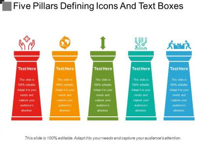
Five pillars defining icons and text boxes




Try Before you Buy Download Free Sample Product
 Impress Your
 Audience
 100%
100% Editable
 Save Hours
 of Time


Our Five Pillars Defining Icons And Text Boxes enable achievement of dreams. You will find them empowering contributors.
People who downloaded this PowerPoint presentation also viewed the following :
Five pillars defining icons and text boxes with all 5 slides:
For our Five Pillars Defining Icons And Text Boxes it's always Q.E.D. Be assured they know their geometry.
FAQs for Five pillars defining icons
So design elements are basically your raw materials - colors, fonts, shapes, images, all that stuff. Design principles? Those are like the "how-to" rules for putting everything together without it looking like garbage. I always think of it as ingredients vs cooking skills. You can have the best tomatoes and pasta in the world, but mess up the technique and dinner's ruined. Honestly, when I'm stuck on layouts it's usually because I'm not following the principles right - stuff like balance and contrast. The elements are fine, I just suck at arranging them properly.
Okay so color theory is basically like psychology for design - it totally controls how people feel about your stuff. Pick complementary colors with good contrast and you're literally steering where people look. Warm colors plus white space? Super approachable vibe. Cool tones crammed together feel all corporate and buttoned-up. It's honestly crazy how much just moving colors around affects whether people trust you or bounce immediately. My advice: figure out the mood you want first, then pick colors and layout stuff that backs it up instead of working against each other. Makes way more sense that way.
Typography and whitespace are literally what make or break your design. Pick one solid typeface first - don't overthink it. Then add way more whitespace than feels right. Trust me on this. Good typography creates hierarchy so people know where to look, while whitespace prevents everything from feeling cramped. I swear, cramped designs are my biggest pet peeve. These two work together to make your content actually readable instead of overwhelming. More white space = less cognitive overload. Your design will look intentional rather than like you just threw everything on the page.
Honestly, good design is a game changer for presentations. Your audience can actually focus on what you're saying instead of squinting at messy slides. I'm obsessed with white space – don't pack everything together like you're rationing pixels! Consistent fonts and proper contrast make a huge difference. Color coding helps guide people's eyes naturally. Keep your palette simple though. Maybe 2-3 fonts max? Otherwise it gets overwhelming fast. Also, alignment matters more than you'd think. The whole thing should feel clean and purposeful, not chaotic.
Oh man, culture totally changes how people see design! Like, red means luck in China but screams "danger" to Americans. Your fonts, colors, layout - all of it gets interpreted differently based on someone's background. Even how much white space you use matters. Reading patterns are huge too - affects where people's eyes go first. It's wild how different cultures have their own visual languages. Definitely research your audience before designing anything major. And test with actual people from that culture! You don't want your "trustworthy" design accidentally looking sketchy to half your users.
Honestly, just nail down a solid grid first - saves you so much headache later. Use contrast (color, size, spacing) to drag people's attention where you want it. Typography hierarchy matters way more than people think - like, have actual rules for headers vs body text. I'm probably too picky about fonts but whatever. Stick to 2-3 colors max plus some neutrals. White space is your friend! Don't cram everything together. Oh and make a master template once you figure this stuff out. Then you can just copy/paste instead of redesigning every damn slide.
Think of contrast and hierarchy as your story's GPS - they guide people's eyes exactly where you want them to go. Contrast makes important stuff pop (bigger text, bold colors, whatever works). Hierarchy shows what matters most, then second most, and so on. Movie posters do this perfectly - you see the title first, then the star, then tiny credits at the bottom. Without these two? Total visual chaos. Everything fights for attention and nothing wins. Oh, and here's what works for me - pick your three biggest story moments first, then build the visual flow around those. Makes the whole process way easier.
Oh totally, design principles change all the time! Technology pushes things forward - like mobile-first design didn't even exist 20 years ago, now it's everywhere. Cultural shifts matter too. User research keeps showing us we were wrong about how people actually use stuff (happens more than you'd think lol). Accessibility standards evolve. The trick is understanding WHY a principle exists in the first place. That way you'll know when it's time to ditch it or adapt. Nothing's really set in stone, despite what some old-school designers might tell you.
Ugh, the worst part is your design choices have to work completely differently everywhere - gorgeous on desktop but totally unreadable on phones, you know? Plus your color scheme might look amazing digitally then fall flat when printed. Technical stuff constantly gets in the way too... like web file limits or print resolution requirements. It's honestly like trying to wear the same outfit to both the beach AND a job interview lol. Start with flexible design systems instead of cramming one format into another. Test everything early across all your formats or you'll hate yourself later.
Get feedback from day one, seriously. Share your messy first drafts with stakeholders - yeah, even when they're terrible. Test them on real users during presentations to see what actually works. I always run mine by trusted colleagues first because they'll call out corporate BS immediately (which is super helpful). Track the feedback you get and see which principles actually help people make decisions. Oh, and set up regular check-ins to tweak them based on real-world use. The whole point is seeing how they perform in practice.
Honestly, the worst thing you can do is throw every design trick at one slide - it becomes this chaotic nightmare. Also don't just slap on pretty fonts because they look cool (guilty of this myself lol). Think about who you're presenting to first. Creative folks might love wild designs, but executives usually want clean data they can actually read. Oh, and readability beats looking fancy every single time. You don't need your entire brand color palette on each slide either. Pick maybe one or two design ideas per presentation and nail those instead of doing everything poorly.
Okay so balance and alignment are basically what make designs look intentional instead of thrown together. Your eye flows naturally when elements are balanced right - doesn't matter if it's symmetrical or not. Alignment connects stuff and creates clean lines that guide where people look. Honestly? These two do like 90% of the work in making something look professional vs amateur. Random tip - grab any design that feels "off" to you and I guarantee it's screwing up one of these. Works every time when I'm trying to figure out what's bugging me about a layout.
A/B testing is your best bet - compare your current template against versions highlighting different principles. Like minimalist vs. detailed layouts. User interviews are honestly where it's at though, you get those raw reactions that data can't capture. Heat mapping shows exactly where people's eyes go, which is pretty cool. Track stuff like bounce rates and conversion rates to see what actually works. Oh and test one principle at a time or you'll never know what's making the difference. Analytics will tell you if users are sticking around or bouncing immediately.
Honestly, accessibility standards don't fight against good design - they actually make it stronger. Most of the time you're just doing solid design basics more carefully. Clear hierarchy, good contrast, intuitive navigation... that stuff was already important. Accessibility just gives you actual numbers instead of guessing what "looks good." Like, contrast ratios work for everyone, not just people with perfect vision. I've found if you build those constraints in from the start (instead of adding them later), your whole design ends up better. It's kind of a win-win situation.
Okay so basically when everything looks consistent, people can actually focus on what you're saying instead of being thrown off by random design changes. Same fonts, colors, spacing - all that stuff. It builds trust too and honestly just makes you look like you know what you're doing. The opposite is jarring as hell. Like imagine someone switching accents mid-conversation - that's what inconsistent slides feel like to your audience. Their brain gets confused trying to process new visual patterns every slide. My advice? Make a master template first with all your design stuff figured out, then don't deviate from it. Seriously, stick to it religiously.
-
Best way of representation of the topic.
-
Thanks for all your great templates they have saved me lots of time and accelerate my presentations. Great product, keep them up!