


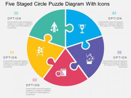
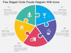
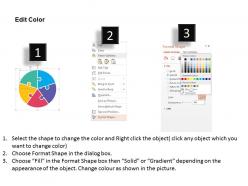
Five staged circle puzzle diagram with icons flat powerpoint design




Try Before you Buy Download Free Sample Product
 Impress Your
 Audience
 100%
100% Editable
 Save Hours
 of Time


In order to ensure the success of business correspondence and make sure the functioning goes well, it is always needed to make the work look creative, thus by enabling the use of a good PPT layout the purpose can be solved. To segregated the data yet keep the facts integrated and well in the loop, there is high possibility of business success with the use of PowerPoint design featuring five staged circle puzzle diagram, thus making the edition and updating process far more easy, less time con summing and manageable. Some PPT designs not only help to seize and recognize the opportunities but help to become the face of the organization or the concerned company, all you need to do is load the pre designed presentation slide show with information. You can put your points in a single PPT slide loaded with enough art graphics that supports your idea and vision statement without disturbing the professional taste of PPT layout. Find the bulls-eye every time with our Five Staged Circle Puzzle Diagram With Icons Flat Powerpoint Design. They enable you to do it consistently.
People who downloaded this PowerPoint presentation also viewed the following :
Five staged circle puzzle diagram with icons flat powerpoint design with all 4 slides:
Our Five Staged Circle Puzzle Diagram With Icons Flat Powerpoint Design ensure bigger effect for your ideas. They acquire greater emphasis.
FAQs for Five staged circle puzzle diagram with icons
So basically it's like a wheel with five circles around the outside connected to one in the middle. Each circle is a step in whatever process you're mapping out - they should all be about the same size. Arrows show how you move from one stage to the next. The center circle? That's your main goal or theme. Honestly, it does look kind of like a flower when you're done, which is kinda nice. Just make sure your five steps actually connect logically and don't cram too much text in there or it gets messy fast.
That circle puzzle thing works great for any step-by-step process - customer journeys, project timelines, whatever you're working on. Each piece connects to the next one, so it shows how everything builds together. People love getting creative with the colors and icons too. Honestly, the circular setup keeps people way more engaged than those boring linear flowcharts. Just figure out your five main stages first, then drop your content into each section. Makes even complicated stuff feel way easier to follow and remember. Oh, and it doesn't feel as overwhelming as those endless bullet-point lists everyone's sick of seeing.
Honestly, circular models just make way more sense because that's how stuff actually works - everything connects back to everything else. Linear processes miss all the feedback loops where step 2 affects step 4, or how the end influences the beginning again. I used to hate circular diagrams but now I'm convinced they're better for spotting problems and dependencies you'd totally miss otherwise. Your team will get the full picture faster too since they can see how changes in one area ripple everywhere else. Next time you map something out, try the circle approach - I bet you'll catch connections that weren't obvious before.
Honestly, these work great when you're stuck on messy problems that don't have clear step-by-step solutions. Strategic planning, product development - stuff like that. What I love about them is how everyone can actually see the connections between ideas during brainstorming. You're not just going A to B anymore. Each stage affects the others, which sounds obvious but trust me, it changes how you think. Oh and they're perfect for those overwhelming problems that make you want to hide under your desk. Break it into the five stages and suddenly it's manageable. Try it next time you're spinning your wheels!
Dude, colors are everything for those circle diagrams. I'd go with something that flows naturally - maybe a gradient from light to dark or those rainbow progressions that pull your eye around clockwise. Just make sure each stage pops against the others. Nothing worse than a muddy diagram where you can't tell what's what (seriously, I've seen some disasters). Your brand colors are cool to try first, but honestly? Sometimes you gotta ditch them for clarity. People need to actually follow the logic, you know?
Honestly, just start with PowerPoint's SmartArt - you can knock out a decent circle diagram in like 5 minutes. Google Slides works too if you're more of a Google person. Canva's my go-to when I want something that looks way more professional than my actual design skills. For the fancy stuff, Lucidchart gives you crazy precise control (Visio does too but it's honestly overkill unless you're an engineer or something). Adobe Illustrator is obviously the best if you need it to look perfect or scale up for printing. But real talk? Most people never need to go beyond PowerPoint's cycle diagrams - just pick your colors and you're basically done.
Yeah totally! Just figure out your 5 main stages first, then swap out all the examples for stuff that makes sense in your field. Healthcare could be patient journey steps, manufacturing might be production phases - whatever fits. The circle thing works because our brains already get cycles, you know? I've seen people overthink this part honestly. Keep the basic structure but change all the words and challenges to match what you actually deal with. Pretty straightforward once you pick those anchor points to build around.
Okay so the
-
Great designs, Easily Editable.
-
Great designs, really helpful.