


Five Staged Pie Charts With Percentage Analysis Powerpoint Slides




Try Before you Buy Download Free Sample Product
 Impress Your
 Audience
 100%
100% Editable
 Save Hours
 of Time


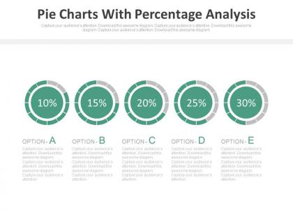
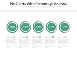
Portray the vivacity in the slides of your business and finance presentation with our exclusively pre-designed Ppt product. The pie charts equipped with the percentage meter is a slide that specifically works for the conclusive financial analysis and comparisons in the areas of sales performance, customer retention, profit share, risks evaluation, funds allocation and so on. The evocative setup of Ppt designs strikes a chord within to unlock the untapped business aptitude. Make use of skilled slides to view a bigger picture of your business health, building a fair understanding with the easily perceptible pie chart representation. The text segment coupled with the graph design is not only a projection tool but works efficiently to document your business trek. Study the arduous journey of your organization with our PowerPoint templates to aspire incessantly towards improvisation that builds a way near perfection. Do not miss the chance to roll your business snapshots with us! Download the template now. Our Five Staged Pie Charts With Percentage Analysis Powerpoint Slides are magnetic in nature. They will draw the right people to your cause.
People who downloaded this PowerPoint presentation also viewed the following :
Five Staged Pie Charts With Percentage Analysis Powerpoint Slides with all 4 slides:
Close the deficit with our Five Staged Pie Charts With Percentage Analysis Powerpoint Slides. They will even it up for you.
FAQs for Five Staged Pie Charts With Percentage
Five staged pie charts present data progression through five sequential phases, showing how proportions evolve over time, unlike traditional pie charts that display static, single-moment distributions. These dynamic visualizations enable businesses to track quarterly performance changes, product lifecycle stages, or market share evolution across departments, ultimately delivering deeper analytical insights and strategic planning advantages that static charts cannot provide.
Five staged pie charts excel when demonstrating progressive changes in composition over time, comparing proportional distributions across different categories, segments, or timeframes, and showing evolving market shares or budget allocations. These visualizations prove particularly valuable in financial services for portfolio analysis, healthcare for treatment progression tracking, and retail for seasonal sales breakdowns, with many organizations finding that staged presentations enhance stakeholder comprehension while revealing strategic trends and operational shifts.
**INPUT**: How can you effectively design a five staged pie chart to avoid misleading representations? **OUTPUT**: Effective five-staged pie chart design requires consistent scaling, clear labeling, logical sequencing, accurate proportional representation, and distinctive color coding across all stages. These design principles streamline data interpretation by maintaining visual consistency, eliminating distortion, and enhancing comparative analysis, with many organizations finding that standardized formatting ultimately delivers clearer insights and more reliable decision-making outcomes. [Word count: 54 words]
**INPUT**: What tools or software are best for creating five staged pie charts? **OUTPUT**: Top tools for creating five-staged pie charts include Microsoft PowerPoint, Excel, Tableau, Adobe Illustrator, and specialized presentation platforms like SlideTeam. These applications streamline complex data visualization by offering customizable templates, automated data integration, and professional formatting options, with many organizations finding that PowerPoint delivers the optimal balance of functionality and accessibility for business presentations. [Word count: 58]
Five staged pie charts integrate seamlessly with bar charts, line graphs, dashboards, and heat maps to create comprehensive data presentations that tell complete analytical stories. This strategic combination enables organizations to showcase categorical breakdowns alongside trends, comparisons, and performance metrics, with many financial services and retail companies finding that mixed-chart presentations deliver enhanced stakeholder understanding and faster decision-making processes.
Five staged pie charts excel at visualizing sequential processes, workflow progressions, and hierarchical breakdowns where each stage represents a distinct phase or category within a whole. Unlike bar graphs or line charts that emphasize comparisons or trends, these pie charts streamline complex multi-step processes, enhance audience understanding of interconnected stages, and deliver clearer visual narratives for project timelines, sales funnels, and operational workflows.
Color choices significantly impact five staged pie charts by enhancing data differentiation, improving visual hierarchy, and increasing audience engagement through strategic contrast and complementary palettes. These design elements streamline information processing by creating clear categorical distinctions, reducing cognitive load, and guiding viewers through sequential data stages, with many organizations finding that thoughtful color application ultimately delivers more compelling presentations and better stakeholder comprehension.
Five staged pie charts prove particularly valuable in project management, financial services, healthcare treatment protocols, manufacturing processes, and educational curriculum development. These industries benefit from visualizing sequential phases, milestone tracking, and resource allocation across defined stages, with many organizations finding that staged pie charts enhance stakeholder communication and decision-making transparency.
Common mistakes include using inconsistent color schemes across stages, overcrowding charts with excessive data labels, failing to maintain proportional accuracy between segments, choosing similar colors for adjacent sections, and neglecting clear stage progression indicators. These visualization errors confuse audiences and undermine data comprehension, with many organizations finding that standardized templates and strategic color palettes ultimately enhance presentation clarity and audience engagement.
Five staged pie charts enhance storytelling by revealing data evolution through sequential visualization, showing progression over time, comparative analysis across segments, and dramatic shifts in proportions. Through this staged approach, presenters create narrative tension, guide audience attention systematically, and demonstrate cause-and-effect relationships, ultimately delivering more compelling insights than static charts, with many organizations finding enhanced audience engagement and retention.
Five staged pie charts typically represent metrics like market share progression, budget allocation across phases, customer segmentation evolution, project milestone completion, and performance indicators over time periods. These visualizations enable organizations to track sequential changes in proportional data, with sectors like retail using them for quarterly sales analysis and manufacturing companies leveraging them for production phase monitoring, ultimately delivering clearer insights into evolving business dynamics.
Five staged pie charts effectively demonstrate progression by displaying how proportions change across sequential phases, whether showing project milestones, product development stages, market evolution, or organizational growth. Each chart represents a distinct timeframe or stage, with varying segment sizes illustrating how different components expand, contract, or emerge, ultimately delivering clear visual storytelling that helps stakeholders understand complex developmental processes and strategic transformations.
**INPUT**: What audience considerations should be made when presenting five staged pie charts? **OUTPUT**: Audience considerations include technical expertise levels, data literacy, time constraints, decision-making roles, and visual processing preferences when presenting complex staged visualizations. These factors determine presentation pace, explanation depth, and emphasis areas, with executives preferring high-level trends while analysts need detailed breakdowns, ultimately ensuring maximum comprehension and actionable insights across diverse stakeholder groups.
Cultural differences significantly influence pie chart interpretation through varying reading patterns, color symbolism, numerical formats, and visual processing preferences across regions. While Western audiences typically read clockwise from 12 o'clock, Middle Eastern cultures may favor counterclockwise patterns, and Asian markets often emphasize collective data relationships over individual segments, ultimately requiring localized design approaches for effective global communication.
**INPUT**: What tips do you have for labeling and annotating five staged pie charts for clarity? **OUTPUT**: Effective labeling strategies include using consistent color coding across all stages, positioning labels outside chart boundaries to avoid clutter, employing progressive numbering systems, utilizing callout lines for smaller segments, and maintaining uniform font sizes throughout the sequence. These approaches streamline data interpretation by enhancing visual flow, minimizing cognitive load, and ensuring seamless comparison between stages, with many organizations finding that strategic annotation placement ultimately delivers clearer storytelling and improved audience comprehension.
-
Excellent products for quick understanding.
-
Awesome presentation, really professional and easy to edit.