


Flow of funds chart powerpoint ppt template bundles




Try Before you Buy Download Free Sample Product
 Impress Your
 Audience
 100%
100% Editable
 Save Hours
 of Time


Our Flow of Funds Chart PowerPoint PPT Template Bundles are topically designed to provide an attractive backdrop to any subject. Use them to look like a presentation pro.
People who downloaded this PowerPoint presentation also viewed the following :
Flow of funds chart powerpoint ppt template bundles with all 12 slides:
Use our Flow of Funds Chart PowerPoint PPT Template Bundles to effectively help you save your valuable time. They are readymade to fit into any presentation structure.
-
Flow of Funds Chart
-
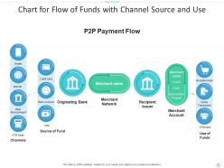
Chart for Flow of Funds with Channel Source and Use
-
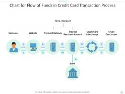
Chart for Flow of Funds in Credit Card Transaction Process
-
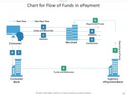
Chart for Flow of Funds in ePayment
-
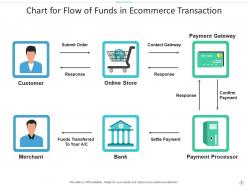
Chart for Flow of Funds in Ecommerce Transaction
-
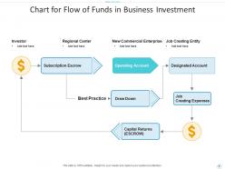
Chart for Flow of Funds in Business Investment
-
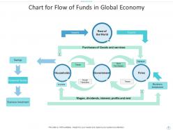
Chart for Flow of Funds in Global Economy
-
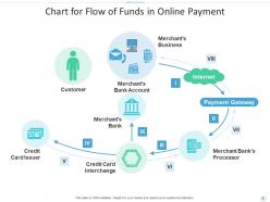
Chart for Flow of Funds in Online Payment
-
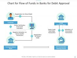
Chart for Flow of Funds in Banks for Debit Approval
-
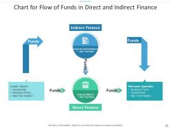
Chart for Flow of Funds in Direct and Indirect Finance
-
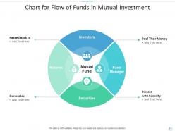
Chart for Flow of Funds in Mutual Investment
-

Thank You Slide
FAQs for Flow of funds chart powerpoint
So a flow of funds chart basically tracks money moving around the economy - between households, businesses, government, foreign investors, all that stuff. Shows who's borrowing and lending. Why it's useful: you can spot financial trouble before it hits. Like seeing which sectors are borrowing too much or where money might get tight. Honestly, it's kind of like following breadcrumbs but with way more boring data. You can use it to get ahead of market moves and check if your investment ideas make sense against what's actually happening with capital flows. Pretty handy tool.
So a flow of funds chart is basically tracking where your money comes from and where it disappears to - way easier than drowning in Excel hell. You map out revenue, expenses, investments, all that stuff visually over time. Honestly, it's a game changer for spotting cash problems before they smack you in the face. Instead of guessing, you actually see which parts of your business eat money vs make money. I'd definitely try making one for next quarter - you'll probably realize you need to shift when you're spending or collecting payments.
So basically you need four main things: where money's coming in, where it's going out, timing for everything, and your running balance at different points. Revenue, expenses, debt payments, investments - all that stuff goes in there. Honestly, I used to ignore the timing part but learned the hard way it's super important for catching cash flow problems before they hit. Don't just show individual transactions either. Show your cumulative totals or you'll miss the big picture. Start with your largest flows first, then add the smaller ones. Way easier to read that way.
So cash flow statements just track your company's actual cash moving in and out - you know, operations, investments, financing stuff. Flow of funds charts are way broader though. They show how money moves between everything - working capital, assets, debt, equity, the whole picture. Here's the thing: flow of funds will catch stuff that doesn't involve real cash changing hands, like when depreciation hits your asset values. Your cash flow statement would totally miss that. Flow of funds is better when you're trying to figure out how your entire financial structure shifted over time. Honestly, it's more useful than most people think.
Honestly, these charts are lifesavers when you've got money coming from different places and need to show stakeholders the full picture. Way better than drowning people in spreadsheets - trust me on that one. I'd start making one early in your project so you can tweak it as things inevitably change. Budget reviews become way smoother, and if you need extra funding later, having a clear flow mapped out makes those asks so much easier. Some projects require them for compliance stuff too. Just don't overthink it at first.
Honestly, the worst thing you can do is overcomplicate it from the start. Keep it simple first, then build complexity later. Also - and I can't stress this enough - make sure your numbers actually balance! Nothing kills credibility like inflows that don't match outflows. Label everything clearly so people know where money's flowing. Tiny fonts are the enemy here; nobody wants to squint during your presentation. Oh, and definitely run your assumptions by stakeholders early. Trust me, it beats doing three rounds of revisions because someone's like "wait, we don't actually spend that much on office supplies."
So those arrows are basically showing you where all the money's flowing - like a roadmap for cash. Follow them from sources (investors, revenue, whatever) to where it goes (expenses, new investments, payouts to people). The thicker arrows usually mean bigger money moving around, which honestly makes it way easier to spot the major stuff quickly. You can trace the whole journey - money comes in, gets shuffled around internally, then exits somewhere. It's pretty neat how you get the full financial picture just by following the flow. Makes sense of everything at once.
Honestly, I'd just go with draw.io (they renamed it to diagrams.net or something). It's free and has decent templates for financial stuff. Lucidchart's pretty solid too if you don't mind paying. Visio works but feels super outdated - like why is everything so clunky? Miro's great for collaborating, especially if multiple people need to edit. Some people swear by PowerPoint for basic charts, which... fair enough I guess. Figma's another option though I mostly think of it for design work. Start with draw.io honestly, you can always switch later.
Yeah, flow of funds charts are great for this! They show you exactly where cash gets stuck - like when customers take forever to pay or you're sitting on too much inventory. It's honestly pretty eye-opening once you see it mapped out visually. The bottlenecks become super obvious because you'll notice these spots where money just... sits there way longer than it should. I'd start by charting what you've got now, then hunt for those trouble areas. Way easier than digging through spreadsheets, trust me.
Honestly, flow of funds charts work way better for big corporations than small businesses. Large companies need that overview of money moving between departments and subsidiaries - helps catch inefficiencies. For small businesses? You're probably fine with basic cash flow statements since things aren't as complicated. Though if you're planning to grow or pitch investors, making one could actually help spot bottlenecks early. I mean, visualization is pretty powerful for seeing patterns you'd miss otherwise. But yeah, don't overcomplicate things if you don't need to.
Check out the Fed's Z.1 report if you want to see the real deal - tracks money flows between households, businesses, and government every quarter. Companies do this too when mapping cash between subsidiaries. Investment firms are obsessed with showing clients where their money goes (fees, investments, returns). Even Mint does a basic version for personal spending. Oh, and nonprofits use them to show donors how funds reach programs. My advice? Start with your biggest money movements first. You can always add details later. Makes those messy financial relationships way easier to follow.
Update those charts monthly if you can swing it. Quarterly's fine for smaller places that aren't changing much, but honestly? I've watched too many people get screwed when their charts were months out of date and missed huge budget shifts. Growth phase or seasonal stuff? Definitely go monthly. The trick is matching how often you update to how fast your money situation actually changes. Put it on someone's calendar as a recurring thing - like, make it their actual job. Otherwise it just sits there gathering dust until you desperately need it and realize the numbers are completely wrong. Trust me on this one.
Look, forecasting is what makes your flow of funds chart actually useful instead of just pretty numbers. You're predicting where cash will come from - operations, financing, investments - and where it's headed with expenses, debt payments, all that stuff. Yeah, you're basically guessing at your business performance, which feels weird at first. But honestly? That's way better than just staring at old data. Start with whatever revenue numbers you trust most. Build out from there. Without this forward-looking piece, you're driving while only checking the rearview mirror.
Dude, flow of funds charts are game-changers - they show where your money *actually* goes vs where you think it does. Most people are shocked when they first see it. You'll spot spending patterns you never noticed and figure out which months you need extra cash. What I love about them is you can play around with different scenarios and see how one change affects everything else. Oh, and they're perfect when you need to explain budget stuff to your boss or whoever. Start by mapping your last three months to get a feel for it first.
Banks are huge on these - they're constantly tracking money for compliance stuff and risk reports. Investment firms love them too, showing clients exactly where their cash is going. Central banks and government agencies use them for economic monitoring. Really though, any business with messy cash flows finds them useful. I'd say if you're doing consulting or working with big institutional clients, definitely learn to read these charts. Makes you look way sharper in meetings. My old boss was obsessed with them - probably because they make complex financial stuff look actually understandable for once.
-
Understandable and informative presentation.
-
Qualitative and comprehensive slides.
-
Perfect template with attractive color combination.