


Food Delivery Guy On Bike Monotone Icon In Powerpoint Pptx Png And Editable Eps Format




Try Before you Buy Download Free Sample Product
 Impress Your
 Audience
 100%
100% Editable
 Save Hours
 of Time


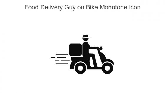
This Food delivery guy on bike monotone icon in powerpoint pptx png and editable eps format is a 100 percent editable icon. The downloaded file will have this icon in EPS, PNG and Powerpoint pptx format and is perfect for your next project. It has a simple yet stylish design.
People who downloaded this PowerPoint presentation also viewed the following :
Food Delivery Guy On Bike Monotone Icon In Powerpoint Pptx Png And Editable Eps Format with all 6 slides:
Use our Food Delivery Guy On Bike Monotone Icon In Powerpoint Pptx Png And Editable Eps Format to effectively help you save your valuable time. They are readymade to fit into any presentation structure.






FAQs for Food Delivery Guy On Bike Monotone Icon In Powerpoint Pptx Png And
Key design elements for visually appealing food delivery icons include clear symbolism like vehicles or food items, bold and contrasting colors, clean minimalist styling, consistent proportions, and intuitive recognition patterns. These elements work together by enhancing user experience through immediate comprehension, maintaining brand consistency across platforms, and delivering seamless navigation, with many food delivery companies finding that well-designed icons significantly boost app engagement and customer retention.
Color choice in food delivery icons significantly impacts user perception by triggering psychological responses, creating brand recognition, establishing appetite appeal, and influencing click-through rates. Warm colors like red and orange stimulate hunger and urgency, while green conveys freshness and health-consciousness, with many food delivery platforms finding that strategic color combinations increase user engagement by up to 25% and enhance overall brand memorability.
Symbolism creates instant recognition through universal visual cues like arrows for movement, clocks for speed, and utensils for food services, enabling customers to immediately understand delivery functions across platforms. These symbolic elements streamline user experience by reducing cognitive load, enhancing brand recall, and facilitating faster decision-making, with many food delivery companies finding that consistent symbolic language ultimately delivers stronger customer engagement and competitive advantage.
Food delivery icons communicate speed and efficiency through dynamic visual elements like motion lines, clock symbols, lightning bolts, racing vehicles, and streamlined delivery bags with aerodynamic shapes. These design elements instantly convey rapid service by incorporating directional arrows, speedometer graphics, and time-based imagery, while many restaurants and delivery platforms find that such icons significantly enhance customer perception of quick, reliable service delivery.
Common mistakes include using overly complex designs, poor color contrast, inconsistent sizing, generic imagery, and ignoring mobile optimization requirements. These design flaws undermine user recognition and app functionality, with many food delivery platforms finding that simplified, high-contrast icons with clear food imagery significantly enhance customer engagement, reduce navigation confusion, and ultimately improve order conversion rates across diverse demographics.
User interface design influences food delivery icon placement through visual hierarchy principles, accessibility requirements, and user behavior patterns, ensuring icons appear prominently on home screens, within intuitive navigation flows, and at optimal touch zones. Strategic placement considers thumb-reach zones on mobile devices, brand visibility requirements, and conversion optimization, with many apps positioning delivery icons in primary navigation bars or as floating action buttons to maximize user engagement and order completion rates.
Cultural considerations for global food delivery icons include dietary restrictions, religious symbols, color meanings, local food preferences, and regional design aesthetics. While green signifies freshness in Western markets, it may represent different concepts in Asian cultures, with many international platforms finding that culturally-neutral symbols like delivery vehicles or generic containers work more effectively across diverse markets than culture-specific food imagery.
Animations enhance food delivery icons by creating visual feedback, guiding user attention, and indicating app states like loading or order completion. Through subtle motion effects, restaurants and delivery platforms streamline user interactions, reduce confusion during checkout processes, and improve overall customer experiences, with many food service apps finding that animated icons increase engagement rates and order conversions.
Food delivery services should prioritize minimalist designs, bold color contrasts, micro-animations, and accessibility features in their 2024 icon strategies. These trends enhance user recognition across mobile platforms, streamline navigation experiences, and accommodate diverse user needs, with many leading delivery companies finding that simplified, high-contrast icons significantly improve app engagement and brand recall.
Responsive designs ensure food delivery icons maintain optimal visibility across devices by automatically adjusting size, spacing, and contrast based on screen dimensions and resolution capabilities. Through scalable vector formats and adaptive layouts, restaurants and delivery platforms achieve consistent brand recognition on smartphones, tablets, and desktops, while enhancing user experience and ultimately driving higher conversion rates across all digital touchpoints.
Simplicity in food delivery icon design enhances user experience by ensuring instant recognition, reducing cognitive load, and enabling faster navigation across mobile interfaces. Clear, minimalist icons streamline ordering processes, improve accessibility for diverse users, and maintain visual consistency across platforms, with many restaurants and delivery services finding that simplified iconography increases app engagement and reduces user confusion during critical ordering moments.
Feedback mechanisms include user surveys, A/B testing, click-through rate analysis, conversion tracking, and usability testing sessions. These methods enable restaurants and delivery platforms to measure icon recognition, ordering efficiency, and customer satisfaction, with many food service businesses finding that data-driven icon optimization significantly enhances user engagement and streamlines the ordering experience.
Food delivery icons interact with other visual elements through strategic placement within navigation systems, complementing branding colors and typography, and maintaining consistent sizing with payment, location, and user profile icons. These icons work seamlessly alongside maps, rating systems, and promotional banners, while supporting checkout flows and notification systems, ultimately creating cohesive user experiences that enhance app functionality and drive customer engagement across digital platforms.
Food delivery icons succeed through psychological factors including visual appetite appeal, color psychology using warm reds and oranges, simplicity for quick recognition, and familiarity through universal food symbols. These design elements trigger immediate hunger cues and emotional connections, with many food delivery platforms finding that strategically designed icons increase app engagement rates, streamline user decision-making, and ultimately deliver higher conversion rates in competitive digital marketplaces.
Scalability is crucial for food delivery icons as they must maintain clarity and recognition across diverse platform sizes, from mobile apps to desktop interfaces and marketing materials. Effective scalable design ensures consistent brand identity while optimizing user experience across touchpoints, with platforms like DoorDash and Uber Eats demonstrating how well-designed icons enhance customer recognition and streamline navigation across multiple devices.
-
SlideTeam’s readymade presentations have landed my unique images with my bosses in the past and it continues to reward me.
-
SlideTeam is a great place for PPT templates. They have many templates on a single topic. It has made my life a lot easier.