


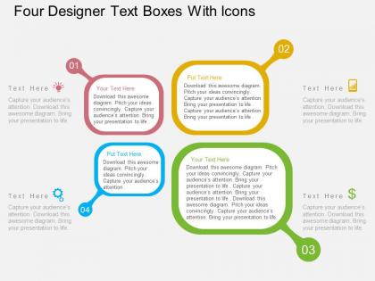
Four designer text boxes with icons flat powerpoint design




Try Before you Buy Download Free Sample Product
 Impress Your
 Audience
 100%
100% Editable
 Save Hours
 of Time


Get that Friday feeling with our Four Designer Text Boxes With Icons Flat Powerpoint Design. They allow you to take it easy.
People who downloaded this PowerPoint presentation also viewed the following :
Four designer text boxes with icons flat powerpoint design with all 4 slides:
Enter the hall of fame with our Four Designer Text Boxes With Icons Flat Powerpoint Design. The doors will automatically open for you.

FAQs for Four designer text boxes with icons
Simple icons that actually relate to your content - ditch anything purely decorative. I always put mine in the same spot (left side or text box corner). Contrast is huge though, can't tell you how many times I've seen icons just vanish into backgrounds. Super annoying. Stick with one style throughout - don't mix flat icons with 3D ones or whatever. Size them so they complement your text without taking over. Oh and definitely test it on the actual screen you'll use since things look different than on your laptop!
Honestly, icons are game-changers for text boxes. They give people those quick visual hints about what they're about to read - like a warning triangle screaming "hey, pay attention!" or a lightbulb for those "aha" moments. Your content instantly becomes way more scannable instead of looking like some boring textbook wall. Plus they break up all that dense text nicely. I'm basically obsessed with how much cleaner everything looks. The visual association thing works too - readers start connecting certain icons with specific types of info, which makes everything feel more intuitive. Definitely worth trying out with your content categories.
Honestly? Go with flat icons or those thin line ones - they look super clean and won't fight your content for attention. Solid filled icons are solid too, especially if you're doing something corporate or tech-heavy. Whatever you do, avoid the overly detailed stuff (nobody wants that 2005 PowerPoint energy, trust me). Oh, and pick colors that actually match your brand palette - monochromatic usually works best. The biggest thing though? Make sure all your icons are from the same style family. Mix and match looks messy. Just pick one vibe and run with it through your whole presentation.
Honestly, color schemes can totally make or break your text boxes. You want high contrast between text, background, and icons so people can actually read the damn thing. I've watched designers choose these gorgeous trendy palettes that look amazing but are impossible to read - such a waste. Poor color choices just make everything blend together. Your icons disappear into the background. Short sentences work better sometimes. Test your colors on different screens before you commit to anything, trust me on this one.
Honestly, the worst thing you can do is just slap random icons everywhere that don't actually relate to your text. Makes zero sense. Also avoid cramming like 20 icons into one section - it looks messy as hell. Make sure they're big enough to see and not some weird low-contrast gray that disappears. I always test mine with a couple people first because what seems obvious to me usually isn't to them lol. Keep the style consistent throughout, add alt text for screen readers, and actually use them to help users understand stuff faster rather than just decoration.
Honestly, just pick icons that actually match what you're talking about. Growth? Go with arrows or plants. Teamwork stuff? People icons or puzzle pieces work great. I used to grab icons just because they looked fancy - big mistake lol. Your icon should either show exactly what you mean or nail the vibe you want. Here's my test: show it to someone random. If they get it right away without you explaining anything, you're golden. Oh and simple beats trying to be too clever every time. Trust me on that one.
So for those text box designs, I'd stick with 280-400px width - anything wider gets hard to scan. Put your icons about 16-24px from the left edge (way more intuitive than centering them above). Leave at least 12px between the icon and text so it doesn't look squished. Oh, and don't make icons smaller than 20px unless you want users struggling to figure out what they are. I usually do 20-24px padding around everything. Trust me, test this stuff on mobile early - I've seen these boxes completely fall apart on smaller screens and it's painful to fix later.
Okay so spacing is seriously everything with icon text boxes. I learned this the hard way when I crammed everything together thinking it looked "clean" – looked terrible honestly. Give yourself at least 8-12px between the icon and text, then add consistent padding around the whole thing. Your users need that breathing room to actually process what they're seeing. It also makes touch targets way better on mobile, which you'll appreciate later. Oh and test it on your phone first because desktop spacing always looks different than you expect.
Honestly, icons are like visual shortcuts that save you so much space. Instead of writing out "Important safety information" you just throw in a shield icon and boom - people get it instantly. Use lightbulbs for ideas, warning triangles for danger, checkmarks when something's done. The trick is picking symbols everyone already knows. I'd start by figuring out what 3-4 things you mention most, then find simple icons that actually make sense. Just stay consistent with them throughout your design or it gets confusing fast.
Honestly, just start with Figma - it's free and you can mess around with it right now. Figma and Adobe XD are both solid for this kind of stuff, especially if you want to collaborate with people. Canva's pretty decent too if you don't want to learn a whole design program. I'd skip Illustrator unless you really need advanced features (it's kind of overkill tbh). Sketch is good but only works on Mac, which is annoying. The main thing is finding something where you can easily add icons and style text how you want. Figma's probably your best bet to start.
Oh man, icons can be tricky with different cultures! Like thumbs-up seems totally fine to us but it's actually offensive in some Middle Eastern countries. Colors mean different things too - red's lucky in China but means danger here. Hand gestures are probably the worst offenders though. I'd honestly just test your icons with people from whatever regions you're presenting to first. Or play it super safe and stick with boring universal stuff like play buttons and envelope icons. Better to be bland than accidentally insult half your audience, you know?
Dude, everyone's going minimal with those clean outline icons now - the chunky filled ones feel so 2019. Custom stuff is huge too, way better than those generic stock packs everyone recognizes. Animation's everywhere in digital work which is cool but can get annoying if overdone. What's really interesting is how people mix styles now - like geometric with hand-drawn bits. Sounds weird but it actually works when you nail it. Oh and match your icon thickness to your fonts! Thin typography = thin strokes. Learned that one the hard way lol.
Your icons need to match across all those text boxes - same weight, style, colors, the whole deal. I made this mistake once and it looked like three different designers worked on my project (so embarrassing). Short, consistent icons work way better than mixing styles. Create a quick style guide first, even if it's just notes on your phone. Then actually follow it! Small differences really stand out and make everything look messy. Users should immediately know all these elements belong together. Trust me, consistency makes such a bigger difference than you'd think.
Definitely run A/B tests on your text boxes - same ones with and without icons. Track click-through rates, form completions, that kind of stuff. Heat mapping tools are clutch for seeing where people actually look and click. Honestly, I've seen icons totally backfire in ways you wouldn't expect, so real data beats assumptions every time. Try watching some users interact with your designs live if you can swing it. Oh, and test one icon change at a time or you won't know what's actually working. User testing sessions are awkward but so worth it.
Honestly, I'd go minimal with icons that actually do something - like showing warnings or success messages. Skip the decorative stuff, it just gets in the way. Your colors should match your brand obviously, but throw in some hover effects or subtle animations to make things feel alive. I've watched so many designers go crazy with flashy icons that nobody needs! Let your typography stay clean and professional while the icons can be where you get more creative. Oh, and definitely test this stuff with real people - sometimes what looks cool totally breaks the user experience. Start simple, then slowly add the fun elements until it feels right.
-
Qualitative and comprehensive slides.
-
Innovative and attractive designs.