


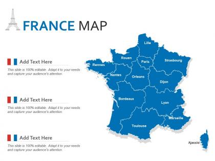
France map powerpoint presentation ppt template




Try Before you Buy Download Free Sample Product
 Impress Your
 Audience
 100%
100% Editable
 Save Hours
 of Time


Our France Map Powerpoint Presentation PPT Template are topically designed to provide an attractive backdrop to any subject. Use them to look like a presentation pro.
People who downloaded this PowerPoint presentation also viewed the following :
France map powerpoint presentation ppt template with all 2 slides:
Use our France Map Powerpoint Presentation PPT Template to effectively help you save your valuable time. They are readymade to fit into any presentation structure.
FAQs for France map powerpoint
Key features include high-resolution regional boundaries, customizable color schemes, editable text placeholders, scalable vector graphics, and department-level detail options. These elements streamline presentation development by enabling precise geographic visualization, seamless branding integration, and flexible data overlay capabilities, with many organizations finding that quality templates significantly reduce design time while enhancing audience engagement.
A detailed France map enhances storytelling by providing visual context for regional narratives, demographic trends, economic data, and geographic relationships between different areas. Through clear territorial boundaries and regional distinctions, presenters can guide audiences through complex information more effectively, with many finding that geographic visualization transforms abstract concepts into compelling, location-specific stories that resonate with stakeholders.
Effective data visualizations with France map templates include regional sales performance charts, demographic heat maps, market penetration analysis, distribution network mapping, and comparative economic indicators across departments. These visualizations work particularly well for retail chains analyzing store performance, logistics companies optimizing delivery routes, and government agencies presenting regional statistics, ultimately delivering clear geographic insights that enhance strategic decision-making.
Custom colors can be applied to France map PowerPoint templates through PowerPoint's formatting tools, including fill colors, outline adjustments, gradient overlays, and theme color customization for consistent branding alignment. These design modifications enable organizations to seamlessly integrate regional data visualization with corporate identity standards, with many consulting firms and multinational companies finding that branded geographical presentations enhance client engagement and reinforce professional credibility across stakeholder communications.
Yes, France map PowerPoint templates are specifically designed for different contexts, with educational versions featuring regional details, historical overlays, demographic data, and interactive elements for classroom learning, while business templates emphasize economic zones, market segments, logistics networks, and corporate branding capabilities. These specialized designs enable educators to enhance geography lessons and cultural studies, while businesses streamline market analysis, sales territory planning, and strategic presentations, ultimately delivering more targeted and effective audience engagement.
Common mistakes include using low-resolution maps that appear pixelated, overcrowding slides with excessive text or data points, choosing colors that clash with your brand, and failing to highlight relevant regions for your specific audience. These presentation pitfalls can undermine professional credibility and audience engagement, with many businesses finding that clean, strategically designed maps enhance message clarity and deliver more impactful presentations.
Present demographics and statistics on a France map template by utilizing color-coded regions, data overlays, interactive hover effects, comparative charts, and visual legends that highlight key metrics. Through strategic color gradients and numerical callouts, organizations can effectively communicate population density, economic indicators, and regional performance data, while maintaining visual clarity and enabling audiences to quickly identify trends across different French territories for strategic decision-making.
Animations can enhance France map presentations through progressive region reveals, dynamic data visualization, zoom transitions between national and local views, and interactive city spotlights with pop-up information boxes. These techniques help audiences follow geographical narratives more intuitively, with many presenters finding that strategic movement and timing significantly improve audience retention and comprehension of complex regional data.
Ancillary resources include demographic data overlays, economic indicators, regional statistics, transportation networks, and customizable infographic elements that enhance map presentations. These complementary materials enable presenters to create comprehensive visual stories by combining geographical context with business intelligence, population trends, and market analysis, ultimately delivering more impactful presentations for strategic planning and decision-making processes.
Geographic overlays strengthen France map presentations by adding demographic data, economic indicators, regional statistics, transportation networks, and industry distributions directly onto the geographical framework. These visual layers enable presenters to demonstrate spatial relationships, highlight regional variations, and support data-driven arguments more effectively, with many business analysts finding that overlaid maps deliver clearer insights and enhanced audience comprehension.
Interactive France map templates offer enhanced audience engagement, real-time data visualization capabilities, clickable regional navigation, customizable hover effects, and seamless integration with dynamic content updates. These features streamline presentations by enabling presenters to drill down into specific departments or cities instantly, while audiences retain information more effectively through hands-on exploration, ultimately delivering more impactful business communications than traditional static formats.
Templates can be customized by adjusting color schemes to highlight specific regions, adding detailed city markers with custom icons, incorporating regional data overlays, and resizing geographical areas for emphasis. These customization features enable businesses to create targeted presentations for regional marketing campaigns, sales territory planning, and location-specific strategies, with many organizations finding that visual emphasis significantly enhances audience engagement and comprehension.
Best practices for citing geographic data include providing source attribution on slides, using consistent citation formats, including data collection dates, and listing complete references in appendices. These practices enhance credibility by ensuring transparency, protecting intellectual property, and enabling audience verification, with many organizations finding that proper attribution strengthens stakeholder trust and demonstrates professional research standards.
Cultural elements of France significantly influence map PowerPoint template design through iconic color schemes featuring tricolor blues, whites, and reds, elegant typography reflecting French aesthetic traditions, and incorporation of landmark symbols like the Eiffel Tower or fleur-de-lis. These design choices enhance audience connection and cultural authenticity, with many presenters finding that culturally-informed templates deliver more engaging presentations and stronger visual impact for France-focused content.
**INPUT**: What trends are emerging in map presentation designs, specifically for mapping France? **OUTPUT**: Emerging trends in France map presentations include interactive overlays, data visualization integration, regional demographic layering, customizable color schemes, and mobile-responsive designs. These enhancements streamline geographic storytelling by enabling dynamic content updates, supporting multi-layered analysis, and delivering engaging visual experiences, with many organizations finding that modern mapping templates significantly enhance audience engagement and decision-making processes. *[Word count: 60]*
-
Nice and innovative design.
-
Really like the color and design of the presentation.
-
Excellent work done on template design and graphics.
-
Informative presentations that are easily editable.