


Future state roadmap powerpoint slide download




Try Before you Buy Download Free Sample Product
 Impress Your
 Audience
 100%
100% Editable
 Save Hours
 of Time


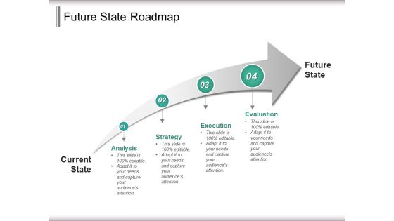
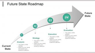
The future state roadmap template is ideal for business upgrading and business change model presentation. The future state presentation slide consists of graphic of increasing arrow timeline diagram which is not only easy to understand but also to explain. The future state roadmap PPT template can provide an outline description of how an organization will do transition from its current state to its future state. Generally, an organization proceeds forward without thinking of where they are now whether it is from a people, process, or technology maturity level so you can rely on the project status and milestones template in that situation. A presenter can go for our future state diagram PPT slide to highlight the profit, growth or achievements over the months or even years. The current state future state gap analysis slide is perfect to display steps that you or your business organization needs to take or plan to achieve the desired target. A user can use our professionally designed future state PPT template to indicate insights of the business transformation strategy. The transition state analysis slide is suitable for managers or consultants to propose changes for strategic model. Eradicate hatred with our Future State Roadmap Powerpoint Slide Download. They help generate an air of friendship.
People who downloaded this PowerPoint presentation also viewed the following :
Future state roadmap powerpoint slide download with all 5 slides:
Our Future State Roadmap Powerpoint Slide Download are innately eco-friendly. Their high recall value negate the need for paper handouts.
FAQs for Future state roadmap
So you'll want a vision statement right at the top, then map out where you're starting from as your baseline. After that, break it down into specific milestones - but don't be like me and make everything way too optimistic timeline-wise, I swear I do this every single time. Your milestones need to be measurable, not just "increase engagement" or whatever vague stuff. Set up your key initiatives that'll actually move the needle. Include success metrics so you can track if it's working. Layout should flow left to right, showing the whole journey. Keep it simple - if someone can't get it in 30 seconds during a presentation, you've overcomplicated it.
Honestly, arrows and timelines are your best friends here - they create that visual flow people actually follow. Color coding is clutch for separating different phases or workstreams. Nobody wants to stare at walls of text (learned that the hard way), so throw in some icons to break things up. Charts work perfectly for metrics and milestones. Keep your colors consistent so stakeholders aren't confused. Here's a random trick: try squinting at your slide. Can you still follow the main story? If not, you need more visual anchors. The whole point is making it scannable in like 3 seconds.
Keep slides clean - too much info and people check out immediately. Realistic timelines are crucial since execs will definitely call you out later (trust me on this). Skip the corporate jargon like "optimize synergies" - nobody knows what that means anyway. Focus on big milestones rather than every tiny step. Here's the thing though: never present it as final. Build in wiggle room and prep backup plans because roadmaps always shift. You'll look way more professional when changes happen and you're ready for them instead of scrambling.
So current state is basically a snapshot of where you're at right now - all your processes, what's broken, what works. Future state roadmap? Completely different beast. That's your GPS showing how to get from point A to point B, with all the milestones and timelines mapped out. I'd definitely keep these sections separate in your presentation - stakeholders need to see the full journey, not just today's mess. The roadmap should show dependencies too, which honestly can get pretty complex depending on your setup. But yeah, think snapshot vs. step-by-step directions.
Look, timelines are what turn your roadmap from a pipe dream into something that'll actually happen. Without dates, you're basically saying "we'll get there eventually" - and we both know how that goes. I'd include your major milestones, key phases, plus any dependencies that could trip you up. The whole point is giving stakeholders real dates they can hold you to. Just make sure you're realistic about timing (maybe even pad it a little because something always goes sideways). Been there too many times. Once you've got concrete dates attached, your vision becomes way more actionable.
Map each milestone to actual stakeholder wins - not just features, but real business problems getting solved. Color-code or use swim lanes so people can instantly see what affects them. Honestly, most roadmaps look nice but tell you absolutely nothing about impact. Use solid numbers like "cut onboarding time by 40%" instead of fluffy "better user experience" stuff. Start each section with the benefit, then add your tech details after. Oh, and definitely run it by stakeholders first - they'll spot holes you totally missed. Trust me on that one.
Pick metrics that actually connect to what you're trying to achieve - stuff like cost savings, time cuts, customer happiness scores, efficiency bumps. Whatever matters for YOUR goals. Honestly, most people go overboard here and track everything under the sun. Stick to 3-5 max or you'll get distracted. Get your baseline numbers first so you can tell a real before/after story. Set target dates too. Just make sure you can actually measure this stuff with what you've got - I've seen too many fancy dashboards that look great but measure nothing useful.
Honestly, templates are a game changer. You get all the boring stuff already done - timelines, milestones, formatting that doesn't look like garbage. Just drop your content in and you're set. Way better than starting from zero every single time (learned that the hard way). Your slides will actually look professional instead of like you threw them together in five minutes. Best part? Use the same template across projects so everything matches. Find a good template pack, tweak it for your company colors or whatever, and you'll save yourself hours of headache later.
Make it flow left to right with clear phases - people need to scan it fast. Use the same colors and shapes throughout so it's not confusing. Most roadmaps I see look like someone threw up text all over PowerPoint, honestly. Focus on big themes, not tiny details. Give it breathing room with white space. Someone should understand your whole plan in 10 seconds max. Here's what works: start with where you want to end up, then work backwards. That way everything actually connects instead of just being random stuff on a timeline. Oh, and don't make it look like a Word doc that wandered into the wrong software.
I usually do colors by timeline - blue for Q1, green for Q2, that kind of thing. Or you could go with priority levels using the traffic light approach (red = critical, yellow = medium, green = nice-to-have). Honestly, the traffic light thing is pretty foolproof since everyone gets it instantly. Just pick one system and stick with it across the whole roadmap. Don't forget to add a legend though - people hate guessing what colors mean. Oh, and max out at like 4-5 colors or it'll look like a rainbow threw up on your roadmap. Also worth checking if your colors work for colorblind folks.
First thing - literally draw lines connecting your roadmap stuff back to the company's main goals. Sounds basic but you'd be shocked how many people skip this. Get the big decision-makers involved from day one, not after you've already built the whole thing. I learned this the hard way when I spent weeks on a roadmap that leadership barely glanced at. Check in with them regularly while you're building it out. Your timeline and resources need to actually match what the business cares about most. Make it super obvious how each piece creates real value.
Honestly, case studies are like your secret weapon for roadmaps. Instead of people thinking "yeah right, this'll never work," they actually start believing it's possible. I usually grab 2-3 solid examples - maybe a competitor who crushed their digital transformation or someone who faced the exact same mess you're dealing with. It's way better than just talking about what you want to do. Show them the before/after instead. The trick is finding examples that actually match your situation so stakeholders can go "oh wait, we could totally do this too."
Honestly, skip PowerPoint for this stuff - it gets messy real quick when you're constantly updating dates. Lucidchart and Miro are way better for interactive timelines. Miro's probably your best bet since everyone can jump in and edit together. If you're doing product roadmaps specifically, Roadmunk's pretty solid. Monday.com connects to your actual project data which is nice (though I find their interface kinda overwhelming sometimes). Visio works too but it's not as user-friendly. Start with Miro - it's collaborative and won't make you want to throw your laptop.
You'll want to show executives completely different stuff than your team. Execs only care about ROI, timelines, and whether they need more budget - honestly, one slide is probably enough for them. Your team needs the nitty-gritty: what they're actually building, dependencies, new skills they'll need. I'd start with what questions each group would throw at you, then work backwards. Like, your boss will ask "when do we see results?" while your developers want to know "how does this change my sprint?" The exec version should be all visual milestones and success metrics. Team version can get way more detailed since they're the ones doing the work.
Color-coding is your best friend here - red, yellow, green traffic lights make risks super obvious at a glance. Heat maps work well too. Honestly, those probability/impact grids are clutch because anyone can understand them instantly. Throw in some callout boxes next to your milestones highlighting the big risks. Maybe dedicate a slide to your top 5 threats with quick descriptions. Oh, and definitely assign owners so people know who's watching what - otherwise risks just float around unmanaged. Keep everything visual and scannable. Nobody reads dense risk paragraphs anyway.
-
Visually stunning presentation, love the content.
-
Easily Editable.