


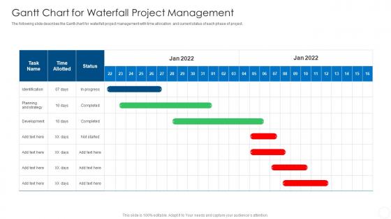
Gantt Chart For Waterfall Project Management




Try Before you Buy Download Free Sample Product
 Impress Your
 Audience
 100%
100% Editable
 Save Hours
 of Time


The following slide describes the Gantt chart for waterfall project management with time allocation and current status of each phase of project.
People who downloaded this PowerPoint presentation also viewed the following :
Gantt Chart For Waterfall Project Management with all 6 slides:
Use our Gantt Chart For Waterfall Project Management to effectively help you save your valuable time. They are readymade to fit into any presentation structure.





FAQs for Gantt Chart For
So a Gantt chart is basically this visual timeline thing - shows your tasks as bars stretched across dates. Way better than regular to-do lists because you can actually see how everything connects. Like if one task gets delayed, you'll spot exactly which other stuff gets screwed up. Kanban boards are cool but they're more about workflow stages, not timing. Honestly? Total overkill for simple projects. But when you've got multiple people working on interconnected things - oh man, they're lifesavers. Try it next time you're dealing with overlapping deadlines. You might surprise yourself with how much clearer everything becomes.
Dude, Gantt charts are honestly game-changers. They show everyone who's doing what and when, so you don't get those weird moments where nobody knows who's supposed to handle something. Dependencies become super obvious - like you'll instantly see when Sarah's delay is gonna mess up Mike's timeline. I used to think they were just fancy calendars, but they're more like roadmaps that actually make sense. Your team can finally see how their piece fits the whole puzzle. Plus tracking progress becomes way less painful. Try showing one at your next standup - I bet the conversations get way clearer.
You want tasks down the left side, timeline across the top, then bars showing how long each thing takes. Dependencies are huge - those arrows between tasks that show what has to finish first. I always used to blow those off and regretted it every time lol. Diamond shapes work great for milestones and big deadlines. Assign people to stuff so everyone knows their part. If your software does critical path, turn that on too - super helpful. Oh and don't go crazy at first! Start basic and add the fancy bits once your team gets used to reading these things.
Honestly, just match it to what you're actually dealing with. Excel works great for simple stuff - don't overcomplicate it. Multi-team chaos? That's when you need the real tools like Microsoft Project or Asana. Think about whether your team actually needs all the bells and whistles - real-time collaboration, budget tracking, whatever. Also, and this is key - if your team hates tech, fancy software will just sit there unused. I'd grab free trials of maybe 2-3 options and test them on something small first. Way better than committing to the wrong thing.
Honestly, the two big ones are over-complicating it from the start and then never touching it again. Don't try mapping every little task - you'll lose your mind. Focus on the big stuff, major milestones. Dependencies always mess people up too, so watch for tasks that can't start until others finish. I've seen so many timelines that are total fantasy just because someone wanted to tell the boss what they wanted to hear. Bad idea. Some things just have to happen in order, even if it looks cleaner on paper to run them parallel. Oh, and actually use the damn thing - update it weekly or it's useless.
So basically you just fill in the bars on your Gantt chart as stuff gets done - it's like coloring in your progress. Super visual way to see if you're on track or falling behind. Those little diamond things mark your big milestones and deadlines. What's really helpful is catching bottlenecks before they screw you over, like when tasks start piling up because one thing's delayed. I usually update mine weekly (though sometimes I forget and do it every two weeks, oops). Keeps everyone on the same page without those painful status meetings nobody wants to sit through.
So Gantt charts are basically like having a bird's eye view of your whole project timeline. You can spot when Sarah's drowning in three tasks while Jim's twiddling his thumbs, or when you need two designers but only have one. Honestly, it beats trying to keep track of everything in your head – I learned that the hard way on my last project lol. The trick is actually updating it regularly so you can move people around when someone calls in sick or priorities shift. Makes resource conflicts way easier to catch before they become a real problem.
Yeah, totally works! The trick is keeping your Gantt charts way more flexible than the old-school waterfall ones. Focus on bigger features or epics instead of mapping out every tiny task months ahead - that'd drive any Agile team crazy. Most people I know do sprint-based timelines, maybe 2-4 weeks max. Honestly, the hybrid approach is pretty solid - Gantt for your high-level roadmap, then regular sprint boards for daily stuff. Jira makes this super easy if you're already using it. Just don't get too attached to your timeline since priorities will shift constantly.
So you can totally tweak Gantt charts to fit whatever project you're doing. Construction folks might break things down into permits, foundation work, framing - that kind of stuff. Software teams usually go with sprints, testing phases, deployment. Colors are super helpful for showing different teams or departments. You can also add custom fields for budget tracking or resources if that's your thing. Timeline-wise, some industries need hourly detail while others work in months (honestly depends on how fast-paced your field is). I'd start by figuring out what milestones actually matter for your specific work, then build the chart around those key points.
Honestly, update that thing at least weekly - daily if your project's crazy busy. Track what's actually happening vs what you planned, and shift those dependencies around when stuff changes. But here's the thing - don't just drag bars around without writing down WHY things shifted. You'll thank yourself later when you start seeing patterns. Oh, and definitely give your stakeholders a heads up before making big changes to the timeline. Nobody likes surprises. The whole point is making it reflect reality instead of that overly optimistic plan you started with. Trust me, a fantasy Gantt chart helps nobody.
Gantt charts are honestly game-changers - they turn messy project info into something you can actually understand at a glance. Those horizontal bars show task lengths, connecting lines reveal dependencies, and you don't have to dig through boring spreadsheets anymore. Color coding is clutch too. I always assign different colors to team members or project phases. Red usually marks critical path stuff, so you know which delays will totally screw you over. Milestone diamonds work great for key deadlines - stakeholders love being able to scan left to right and instantly get what's happening when.
Dude, Gantt charts are seriously perfect for remote work. Everyone can see exactly what's happening without bugging each other constantly. No more of those annoying "hey what's the update?" messages every five minutes. You'll spot problems way earlier too since the dependencies are right there visually. Plus when you're all scattered across time zones, having that shared timeline keeps everyone on the same page. I'm probably biased since I love visual stuff, but they really do cut down on meetings. Start with something basic like Asana - don't overthink it at first.
Dude, Gantt charts are seriously game-changers for making decisions. You get this instant visual of where everything actually stands - no more guessing. Behind schedule tasks? They jump out at you immediately. Resource conflicts that would normally blindside you? You'll spot them way ahead of time. The timeline shows you exactly how one delay ripples through everything else, which honestly saves so much drama later. Instead of just rambling through status updates in meetings, pull up the chart. Makes reallocating budget or people way more obvious when you can actually see the mess (or success) laid out visually.
Ugh, Gantt charts are such a pain to keep current - that's honestly the worst part. When one thing shifts, you're stuck updating like 20 other connected tasks. Super tedious. Large projects turn into these overwhelming visual messes too. My advice? Get software that handles dependency updates automatically. Break big projects into smaller chunks so you're not drowning in details. Oh, and definitely have someone review it regularly - maybe weekly? Don't chart every little thing either. Stick to the big stuff and major deadlines. Trust me, you'll save yourself hours of frustration.
Honestly, the biggest thing is just keeping it simple - clear task names and consistent colors so people aren't scratching their heads trying to figure out what you meant. Nobody wants to decode "Phase 2B optimization" nonsense. If you can make it interactive, do it. Let people update their own stuff and leave comments. Build in buffer time too because things always shift (learned that the hard way). But here's what really matters - get your team involved when you're setting it up. They'll actually use it instead of rolling their eyes at another tracking tool being dumped on them. Ask them what format works best right from the start.
-
Enough space for editing and adding your own content.
-
SlideTeam offers so many variations of designs and topics. It’s unbelievable! Easy to create such stunning presentations now.