


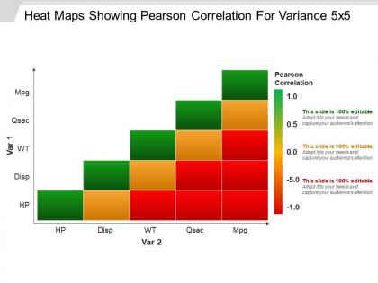
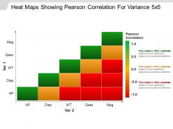
Heat maps showing pearson correlation for variance 5x5 good ppt example




Try Before you Buy Download Free Sample Product
 Impress Your
 Audience
 100%
100% Editable
 Save Hours
 of Time


Showcase the correlation for variance using this 5x5 methodology incorporated in our heat maps showing pearson correlation for variance 5x5 good PPT PPT example. This is a three-stage a process which comprises of the main following component, namely: heatmaps. Use this PowerPoint slide to explain the significance of the linear correlation between two variables and this can be incorporated in any business. As concentration is key when it comes to running a business or even in daily life, this PPT deck has been carefully designed and integrated to incorporate the attention of a professional and a varied audience during business meetings. Use this PPT to smartly process and convey the concept of the heat maps showing pearson correlation for variance 5x5 PPT diagrams template using this PowerPoint in a business meeting within an organization. This icon is smartly designed so that you can now captivate your audience with this process chart PowerPoint layout at the simple click of a button! Simply download, add your data and present it to your audience! Get endorsed by experts with our Heat Maps Showing Pearson Correlation For Variance 5x5 Good Ppt Example. The best will back your every idea.
People who downloaded this PowerPoint presentation also viewed the following :
Heat maps showing pearson correlation for variance 5x5 good ppt example with all 5 slides:
Inform folks on how to implement decisions with our Heat Maps Showing Pearson Correlation For Variance 5x5 Good Ppt Example. It helps complete the change effectively.

-
Illustrative design with editable content. Exceptional value for money. Highly pleased with the product.
-
Great designs, Easily Editable.
-
Great quality product.
-
Perfect template with attractive color combination.