


High low medium chart project marketing management risk assessment value




Try Before you Buy Download Free Sample Product
 Impress Your
 Audience
 100%
100% Editable
 Save Hours
 of Time


Our High Low Medium Chart Project Marketing Management Risk Assessment Value are topically designed to provide an attractive backdrop to any subject. Use them to look like a presentation pro.
People who downloaded this PowerPoint presentation also viewed the following :
High low medium chart project marketing management risk assessment value with all 12 slides:
Use our High Low Medium Chart Project Marketing Management Risk Assessment Value to effectively help you save your valuable time. They are readymade to fit into any presentation structure.
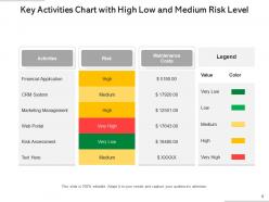
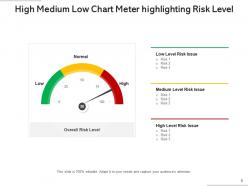
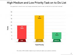
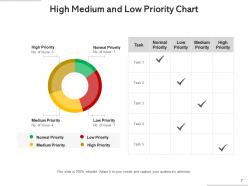

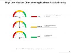
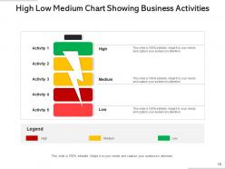
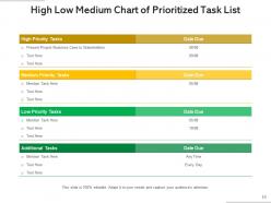

FAQs for High low medium chart project marketing management
The primary purpose of a High Low Medium Chart is to display value ranges and price movements over time, particularly for financial data like stock prices, commodities, and market indicators. These charts enable analysts, traders, and business professionals to identify trends, volatility patterns, and support resistance levels, ultimately delivering clearer market insights and more informed investment decisions.
High Low Medium Charts enhance understanding of fluctuating data trends by visualizing price ranges, volatility patterns, and trend boundaries within specific timeframes, making complex market movements immediately comprehensible. These charts enable analysts, traders, and business professionals to identify support levels, resistance points, and momentum shifts across sectors like finance, commodities, and retail, ultimately delivering clearer insights for strategic decision-making.
**INPUT**: What types of data are best suited for representation using High Low Medium Charts? **OUTPUT**: High Low Medium Charts excel at displaying financial data like stock prices, trading volumes, and currency fluctuations, along with performance metrics including sales ranges, temperature variations, and budget forecasts. These visualizations streamline complex data interpretation by clearly showing maximum, minimum, and median values, with many organizations finding that such charts enhance decision-making processes and deliver clearer insights for stakeholder presentations. **Word count: 59 words**
High Low Medium Charts excel at showing data ranges and volatility that traditional bar or line charts cannot capture, displaying minimum, maximum, and median values simultaneously within single time periods. While bar and line charts effectively show trends and comparisons, High Low Medium Charts deliver superior insights for financial analysis, performance tracking, and risk assessment, with many organizations finding that range visualization enhances decision-making accuracy.
Key elements for designing a High Low Medium Chart include clear data ranges, distinct color coding for each category, appropriate scaling, legend identification, and consistent categorization criteria. These visual components streamline decision-making by enabling quick pattern recognition, risk assessment, and priority identification, with many organizations finding that well-designed charts enhance strategic planning and operational efficiency.
High Low Medium Charts excel when displaying data ranges, comparisons across categories, or temporal variations where minimum, maximum, and median values matter more than proportional relationships. Unlike pie or donut charts that show parts of a whole, these charts enable stakeholders to analyze performance bands, risk assessments, and quality metrics across departments or time periods, ultimately delivering deeper analytical insights for strategic decision-making.
Colors and labels enhance High Low Medium Charts by creating visual hierarchies, ensuring accessibility through contrasting hues, and providing clear category identification that eliminates interpretation errors. Strategic color coding, such as red for high-risk areas and green for low-risk zones, combined with descriptive labels, enables stakeholders to quickly assess performance metrics and make data-driven decisions across departments.
**INPUT**: What software or tools are recommended for creating High Low Medium Charts? **OUTPUT**: Recommended software includes Microsoft Excel, Google Sheets, Tableau, Power BI, and specialized presentation platforms like SlideTeam. These tools streamline chart creation by offering customizable templates, automated data integration, and professional formatting options, with many organizations finding that dedicated business intelligence platforms ultimately deliver enhanced visual clarity and strategic presentation capabilities.
High Low Medium Charts integrate seamlessly into various presentation formats, including strategy frameworks, risk assessment matrices, project dashboards, and executive briefings. These versatile visualizations enhance decision-making presentations by providing clear priority rankings within SWOT analyses, balanced scorecards, and strategic planning documents, ultimately delivering more structured communication and faster consensus-building across organizational levels.
Common mistakes include using inconsistent data intervals, overcrowding with excessive data points, poor color choices that reduce readability, inadequate scaling that distorts trends, and missing contextual labels. These errors compromise chart effectiveness by creating confusion, misrepresenting data patterns, and hindering decision-making processes, with many organizations finding that standardized formatting and clear visual hierarchy ultimately deliver more accurate insights and better strategic outcomes.
Audience expectations significantly influence High Low Medium Chart design through clarity requirements, visual preferences, and decision-making contexts that vary across sectors. Financial professionals expect detailed price action with candlesticks, while executive audiences prefer simplified bar formats, and healthcare stakeholders require clear range indicators, ultimately delivering targeted insights that enhance comprehension and strategic decision-making effectiveness.
High Low Medium Charts provide critical insights for financial reporting by visualizing price volatility, trading ranges, and market trends across specific periods. These charts enable financial analysts to assess risk levels, identify support and resistance patterns, and communicate market performance to stakeholders, with investment firms and corporate finance teams finding that this visualization enhances decision-making accuracy and streamlines portfolio analysis processes.
Animated High Low Medium Charts enhance viewer engagement by creating dynamic visual storytelling, maintaining attention through progressive data reveals, and making complex comparisons more digestible. These animated elements help presenters guide audiences through key insights systematically, with financial analysts, sales teams, and project managers finding that movement and timing significantly improve comprehension and retention rates.
When interpreting High Low Medium Charts, consider data source reliability, time frame relevance, sample size adequacy, and potential outliers that might skew the ranges. These considerations ensure accurate analysis by validating data quality, establishing appropriate context, and accounting for seasonal variations or market conditions, with many analysts finding that cross-referencing multiple data points ultimately delivers more reliable insights and strategic decision-making.
High Low Medium Charts enable project managers to track performance metrics by visualizing data ranges, identifying trend patterns, and highlighting performance variance across timelines. Through these visual tools, project teams can monitor budget fluctuations, resource allocation efficiency, and milestone completion rates, while enabling stakeholders to quickly assess project health and make data-driven decisions that ultimately enhance operational efficiency.
-
Out of the box and creative design.
-
Great designs, Easily Editable.
-
Unique design & color.