


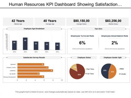
Human resources kpi dashboard showing satisfaction survey result age breakdown




Try Before you Buy Download Free Sample Product
 Impress Your
 Audience
 100%
100% Editable
 Save Hours
 of Time


Research shows that satisfied, motivated employees will create higher customer satisfaction and in turn positively influence organizational performance. Keeping this in mind our team of dedicated designers have created this human resources KPI dashboard showing satisfaction survey result age breakdown PowerPoint template. Our human resources KPI dashboard showing satisfaction survey result age breakdown Presentation slideshow helps you understand the needs and wants of your employee workforce. Employee feedback and ideas are an invaluable resource to help you understand the current dynamics of the workplace and also identify training requirements or learning activities. By incorporating our human resources KPI dashboard PPT graphic you can measure employee engagement with regular polls and spot potential issues early and take action. Human resources dashboards can also help organizations improve their hiring process as well as to make sure that valuable employees will remain within the organization. Download and use this human resources KPI dashboard PPT slide in your working presentation. Our Human Resources Kpi Dashboard Showing Satisfaction Survey Result Age Breakdown are jolly good. They are always an instant hit.
People who downloaded this PowerPoint presentation also viewed the following :
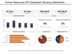
Human resources kpi dashboard showing satisfaction survey result age breakdown with all 6 slides:
Experience euphoria with our Human Resources Kpi Dashboard Showing Satisfaction Survey Result Age Breakdown. The happiness they generate is above all else.
FAQs for Human resources kpi dashboard showing satisfaction survey
Start with the basics: turnover rate, time-to-fill, and employee satisfaction scores. Absenteeism and training completion rates are solid too. Performance review completion is huge - seriously, nobody ever finishes those on time. Revenue per employee shows actual business impact, which executives love seeing. Honestly, I'd stick to maybe 6-8 metrics max at first. You can always add more later based on what your leadership team keeps bugging you about in meetings. Oh, and throw in some diversity tracking if that's on their radar.
Honestly, having all your workforce data in one spot is huge. Instead of guessing what's going on, you can actually see turnover patterns, engagement scores, hiring numbers - the whole picture. Makes budget meetings way less painful when you've got real numbers backing you up. Plus you catch problems early instead of dealing with disasters later. I'd start small though - pick your biggest 3-5 headaches and build around those specific metrics. Way better than drowning in data you don't need. The strategic stuff becomes so much clearer when you're not just shooting in the dark.
Honestly, real-time data is a game changer for HR dashboards. You're not just staring at last month's turnover anymore - you can actually catch problems while they're happening. Like if employee sentiment suddenly tanks or overtime spikes out of nowhere, you'll know right away. Think of it as taking your company's pulse daily instead of waiting for that annual checkup (which always feels too late anyway). The trick is setting up smart alerts for stuff that actually matters to your business. Otherwise you'll go crazy with notifications, but you still want to catch the important things before they blow up.
Okay so for engagement data, start with those gauge charts or progress bars - super easy to read at a glance. Trend lines are clutch for showing changes over time, like monthly or quarterly. Heat maps? Perfect for spotting which departments are struggling. Honestly though, don't get too fancy with it. Sometimes a basic bar chart comparing survey results across different areas (communication, growth opportunities, recognition stuff) works better than anything complicated. Oh and make sure you can dig deeper into the numbers because your leadership team will definitely want to know the "why" behind everything.
Don't cram everything onto one screen - that's the biggest mistake I see. Pick 5-7 metrics that actually matter for your business goals. Skip the vanity stuff like "total training hours" that sounds good but doesn't help anyone make decisions. Your data needs to be current too, because nothing's worse than showing last month's numbers in a meeting (been there). Honestly, most executives just want the highlights anyway. Test it with real users first - they'll tell you what's confusing. Keep it clean and simple.
So basically you gotta tailor your HR dashboard to whatever industry you're in. Healthcare needs compliance stuff and patient safety training tracked. Tech companies? They're all about retention and skill metrics. Manufacturing cares way more about safety incidents and overtime costs - makes sense when you think about it. Honestly, the best approach is figuring out what actually matters for your specific sector first. Talk to your department heads about what stresses them out most. Then just turn those headaches into numbers you can track on the dashboard. Way more useful than generic metrics that don't mean much.
Honestly, adding turnover rates to your HR dashboard is a game-changer. You'll spot which departments are hemorrhaging people before it gets ugly. CEOs love asking about retention out of nowhere, so having this ready beats scrambling through Excel hell every time. Break it down by department and how long people stayed - that's where the good stuff is. I've seen companies catch toxic managers just by watching these patterns. The cool part? Cross-reference it with engagement scores or how long it takes to fill roles. Seasonal trends pop up too, which is actually pretty interesting to track.
So predictive analytics is like turning your HR reports into a fortune teller - way cooler than just seeing who already quit. You can actually spot which employees might bail next quarter by looking at their engagement scores and how long they've been around. Plus it helps predict if new hires will actually work out (honestly, this part is pretty game-changing). Instead of scrambling when people leave, you're already planning ahead. My advice? Don't go crazy trying to predict everything right away. Pick one thing like turnover risk and nail that first.
Honestly, just go with bar charts and line graphs for the main stuff - turnover rates, time-to-hire trends, that kind of thing. Heat maps are solid for employee satisfaction by department (and they make you look fancy). Skip pie charts unless it's something super basic like headcount breakdown. Keep your colors consistent throughout, but go easy on red/green since some people can't distinguish them well. Add little text boxes calling out the key points - don't make them work to figure out what matters. Oh, and definitely test everything beforehand. Nothing worse than realizing your charts are unreadable from where the executives are sitting.
So basically you wanna compare what you spent vs what you actually got back. Look at performance scores before and after, promotion rates, retention - all that stuff. Honestly, the productivity jumps after solid training are pretty incredible to see. Don't forget completion rates and how people felt about it too. The magic happens when you connect those training costs to real business wins - more sales, fewer mistakes, new people getting up to speed faster. Oh and set up some automated reports so you're not scrambling when leadership asks for proof it's working.
Stick to 5-7 main metrics on your dashboard - anything more gets messy fast. Big, clear visuals for the must-haves like turnover and time-to-hire work best. Your execs shouldn't need a magnifying glass, you know? Then add drill-downs so people can dig deeper when they want departmental stuff or monthly trends. I swear, some dashboards look like someone just vomited data everywhere. Employee satisfaction scores are huge too - don't bury those. Think of it like a news site: headlines up front, full story when you click through.
Start with clean data - garbage in, garbage out is so real with dashboards. Pull consistently from your HRIS, payroll, and performance systems. Set up automated checks for duplicates, missing stuff, and weird outliers that don't add up. Each metric needs a designated owner who checks accuracy monthly and tracks any changes to how you calculate things. Users should be able to flag issues they catch too - honestly, they're usually first to spot when something's wonky. That feedback loop is clutch for keeping everything accurate.
First thing - get your leadership on board or you're dead in the water. Pick like 5-7 metrics that actually move the needle (turnover, time-to-hire, engagement scores). Don't track random stuff just because you can. Your data needs to be solid from day one - trust me, explaining wonky numbers gets old fast. Bring in the people who'll actually use this dashboard while you're building it. Otherwise they'll ignore it completely. Oh, and assign someone to keep it updated regularly. I've seen too many beautiful dashboards turn into expensive digital dust collectors because nobody owns them.
Honestly, pulling KPI data straight into performance reviews is a game changer. No more awkward guessing games about how you actually did. Productivity scores, goal completion rates, collaboration metrics - having real numbers makes everything so much clearer. Those "how was my quarter?" conversations get way less weird when data backs up everything you're saying. Use the dashboard trends to spot your wins and areas that need work. Then set actual targets for next time based on what the numbers tell you. Way better than just going off memory or whatever your manager happened to notice last week.
Honestly depends what you're working with budget-wise. If you've got money, BambooHR and Workday are solid - they come with dashboards built in. Power BI is my go-to though, especially if you're already on Microsoft stuff. Tableau's great too but pricier. Google Data Studio works if you want something free-ish. Oh, and don't sleep on Excel if you're just testing the waters - I know it sounds basic but it gets the job done. I'd start with whatever plays nice with your current HR system, then figure out what metrics actually matter before you go crazy with upgrades.
-
Great product with effective design. Helped a lot in our corporate presentations. Easy to edit and stunning visuals.
-
Excellent design and quick turnaround.