


Income Statement Financial Waterfall Chart




Try Before you Buy Download Free Sample Product
 Impress Your
 Audience
 100%
100% Editable
 Save Hours
 of Time


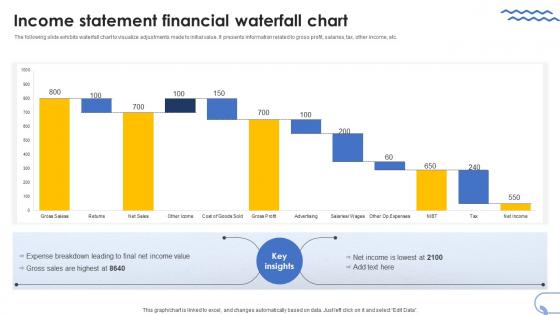
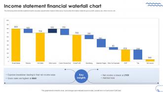
The following slide exhibits waterfall chart to visualize adjustments made to initial value. It presents information related to gross profit, salaries, tax, other income, etc.
People who downloaded this PowerPoint presentation also viewed the following :
Income Statement Financial Waterfall Chart with all 7 slides:
Use our Income Statement Financial Waterfall Chart to effectively help you save your valuable time. They are readymade to fit into any presentation structure.





FAQs for Income Statement
An income statement waterfall chart is a visual representation that breaks down revenue progression through various cost components, deductions, and line items to show how gross revenue transforms into net income step-by-step. This strategic visualization enhances financial analysis by enabling stakeholders to quickly identify profit leakage points, cost drivers, and performance trends, with many CFOs and financial analysts finding that waterfall charts streamline executive presentations and accelerate decision-making processes.
An income statement waterfall chart helps visualize how different revenue and expense components contribute to a company's net income changes over time, making it easier to identify which factors drive profitability improvements or declines. This visualization enables stakeholders to quickly pinpoint specific areas like cost reductions, revenue growth, or expense increases, ultimately delivering clearer financial insights and supporting more strategic decision-making across organizations.
Key components include revenue, cost of goods sold, operating expenses, interest expenses, taxes, and net income, with each element showing sequential impact on profitability. This visualization enables financial teams to track how revenue transforms into profit through various deductions, with many organizations finding that waterfall charts streamline financial presentations and enhance stakeholder understanding of earnings progression.
A waterfall chart differentiates these elements through visual flow and color coding, with revenue appearing as positive bars, expenses as negative bars that reduce totals, and net income as the final cumulative result. This visualization enables finance teams to track how revenue transforms into profit through operational costs, tax expenses, and other deductions, ultimately delivering clear transparency for stakeholder presentations and budget analysis.
Waterfall charts enhance financial transparency by visualizing incremental changes between revenue and net income, clearly showing each component's contribution or reduction to profitability. Unlike traditional formats, they streamline complex financial analysis for stakeholders, enabling faster identification of profit drivers and cost pressures, with many CFOs finding that these visual representations significantly improve board presentations and strategic decision-making processes.
Businesses can customize waterfall charts by adjusting categories to match their revenue streams, cost structures, and reporting segments, incorporating industry-specific metrics like subscription renewals or manufacturing overhead. Through flexible formatting, color coding, and hierarchical breakdowns, companies in sectors like retail, healthcare, and financial services can highlight key performance drivers, seasonal variations, and operational inefficiencies, ultimately delivering clearer financial storytelling.
Microsoft Excel and PowerPoint offer built-in waterfall chart functionality, while specialized tools like Tableau, Power BI, and Qlik Sense provide advanced customization options for financial analysis. These platforms streamline data visualization by automating calculations, enabling dynamic updates, and delivering professional presentations, with many finance teams finding that dedicated financial software like Adaptive Insights ultimately enhances accuracy and reporting efficiency.
Common mistakes include using inconsistent color schemes, overcrowding with excessive detail, misaligning baseline calculations, poor labeling of variance drivers, and ignoring logical flow sequence. These design flaws confuse stakeholders and undermine analytical value, with many finance teams finding that simplified layouts, consistent formatting, and clear variance explanations ultimately deliver better executive comprehension and faster decision-making processes.
An income statement waterfall chart identifies trends and anomalies by visualizing sequential changes between revenue, expenses, and net income across periods, making variances immediately visible through stepped flows. This approach enables financial analysts to quickly spot unusual spikes in operating costs, declining gross margins, or unexpected revenue fluctuations, with many organizations finding that these visual patterns accelerate decision-making and enhance strategic financial planning.
Stakeholders use waterfall charts to identify specific revenue drivers, pinpoint cost inefficiencies, track performance against budgets, and visualize the cumulative impact of business changes over time. These charts enable executives, investors, and managers to quickly assess which segments contribute most to profitability, streamline resource allocation decisions, and communicate financial narratives effectively during board meetings and strategic planning sessions.
An income statement waterfall chart facilitates communication by visually breaking down financial performance into digestible, sequential steps that clearly show how revenue transforms into net income through various expense categories. This visual approach enables non-financial stakeholders like board members, investors, and department heads to quickly grasp complex financial relationships, while the step-by-step format eliminates confusion around accounting terminology, ultimately delivering enhanced transparency and more informed strategic decision-making across organizations.
Colors and design elements are crucial for income statement waterfall charts, with distinct colors differentiating positive revenue flows from negative expenses, neutral connecting bridges, and final net income positions. Effective design uses consistent color coding, clear labeling, and appropriate scaling to enable stakeholders to quickly identify profit drivers, cost centers, and overall financial performance trends, ultimately enhancing decision-making speed and accuracy.
**INPUT**: Can an income statement waterfall chart be used for forecasting future financial performance? **OUTPUT**: Yes, income statement waterfall charts can effectively support financial forecasting by visualizing projected revenue changes, cost fluctuations, and profit drivers across future periods. While primarily analytical tools, these charts enable finance teams to model scenarios, track variance assumptions, and communicate forecast rationale to stakeholders, ultimately delivering enhanced strategic planning and more transparent financial projections for organizational decision-making. [Word count: 58]
Historical data can be incorporated into income statement waterfall charts through multi-period comparisons, variance analysis overlays, trending arrows, and baseline reference lines that show year-over-year or quarter-over-quarter changes. These visual elements enable finance teams to identify patterns, benchmark performance against previous periods, and communicate financial trajectories more effectively, with many organizations finding that historical context enhances stakeholder understanding and strategic decision-making.
Best practices for presenting an income statement waterfall chart include using clear labels, consistent color coding for positive and negative changes, logical flow from revenue to net income, and highlighting key variance drivers. These visual elements streamline financial storytelling by emphasizing critical performance factors, enabling stakeholders to quickly identify profit impact areas, and ultimately delivering enhanced comprehension of financial results across business presentations.
-
Extremely professional slides with attractive designs. I especially appreciate how easily they can be modified and come in different colors, shapes, and sizes!
-
Requested a complete pitch deck. Delivered immediately and with high quality well researched content.