


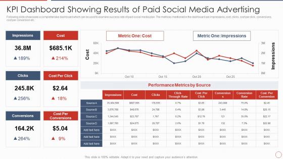
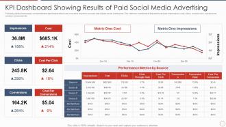
KPI Dashboard Showing Results Of Paid Social Media Advertising




Try Before you Buy Download Free Sample Product
 Impress Your
 Audience
 100%
100% Editable
 Save Hours
 of Time


Following slide showcases a comprehensive dashboard which can be used to examine success rate of paid social media plan. The metrices mentioned in the dashboard are impressions, cost, clicks, cost per click, conversions, cost per conversion etc.
People who downloaded this PowerPoint presentation also viewed the following :
KPI Dashboard Showing Results Of Paid Social Media Advertising with all 7 slides:
Use our KPI Dashboard Showing Results Of Paid Social Media Advertising to effectively help you save your valuable time. They are readymade to fit into any presentation structure.





FAQs for KPI Dashboard Showing Results Of Paid
Start with your top 3 business priorities - that's your foundation. Pick 5-7 KPIs max that actually tie to those goals. More than that? Total information overload. You'll want real-time data (or close to it) with clean visuals - charts, gauges, whatever makes sense. I'm a big fan of including target benchmarks so everyone knows if they're crushing it or not. Group related stuff together on the dashboard so it's not all random. Oh, and add some context around timeframes - people need that reference point. Keep the layout super clean though, nobody has time to hunt for data.
First thing - figure out what "winning" actually means for your situation. Then work backwards from there. Like if you want customers to stick around, track churn rate and NPS instead of just staring at revenue numbers all day (though obviously revenue still matters). Pick metrics that predict what's coming, not just tell you what already went down. Each KPI should connect to an actual business goal - sounds basic but people mess this up constantly. Start with maybe 3-5 things your team can realistically move through their day-to-day work. Review them regularly because what matters today might be totally irrelevant in six months.
Tableau and Power BI are probably your best bet - they look amazing but yeah, there's definitely a learning curve there. Looker Studio is free and way easier if you don't need all the bells and whistles. Honestly, I've seen some pretty slick Excel dashboards lately too, though they're not as interactive. Grafana works well for web stuff, or you could go custom with D3.js if you're feeling ambitious. Oh, and definitely check what connects to your current data sources first - no point picking something that'll fight with your setup. That's been my mistake before.
Start with your most important KPIs and work backwards. Get everyone pulling from the same data sources - those random spreadsheets people love are usually trouble. Set up some basic validation rules to catch stupid stuff like negative revenue or blank customer fields. You'll want to spot-check your numbers against the original systems monthly, which honestly is kind of tedious but totally worth it. Document what each metric actually means so your team isn't arguing about definitions later. Once you nail down the critical stuff, you can always add more validation rules.
So the main ones every dashboard needs are lead gen metrics, conversion rates, CAC, and ROAS. Website traffic and email stats (open rates, clicks) are pretty standard too. Social engagement matters, but follower count? Meh, kind of overrated these days. Don't forget CLV and your MQLs - those actually tell you something useful. Oh, and here's the thing that trips everyone up: pick like 5-7 metrics max that connect to revenue. Trust me, cramming everything in just makes you crazy and you won't focus on what's moving the needle.
Honestly, start by figuring out what actually needs real-time updates - most stuff doesn't. Set up API connections to feed your source systems into whatever dashboard tool you're using (Tableau, Power BI, whatever). Focus on metrics where split-second changes matter, like sales conversions or if your site's crashing. The rest can refresh hourly or daily, no big deal. I'd tackle your most critical ones first since getting the basics right takes longer than you think. Then just expand once everything's running smooth. Most platforms handle automated refresh intervals pretty well these days.
Honestly, UX makes or breaks a dashboard. I've watched people stare blankly at beautifully designed ones because they couldn't figure out what mattered most. Your visual hierarchy needs to guide people's eyes to the key metrics first. Navigation should feel obvious - no hunting around for basic functions. Colors stay consistent throughout, and for the love of all that's holy, test it with real users before launch. Clutter kills comprehension fast. The whole point is answering questions in seconds, not making people work harder to find insights.
Add time-series charts to track your KPIs - weekly, monthly, and quarterly views work great. Throw in some trend lines or percentage change indicators. Those little arrow icons are clutch for seeing direction instantly (honestly, way better than staring at numbers). Moving averages help smooth out weird data spikes too. Year-over-year comparisons are solid for context. The goal is spotting trends without digging through spreadsheets. Oh, and set up alerts when things hit certain thresholds - catches problems before they get messy.
Tell a story with your data instead of just showing numbers. Seriously, nothing kills a room faster than dropping a massive spreadsheet on executives. Start with what it actually means for the business - that's your hook. Simple charts work way better than complex ones, and ditch any technical jargon. I always use the traffic light system (red/yellow/green) because everyone gets it instantly. Keep dashboards clean with lots of white space, and have a one-sentence takeaway ready for each metric. Oh, and practice explaining everything in normal English first - you'll thank me later.
Honestly, mobile optimization is a game changer for KPI dashboards. You can check your metrics anywhere - during meetings, on the train, whatever. The key stuff? Making sure charts actually look decent on small screens and don't take forever to load on crappy cell service. Touch controls need to work smoothly too, obviously. Your team won't be stuck at their desks waiting to see if something's going wrong. I'd start by just pulling up your dashboard on your phone right now - you'll probably spot issues immediately. Quick reactions matter way more than perfect formatting anyway.
Look at what your leadership team checks every single day - that stuff goes top left where people look first. Group similar metrics together and honestly, don't overthink the fancy visual tricks. I'd stick to maybe 5-7 key numbers max because nobody wants to stare at a wall of data. Put your secondary metrics on separate pages they can click into. The real test? Watch how people actually use it. If they're squinting or scrolling past important stuff, you've got your answer right there. Sometimes the metrics you think matter most aren't what people need to make decisions.
Honestly, it comes down to how fast your metrics actually change. Daily sales or web traffic? Yeah, check those weekly or even daily. But customer lifetime value? Monthly is plenty - that stuff moves like molasses. I've watched teams kill themselves doing daily reports on metrics that barely budge. Such a time suck. Match your reporting to when you'll actually DO something with the data. If your team meets monthly to review performance, why stress over daily updates? Start with whatever matches your decision rhythm, then tweak it. You'll know pretty quick if you're missing problems or getting buried in useless reports.
Don't cram everything onto one screen - that's the biggest mistake I see. Pick 5-7 metrics that actually matter for decisions, not just impressive-looking numbers like "total users." Active users or conversion rates? Way more useful. Also make sure your data's clean first because bad data = useless dashboard, obviously. Keep your time periods consistent too. I'd honestly rather see a simple dashboard that tells one clear story than some cluttered mess with 20 different charts. You can always add more later once people actually start using what you've built.
Honestly, visibility is everything - put up dashboards so people can actually see their numbers in real time. Pick metrics they can actually control though, because measuring someone on random stuff they can't influence is just cruel. When people hit their targets, celebrate it! Regular check-ins help too. The trick is connecting those KPIs to something that actually matters, not just made-up goals from corporate. People work harder when they get how their daily grind ties into the bigger picture. Oh, and make sure the dashboards are actually easy to read - I've seen some absolute disasters that nobody wanted to look at.
Templates are honestly a lifesaver - you'll get proven layouts and working visualizations right out of the gate. Days to launch instead of weeks building everything yourself. Best practices are already built in too, so you won't end up with those nightmare dashboards that cram like 50 metrics everywhere (seriously, we've all seen those). Sure, custom builds give you more control, but most teams don't actually need that complexity at first. My take? Start with a template, watch how your people use it, then tweak what needs tweaking later.
-
Attractive design and informative presentation.
-
Unique and attractive product design.