


KPI Dashboard To Evaluate The New Retail Store Opening Retail Outlet To Cater New Target Audience




Try Before you Buy Download Free Sample Product
 Impress Your
 Audience
 100%
100% Editable
 Save Hours
 of Time


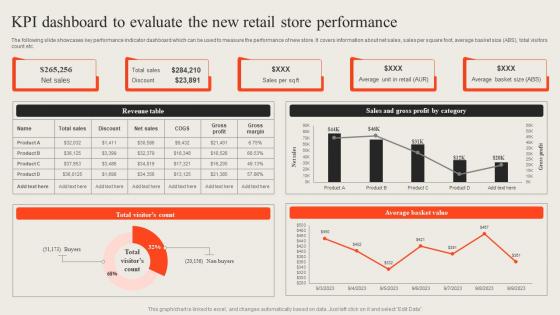
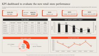
The following slide showcases key performance indicator dashboard which can be used to measure the performance of new store. It covers information about net sales, sales per square foot, average basket size ABS, total visitors count etc.
People who downloaded this PowerPoint presentation also viewed the following :
KPI Dashboard To Evaluate The New Retail Store Opening Retail Outlet To Cater New Target Audience with all 7 slides:
Use our KPI Dashboard To Evaluate The New Retail Store Opening Retail Outlet To Cater New Target Audience to effectively help you save your valuable time. They are readymade to fit into any presentation structure.





FAQs for KPI Dashboard To Evaluate The New Retail Store Opening Retail Outlet To Cater
Effective KPI dashboard components include clear visual metrics, real-time data feeds, customizable layouts, drill-down capabilities, and automated alerts. These elements work together by providing instant visibility into performance trends, enabling quick decision-making through interactive features, and delivering actionable insights, with many organizations finding that streamlined dashboards significantly enhance operational efficiency and strategic responsiveness.
Organizations determine relevant KPIs by aligning metrics with strategic goals, analyzing historical performance data, and consulting stakeholders across departments to identify critical success factors. Through careful assessment of business objectives, many companies find that combining leading indicators with lagging metrics, while regularly reviewing performance against targets, ultimately delivers clearer insights and enhanced decision-making capabilities.
Design elements that enhance KPI dashboard readability include clear visual hierarchy, consistent color coding, appropriate white space, intuitive navigation, and strategic use of charts and graphs. These elements work together by reducing cognitive load, enabling quick data interpretation, and facilitating faster decision-making, with many organizations finding that well-designed dashboards significantly improve operational efficiency and strategic responsiveness.
KPI dashboards should be updated based on business needs and data criticality, ranging from real-time for operational metrics to daily or weekly for strategic KPIs. Financial services often use real-time updates for fraud detection and trading, while manufacturing companies update quality metrics hourly, ultimately delivering faster decision-making and enhanced operational responsiveness.
Popular KPI dashboard tools include Tableau, Power BI, Google Data Studio, Qlik Sense, and Looker, alongside comprehensive platforms like Salesforce Analytics and Microsoft Excel. These solutions streamline data visualization by automating reporting processes, integrating multiple data sources, and enabling real-time monitoring, with many organizations finding that cloud-based dashboards deliver enhanced accessibility and collaborative decision-making capabilities.
KPI dashboards drive decision-making by providing real-time visibility into performance metrics, identifying trends and bottlenecks, and enabling data-driven strategic choices across departments. These visualization tools streamline organizational alignment by centralizing critical information, facilitating faster response times to market changes, and ultimately delivering improved operational efficiency and competitive advantage through informed leadership decisions.
Stakeholder buy-in for KPI dashboards requires involving key users in dashboard design, demonstrating clear ROI through pilot programs, and providing comprehensive training on dashboard functionality. These strategies work by aligning dashboard metrics with stakeholder priorities, showcasing tangible benefits like faster decision-making and improved performance visibility, ultimately delivering organizational alignment and data-driven culture adoption.
Industries tailor KPI dashboards by incorporating sector-specific metrics, regulatory requirements, and operational priorities unique to their market environments. Healthcare organizations focus on patient outcomes and compliance tracking, while retail companies emphasize inventory turnover and customer acquisition costs, and manufacturing firms prioritize production efficiency and quality control, ultimately delivering targeted insights that enhance competitive advantage.
Common KPI dashboard pitfalls include overcrowding with too many metrics, using misleading visualizations, lacking real-time data integration, poor color scheme choices, and missing stakeholder alignment on objectives. These design flaws can overwhelm users and reduce decision-making effectiveness, with many organizations finding that streamlined dashboards focusing on 5-7 critical metrics ultimately deliver clearer insights and faster strategic responses.
Visualization techniques enhance KPI data clarity by transforming complex metrics into intuitive charts, graphs, and interactive displays that enable quick pattern recognition and trend identification. Through color coding, real-time dashboards, and comparative visualizations, organizations streamline decision-making processes, reduce interpretation time, and ultimately deliver more informed strategic responses, with many executives finding that visual KPI presentations significantly accelerate performance discussions.
Automation streamlines KPI dashboard maintenance by automatically updating data feeds, refreshing metrics, and generating scheduled reports without manual intervention. Through automated data integration and real-time synchronization, organizations reduce administrative overhead, minimize human errors, and ensure stakeholders consistently access current performance insights, ultimately delivering enhanced operational efficiency and faster decision-making capabilities.
Organizations integrate qualitative metrics through sentiment scoring, color-coded status indicators, text analytics summaries, and visual progress bars that translate subjective data into measurable formats. These approaches enable comprehensive performance tracking by combining customer satisfaction scores, employee engagement ratings, and stakeholder feedback with traditional financial metrics, ultimately delivering more holistic business intelligence and strategic insights.
Mobile accessibility significantly enhances KPI dashboard effectiveness by enabling real-time decision-making, increasing user adoption, and providing anytime-anywhere data access. With mobile-optimized dashboards, executives and managers can monitor critical metrics during travel, respond quickly to performance alerts, and maintain operational oversight outside traditional office settings, ultimately delivering faster response times and improved business agility.
KPI dashboards foster workplace accountability by making individual and team performance visible, establishing clear metrics for success, and creating transparent tracking of progress toward goals. Through real-time data visibility, employees can monitor their contributions directly, managers can provide timely feedback based on objective measures, and teams develop ownership of outcomes, ultimately driving a performance-oriented culture where results speak louder than assumptions.
Training methods for KPI dashboard interpretation include hands-on workshops, role-specific tutorials, interactive simulations, peer mentoring programs, and regular data literacy sessions. These approaches enhance employee understanding by combining theoretical knowledge with practical application, enabling teams across departments like sales, operations, and finance to make data-driven decisions confidently, ultimately improving organizational performance and strategic alignment.
-
I am so thankful for all of the templates I've found on your site. They have saved me hours every week and helped make my presentations come alive. Keep up with these amazing product releases!
-
I faced no difficulty while searching for the slide I wanted. Honestly, the website’s interface is easy to use and can be navigated easily!