


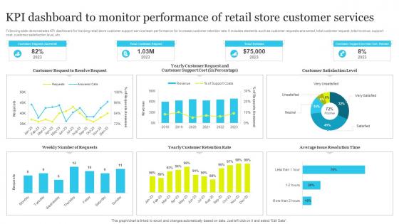
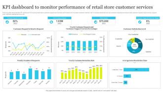
KPI Dashboard To Monitor Performance Of Retail Store Customer Services




Try Before you Buy Download Free Sample Product
 Impress Your
 Audience
 100%
100% Editable
 Save Hours
 of Time


This slide provide insight about various customer service strategies which can be used by business to build competitive edge against competitors. It includes strategies provide easy access to product information, display request status, collect customer information.
People who downloaded this PowerPoint presentation also viewed the following :
KPI Dashboard To Monitor Performance Of Retail Store Customer Services with all 7 slides:
Use our KPI Dashboard To Monitor Performance Of Retail Store Customer Services to effectively help you save your valuable time. They are readymade to fit into any presentation structure.





FAQs for KPI Dashboard To Monitor Performance Of Retail
Effective KPI dashboard components include clear visual indicators, real-time data integration, customizable metrics alignment, intuitive navigation interfaces, and automated alert systems. These elements streamline performance monitoring by enabling quick trend identification, facilitating data-driven decision making, and enhancing operational transparency, with many organizations finding that well-designed dashboards ultimately deliver faster response times and improved strategic outcomes.
Organizations ensure KPI dashboard alignment by establishing clear strategic objectives first, selecting metrics that directly measure progress toward those goals, and involving key stakeholders in the selection process. Through regular review cycles and dashboard refinements, companies like retail chains and financial services firms maintain relevance, with many finding that quarterly alignment assessments ultimately deliver improved decision-making and strategic focus.
Common KPI dashboard pitfalls include displaying too many metrics, using unclear visualizations, lacking stakeholder input, ignoring mobile optimization, and failing to align with business objectives. These design mistakes can overwhelm users and reduce decision-making effectiveness, with many organizations finding that streamlined, purpose-driven dashboards ultimately deliver better insights and faster strategic responses.
Choosing the right KPIs involves aligning metrics with strategic business objectives, stakeholder needs, and actionable insights that drive decision-making. Start by identifying your primary goals, whether revenue growth, operational efficiency, or customer satisfaction, then select measurable indicators that directly reflect progress toward these outcomes, ensuring each KPI provides clear, actionable data that enables timely interventions and strategic adjustments.
Data visualization transforms KPI dashboards by converting complex datasets into intuitive charts, graphs, heat maps, and real-time indicators that enable instant pattern recognition and trend analysis. Through strategic visual design, organizations streamline decision-making processes, enhance stakeholder comprehension, and accelerate response times to performance variations, ultimately delivering improved operational efficiency and competitive advantage.
Real-time data integration enhances KPI dashboard functionality by delivering immediate insights, eliminating data delays, and enabling instant decision-making capabilities. Through automated data feeds, organizations streamline performance monitoring, reduce manual reporting errors, and accelerate response times to critical metrics, with many businesses finding that real-time visibility ultimately drives faster strategic adjustments and competitive advantage.
KPI dashboard maintenance best practices include establishing regular update schedules, implementing automated data feeds, conducting monthly performance reviews, ensuring data accuracy validation, and maintaining user access controls. These practices streamline operations by minimizing manual errors, enhancing real-time decision-making capabilities, and delivering consistent insights across organizations, with many companies finding that systematic maintenance approaches ultimately improve strategic visibility and competitive advantage.
KPI dashboards can be tailored by customizing metrics, visualization styles, access levels, and reporting frequencies to match each stakeholder's specific responsibilities and decision-making needs. Executives typically require high-level strategic metrics with trend analysis, while department managers need operational KPIs with drill-down capabilities, and frontline staff benefit from real-time performance indicators, ultimately enabling data-driven decisions across organizational levels.
Recommended KPI dashboard platforms include Tableau, Power BI, Google Data Studio, Qlik Sense, and Looker, each offering drag-and-drop functionality, real-time data integration, and customizable visualization options. These tools streamline dashboard creation by automating data connections, providing pre-built templates, and enabling collaborative sharing, with many organizations finding that cloud-based solutions deliver faster deployment and enhanced accessibility.
KPI dashboards drive decision-making by providing real-time visibility into key metrics, identifying performance trends, and highlighting areas requiring immediate attention or strategic adjustment. Through interactive visualizations and automated alerts, organizations streamline data analysis, accelerate response times, and enhance accountability across teams, with many companies finding that centralized performance monitoring ultimately delivers faster problem resolution and improved operational efficiency.
Operational KPI dashboards focus on daily activities, real-time metrics, and immediate performance indicators like production rates, customer service response times, and inventory levels. Strategic KPI dashboards emphasize long-term objectives, quarterly trends, and high-level outcomes such as market share, revenue growth, and customer satisfaction, with many organizations finding that combining both approaches delivers comprehensive visibility and enables data-driven decision-making.
Effectively training team members on KPI dashboards involves establishing clear data literacy foundations, conducting hands-on workshops with real scenarios, and creating role-specific interpretation guides that connect metrics to daily responsibilities. Through interactive training sessions, organizations enable faster decision-making, improved performance tracking, and enhanced strategic alignment, with many teams finding that regular practice sessions and mentorship programs ultimately deliver greater analytical confidence and measurable business outcomes.
Sales KPI dashboards should include revenue metrics, conversion rates, pipeline velocity, average deal size, lead generation numbers, and customer acquisition costs. These metrics enable sales managers to track performance across the entire sales funnel, identify bottlenecks in prospect conversion, and optimize resource allocation, with many organizations finding that comprehensive dashboards ultimately deliver improved forecasting accuracy and enhanced team productivity.
KPI dashboards streamline project management by providing real-time visibility into budget utilization, timeline adherence, resource allocation, and milestone completion. These centralized platforms enable project managers to identify bottlenecks early, optimize team productivity, and maintain stakeholder alignment, with many organizations finding that dashboard-driven insights reduce project delays and enhance delivery predictability across multiple concurrent initiatives.
**INPUT**: What are the advantages of using a template for creating a KPI dashboard over building one from scratch? **OUTPUT**: KPI dashboard templates offer accelerated development, proven design frameworks, cost efficiency, standardized layouts, and reduced technical complexity compared to custom builds. These pre-built solutions streamline implementation by incorporating industry best practices, established visualization patterns, and tested functionality, with many organizations finding that templates deliver professional dashboards faster while minimizing resource investment and development risks. [Word count: 56 words]
-
They helped us design the pamphlets for our church’s food drive! The people loved the design, and I’m happy to say it was successful. Thank you, SlideTeam!
-
SlideTeam is the way to go when you are in a time crunch. Their templates have saved me many times in the past three months.