


KPI Metrics Dashboard To Measure Sales Performance Of SAAS Company




Try Before you Buy Download Free Sample Product
 Impress Your
 Audience
 100%
100% Editable
 Save Hours
 of Time


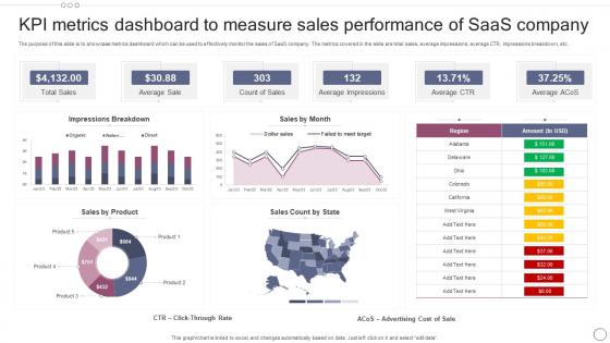
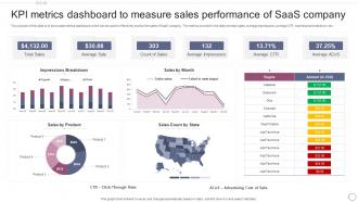
The purpose of this slide is to showcase metrics dashboard which can be used to effectively monitor the sales of SaaS company. The metrics covered in the slide are total sales, average impressions, average CTR, impressions breakdown, etc.
People who downloaded this PowerPoint presentation also viewed the following :
KPI Metrics Dashboard To Measure Sales Performance Of SAAS Company with all 7 slides:
Use our KPI Metrics Dashboard To Measure Sales Performance Of SAAS Company to effectively help you save your valuable time. They are readymade to fit into any presentation structure.





FAQs for KPI Metrics Dashboard To Measure Sales Performance
Key performance indicators vary by industry but commonly include revenue growth, customer acquisition cost, operational efficiency, profit margins, and customer satisfaction scores. Effective dashboard visualization requires strategic placement of metrics using charts, graphs, and heat maps that enable quick decision-making, with many organizations finding that industry-specific KPIs combined with real-time data visualization ultimately delivers enhanced operational transparency and competitive advantage.
**INPUT**: How do I determine the right balance of KPIs to include in my dashboard without overwhelming the viewer? **OUTPUT**: Effective KPI dashboard balance involves focusing on 5-7 core metrics aligned with specific business objectives, grouping related indicators by function or department, and prioritizing actionable insights over comprehensive data display. Strategic dashboard design emphasizes visual hierarchy through color coding and sizing, with many organizations finding that role-based customization and quarterly metric reviews maintain relevance while preventing information overload. *[Word count: 58 words]*
Leading KPI dashboard platforms include Tableau, Power BI, Looker, Qlik Sense, and Grafana, each offering real-time data visualization and interactive analytics capabilities. These tools streamline performance monitoring by integrating multiple data sources, automating report generation, and delivering customizable visualizations, with many organizations finding that cloud-based solutions like Power BI and Tableau enhance collaboration while reducing IT overhead costs.
Tailoring KPI dashboards involves creating role-specific views that highlight relevant metrics, customizable filters, and appropriate visualization formats for each stakeholder group. Management teams typically require high-level strategic overviews with trend analysis, sales teams need pipeline metrics and conversion rates, while finance teams focus on revenue tracking and cost analysis, with many organizations finding that personalized dashboard interfaces ultimately enhance decision-making speed and strategic alignment.
Real-time data transforms KPI dashboards from static reporting tools into dynamic decision-making platforms by providing immediate visibility into performance fluctuations, enabling faster response to market changes, and delivering continuous monitoring capabilities. This immediacy allows organizations across sectors like retail, manufacturing, and financial services to identify trends instantly, address operational issues proactively, and optimize resource allocation, ultimately enhancing competitive advantage through data-driven agility.
Ensuring data accuracy requires implementing automated validation rules, establishing single source systems, conducting regular audits, setting up real-time monitoring alerts, and creating standardized data collection protocols. These practices streamline data governance by minimizing human error, detecting anomalies quickly, and maintaining consistent formatting, with many organizations finding that automated validation coupled with regular review cycles ultimately delivers reliable insights and enhanced decision-making confidence.
**INPUT**: What visual elements (charts, graphs, gauges) are most effective for representing different types of KPIs? **OUTPUT**: Effective KPI visualizations include line charts for trends, bar charts for comparisons, gauges for performance targets, pie charts for composition data, and heat maps for multi-dimensional analysis. These visual elements enhance decision-making by enabling quick pattern recognition, highlighting variance from targets, and facilitating stakeholder comprehension, with many organizations finding that strategic dashboard design ultimately delivers faster insights and improved operational efficiency.
KPI dashboards should be updated based on business velocity and metric sensitivity, with real-time updates for operational KPIs, daily updates for sales metrics, and weekly or monthly refreshes for strategic indicators. This approach ensures stakeholders access current insights while avoiding information overload, with many organizations finding that automated, tiered update schedules enhance decision-making speed and maintain dashboard credibility across departments.
Common pitfalls include overcrowding with excessive metrics, using misleading visualizations, lacking real-time data updates, poor color choices, and ignoring user accessibility needs. These design flaws can overwhelm decision-makers and reduce dashboard effectiveness, with many organizations finding that streamlined, user-focused dashboards deliver clearer insights and faster strategic responses.
User feedback improves KPI dashboard design by identifying confusing metrics, highlighting missing data visualizations, revealing navigation pain points, and exposing performance bottlenecks that impact daily workflows. Through iterative feedback collection, organizations streamline dashboard layouts, enhance data accuracy, and optimize user interfaces, with many companies finding that regular user input reduces reporting time and increases executive adoption rates.
**INPUT**: What performance trends should be highlighted to support strategic decision-making within my dashboard? **OUTPUT**: Strategic dashboards should highlight revenue growth patterns, operational efficiency trends, customer acquisition and retention rates, market share evolution, and cost optimization trajectories. These performance indicators enable executives to identify emerging opportunities, anticipate market shifts, and allocate resources strategically, with many organizations finding that trend visualization accelerates decision-making cycles and enhances competitive positioning. [Word count: 54 words]
Categorize KPIs by organizing leading indicators (predictive metrics like sales pipeline, customer acquisition rates, employee engagement scores) separately from lagging indicators (outcome metrics like revenue, customer satisfaction, market share). This strategic separation enables organizations to monitor both future performance drivers and current results simultaneously, with many businesses finding that visual distinction through color coding or dashboard sections enhances decision-making speed and strategic responsiveness.
Best practices for sharing KPI dashboards across departments include role-based access controls, data encryption, user authentication protocols, audit trails, and departmental data segmentation. These security measures enable organizations to streamline cross-functional collaboration while protecting sensitive information, with many enterprises finding that strategic dashboard sharing enhances operational transparency and decision-making efficiency across teams.
Mobile compatibility enhances KPI dashboard accessibility by enabling real-time monitoring from anywhere, supporting responsive design across devices, and providing touch-optimized navigation for seamless interaction. This mobility empowers executives and managers to make data-driven decisions instantly, whether in meetings or traveling, ultimately delivering faster response times and improved operational agility.
Organizations implementing KPI dashboards report significant operational improvements, with retail chains reducing inventory costs by 15-20%, healthcare systems decreasing patient wait times by 30%, and manufacturing companies improving production efficiency by 25%. These success stories demonstrate how real-time visibility enables faster decision-making, streamlined operations, and enhanced performance tracking, ultimately delivering competitive advantages across diverse industries.
-
Their designing team is so expert in making tailored templates. They craft the exact thing I have in my mind…..really happy.
-
Use of different colors is good. It's simple and attractive.