


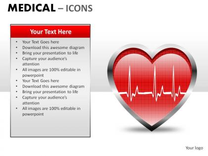
Medical icons powerpoint presentation slides




Try Before you Buy Download Free Sample Product
 Impress Your
 Audience
 100%
100% Editable
 Save Hours
 of Time


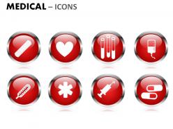
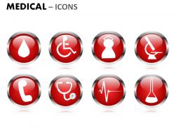
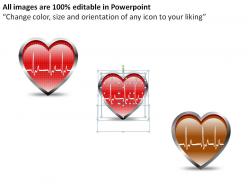
Our Medical Icons Powerpoint Presentation Slides will help in your delivery. Carry your ideas into each and every mind.
People who downloaded this PowerPoint presentation also viewed the following :
Medical icons powerpoint presentation slides with all 10 slides:
Invoke divinity with our Medical Icons Powerpoint Presentation Slides. Recieve the blessings of the powers that be.
FAQs for Medical icons
Keep it simple - bold, clean lines that won't turn into mush when tiny. I'd stick with symbols people already know, like crosses or hearts. Seriously, some medical icons look ridiculous at small sizes because designers went overboard with details. Make sure there's good contrast since these pop up on all kinds of backgrounds. Consistent line thickness helps too. Here's what works for me: sketch it at the smallest size first. If you can't tell what it is at 16px, you're already screwed. Universal recognition beats creativity every time with this stuff.
So color choices really matter for medical stuff - people already have these mental shortcuts built in. Red means danger or urgent, green is good/safe, blue feels professional but maybe a little cold? Yellow's perfect for warnings. Here's the thing though - you gotta stick with what people expect. Don't get creative and use red for something positive because you'll just confuse everyone and slow them down. I mean, we're talking medical info here. Keep it conventional and users will get it instantly.
Don't just grab any medical icon thinking it'll work - I've seen people use stethoscopes for "patient data" and it makes zero sense. Simple icons beat fancy detailed ones every time, especially if people are sitting far back. Oh, and here's something most people don't think about: not everyone reads medical symbols the same way depending on their background. Test your slides with someone first (seriously, just ask a coworker). Always add text labels too. Trust me on this one - I've sat through way too many confusing presentations where nobody knew what the icons meant.
Think of medical icons as visual shortcuts - they communicate complex stuff instantly. A heart symbol screams "cardiology" to everyone, right? They're amazing for breaking language barriers and helping patients who struggle with medical jargon actually understand what's happening. Your documentation becomes way more scannable too. Honestly, they're lifesavers for medication instructions and emergency situations where people need to recognize things fast. Start using standardized medical icons in patient materials - I bet you'll notice comprehension rates jump pretty quickly. It's one of those simple changes that actually makes a difference.
Oh man, this is such a minefield! Red might scream "danger" here but in China it's lucky. And don't even get me started on religious stuff - some cultures get really sensitive about body imagery. You know how we'd use a mortar and pestle for pharmacy icons? Totally meaningless in tons of places. Even medical crosses aren't universal. The pill bottle thing works great in the US but means nothing elsewhere. Honestly, you've got to test everything with actual people from those regions first. I learned this the hard way on a project last year.
Honestly, you can't go wrong with the red cross or a simple plus sign - they're recognized everywhere. Heart symbols work great too since everyone connects hearts with health and life. I'd avoid the caduceus though, that's more of an American thing and might confuse people in other countries. These symbols are genius because they don't rely on language at all. Just basic visual stuff that makes sense to anyone. Plus they've been used consistently for decades now. Stick with the red cross for emergency situations and hearts for general health content. Simple but effective.
Dude, medical icons are getting a total makeover right now. They're way more interactive and actually adapt to different screens - think smartwatches vs those huge hospital monitors. Accessibility is finally catching up too (took long enough), so now they support voice commands and haptic stuff. The real pain is keeping up with all the new medical tech that needs icons. Plus context matters more - symbols change based on what the user's doing. Short answer? Go through your icon library and see what's outdated. Modern healthcare moves fast and your visuals need to keep up.
Honestly, consistency is everything with medical icons - don't mix cartoon hearts with realistic stethoscopes because it looks so amateur. I learned this the hard way when my icons looked pixelated during a big presentation, so definitely use high-res ones. You'll want to stick with one icon library if you can. Think about who you're presenting to though - patients might get confused by super technical symbols that doctors would totally understand. Use icons to highlight important points instead of just throwing them everywhere. Oh, and make a master template with your go-to icons. It'll save you tons of time later.
Oh totally! Each medical specialty has its own thing going on with icons. Nursing uses a lot of caring symbols - stethoscopes, hearts, gentle hands. Pharmacy's obsessed with pill bottles and that mortar/pestle combo (honestly, when's the last time anyone actually used one of those?). Emergency medicine goes all-out with urgency vibes. Ambulances, red crosses, defibrillators, lightning bolts - anything screaming "we're fast." It's pretty smart actually. Patients can spot exactly what they need right away. When you're designing healthcare stuff, just check what symbols people in that field expect to see.
Honestly, I'd go with Adobe Illustrator for medical icons - it's still the best for those super clean, precise lines you need. Figma's solid too, especially if you're working with a team since everything's cloud-based. Sketch used to be huge but feels kinda outdated now? Both are vector-based so your icons won't get pixelated when you resize them. Just remember to keep things high contrast and test how they look tiny on mobile screens. Medical stuff needs to be readable above all else, you know?
Focus on high contrast - at least 3:1 ratio between icon and background. I've seen so many terrible gray-on-white medical symbols that are basically invisible. Simple shapes work best since detailed stuff gets muddy when you scale down. Always add text labels too - visual symbols mean different things to different people. Oh, and definitely test with screen readers and think about colorblind users. The big thing though? Run everything past actual healthcare workers first. They'll spot problems you totally missed and save you headaches later. Trust me on that one.
Honestly, you've gotta get doctors and nurses involved from day one. They'll roast your "prescription" icon if it looks like a grocery list - trust me on this. Survey them about what's already driving them crazy with current medical icons. Cultural stuff matters too, since symbols mean different things globally. Test early and often with actual medical staff because what makes sense to designers rarely translates to real clinical situations. Their mental models are totally different from ours. Short version: let healthcare workers tell you what sucks before you launch anything.
You'll mostly see anatomy stuff (hearts, brains, lungs), medical equipment like stethoscopes and pills, people icons, and basic symbols - crosses, DNA strands, that kind of thing. They're honestly way better than trying to write out complicated medical terms everywhere. Like, a little pill icon beats "pharmaceutical interventions" any day, right? Hospitals use them for wayfinding, apps use them for services. Makes sense since they work across languages too. When you're designing, just pick whatever your actual users will get immediately - not what sounds impressive to doctors. Sometimes the simplest option wins.
Honestly, medical icons blow regular text out of the water because they're built for healthcare stuff specifically. You see a heart symbol and instantly know what it means - way faster than reading "cardiovascular system." They work across language barriers too, which is clutch when you've got patients from everywhere. Plus healthcare workers already know what these symbols mean since they follow the same visual standards everywhere. Regular photos or random graphics? They'll just confuse people. The trick is sticking with the icons everyone actually recognizes, not some designer's creative interpretation that looks cool but means nothing to patients.
So there's some cool stuff happening with medical icons right now. Accessibility is huge - high contrast, colorblind-friendly designs, better screen reader support. Personalization is taking off too, where icons actually adapt to different patient types or conditions. The AI integration is honestly pretty sick - icons that change based on what you're doing in the app. Oh, and platforms are finally standardizing symbols so people don't have to relearn everything constantly. If you're working on this stuff, definitely test with diverse users early and make sure you're hitting accessibility requirements. That's probably the most important thing.
-
Top Quality presentations that are easily editable.
-
Colors used are bright and distinctive.