


Music powerpoint presentation slides db





Try Before you Buy Download Free Sample Product
 Impress Your
 Audience
 100%
100% Editable
 Save Hours
 of Time


Tired of yawns at presentation time? Get your audience back in the game with the cutting edge designs of our Music Powerpoint Presentation Slides DB.
People who downloaded this PowerPoint presentation also viewed the following :
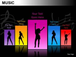
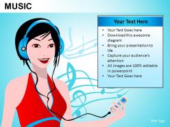
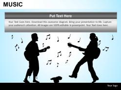
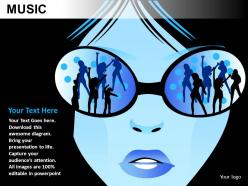
Music powerpoint presentation slides db with all 20 slides:
With the right presentations you can reveal a lot of information about your business while educating customers on your services and products. Good presentations make use of Music Powerpoint Presentation Slides DB that are created by professionals.

FAQs for Music powerpoint
Okay so for music presentations - good visuals are everything, but don't go crazy with text. Let the music breathe, you know? High-quality images that actually match your vibe, and please test your audio setup first because every venue's different. I learned that one the hard way lol. Keep transitions smooth between slides - jarring cuts will totally ruin the flow. Your colors should match whatever mood you're going for. The whole point is making slides that support the music, not fight against it. Think of it like visual backup vocals, not the lead singer trying to steal the show.
Honestly, the right visuals can make or break your music presentation. Match your colors to the vibe - dark blues for jazz, bright reds for rock, you know? Ditch the cheesy stock photos and go for actual instrument shots or cool abstract sound waves instead. Font choice matters more than people think - it should fit your genre's whole personality. Oh, and don't clutter your slides with a million things. Clean layouts let your content shine. Keep everything consistent throughout so it tells one cohesive story that actually supports your music.
Honestly, most teachers I know stick with those clean templates that have piano keys or treble clefs - nothing too fancy. Elementary teachers go crazy for the animated ones with bouncing notes (can't blame them, kids eat that stuff up). Middle and high school teachers usually pick darker, more sophisticated designs. Jazz, classical, and rock templates are super popular when you're doing genre units. Just avoid anything too busy - learned that the hard way when my students spent the whole class staring at spinning music notes instead of listening. Good contrast is key so kids can actually read your text without squinting.
Click where you want the audio first, then hit Insert > Audio. You'll see "Audio on My PC" for files you already have, or "Online Audio" if you want something from the web. MP3 and WAV files usually work fine - PowerPoint can be weird about other formats though. Once it's in there, you can make it play automatically when the slide loads or just when someone clicks it. Oh, and definitely test it beforehand! I learned that the hard way when my audio didn't work during an actual presentation because the other computer was being finicky.
Definitely go chronological - makes everything way easier to follow. Audio clips are everything though, seriously don't skimp on those because you can't really get music across without actually hearing it. I'd keep the text super light and focus more on the big names and movements that actually mattered. Throw in album covers and old concert pics too, keeps people awake. Oh and practice how you're gonna transition between decades - that's where most presentations get awkward. You want it to flow like you're telling a story, not reading from Wikipedia. The cultural stuff is honestly just as important as the music itself.
So basically you want different color schemes and vibes for each genre. Rock = bold reds/blacks with edgy fonts, maybe some guitar pics. Jazz looks great with warm golds and blues - those vintage mics work really well too. Electronic stuff? Go full neon with geometric shapes and futuristic vibes. Classical needs elegant fonts and concert hall shots, you know the deal. Just stay consistent within each genre's look. Oh and definitely make a style guide for each one - trust me, it'll save you time later and everything will look way more polished.
Definitely throw in audio clips so people can actually hear what you're talking about - way better than just describing it. Music quizzes are honestly the best part of any presentation like this. Get them clapping along to rhythms or voting on their favorite genres. Album covers and concert footage make everything look cooler too. Oh, and those listening exercises where people guess instruments? Super fun. Sometimes I'll just pause everything and play a full song - gives everyone a chance to actually absorb it instead of rushing through slides. Waveform graphics look pretty neat if you can find good ones.
Honestly, just start with the basics - note names, intervals, scales. Don't jump into crazy chord progressions right away or you'll lose everyone. I learned this the hard way lol. Visual stuff is huge - use staff notation, piano diagrams, whatever helps because theory gets super abstract fast. Keep it short though, maybe 15-20 slides with clear breaks between sections. The game changer? Add listening examples after each major concept so people actually hear what you're talking about. Trust me, practical beats academic every single time. Your audience will actually stay awake that way.
Dude, animations can totally make your music presentation way better if you match them to what you're playing. Smooth fades work great for slower songs, while quick cuts hit different for rock stuff. I swear, nothing's worse than bouncing text ruining a perfectly good vibe - seen it way too many times. Use effects to guide people's attention and set the mood, not just because they look cool. Keep your transitions consistent within each section so it doesn't feel random. Oh and definitely test everything with your actual audio first, trust me on that one.
For sales comparisons, bar charts are your best friend - you'll instantly see which artists are crushing it. Line graphs show trends perfectly, like watching a song climb the Billboard charts week by week. Pie charts work for market share but honestly they're so overused (I'm guilty of this too). Scatter plots are cool for finding connections between things like social media buzz and ticket sales. The main thing is matching your visual to what story you're trying to tell. Don't just throw data into whatever looks nice. Oh, and pick colors that actually vibe with your music brand!
Okay so first thing - divide up the slides beforehand so nobody's fighting over who does what. Google Slides is your friend here since everyone can work on it at once (way better than emailing files back and forth, ugh). Pick your fonts and colors early and actually stick to them. Seriously, designate someone to be the format nazi or it'll look like a mess. Oh and make a shared folder for all your audio clips and images so people aren't hunting around for stuff. Check in with each other regularly to make sure everything connects properly between sections.
Honestly, just bake accessibility into your slides from day one - way easier than fixing them later. High contrast colors are your friend, plus fonts that are actually readable (24pt minimum). I made the mistake once of using tiny white text on yellow and literally half the room was squinting like they needed glasses! Alt text for images is crucial, and don't forget audio descriptions for your music examples. Captions on videos too. Multiple format handouts help everyone out. Oh, and tag everything in your music database so you can find the accessible stuff quickly when you're scrambling before class. One solid template makes the whole process smoother.
Honestly, Canva's your best bet if you need something fast - I've whipped up decent music templates there in like 30 minutes. Adobe stuff (Photoshop, Illustrator) is obviously more powerful for custom graphics and those cool waveform visuals, but there's a learning curve. PowerPoint's Designer feature is actually not terrible for quick tweaks. After Effects makes sick animations if you're feeling ambitious, though that might be overkill depending on what you're doing. Oh, and grab images from Unsplash or Freepik - way better than random Google pics. Start with Canva though, you can always get fancier later.
Oh totally! You've gotta match your design to the music's vibe. Classical stuff needs elegant fonts and muted colors - not like, hot pink and comic sans lol. Research where the music comes from first. Then pick colors, fonts, and images that actually fit that culture. Your audience matters too though - what feels cool to one group might seem weird to another. Even your slide transitions should match the mood. I always think about whether the visuals would make sense if someone from that culture saw them. It's kinda like dressing for the occasion but for presentations.
Yeah, you definitely need proper licensing or go with royalty-free stuff. Copyright violations are no joke - especially for public presentations or anything you're sharing around. I actually got burned on this once, so trust me on this one. Creative Commons tracks are solid, or check out sites like Freesound and AudioJungle. You could try getting written permission from the rights holders, but that's usually a pain. Internal company stuff might fall under fair use? Honestly though, that's pretty gray area territory. Just start collecting some legally-cleared music now so you're not stressed later.
-
Appreciate the research and its presentable format.
-
The content is very helpful from business point of view.