


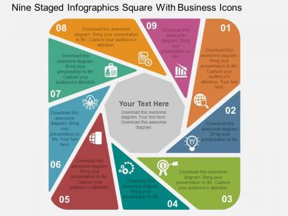
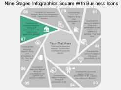
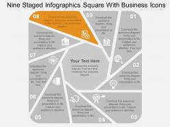
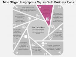
Nine staged infographics square with business icons flat powerpoint design




Try Before you Buy Download Free Sample Product
 Impress Your
 Audience
 100%
100% Editable
 Save Hours
 of Time


Gains happen with our Nine Staged Infographics Square With Business Icons Flat Powerpoint Design. Assets will grow by the day.
People who downloaded this PowerPoint presentation also viewed the following :
Nine staged infographics square with business icons flat powerpoint design with all 13 slides:
Our Nine Staged Infographics Square With Business Icons Flat Powerpoint Design can be excellent fun. The audience will be extremely amused.
FAQs for Nine staged infographics square with business icons
Visually appealing infographics incorporate clear hierarchy, consistent color schemes, readable typography, compelling data visualizations, and strategic white space to guide viewer attention. These design elements work together by simplifying complex information, enhancing comprehension through visual storytelling, and creating memorable experiences, with many organizations finding that well-designed infographics increase engagement and information retention significantly.
Color theory enhances infographic design by establishing visual hierarchy, evoking emotional responses, ensuring accessibility, and improving information retention through strategic palette selection. Complementary colors create contrast for key data points, analogous schemes maintain harmony across sections, and proper color temperature guides viewer attention, with many marketing teams finding that consistent brand-aligned color choices increase audience engagement and message comprehension significantly.
Best practices for choosing charts include matching data types to visualization purpose, prioritizing audience comprehension, ensuring visual clarity, maintaining consistent scaling, and selecting colors strategically. Bar charts work well for comparisons, line graphs excel for trends over time, and pie charts suit proportion displays, with many organizations finding that simple, focused visualizations deliver clearer insights and more effective stakeholder communication.
Audience perception significantly influences infographic design through color psychology, cultural considerations, literacy levels, and preferred visual formats. Understanding demographic preferences, industry contexts, and information consumption habits enables designers to select appropriate typography, imagery, and layout structures, with many organizations finding that audience-tailored infographics deliver higher engagement rates and more effective communication outcomes.
Typography significantly impacts infographic effectiveness through readability, hierarchy, brand consistency, and visual flow, with poor font choices potentially overwhelming or confusing viewers. Strategic typography enhances comprehension by guiding attention, establishing information priorities, and maintaining visual harmony, with many designers finding that consistent font families and appropriate sizing ultimately deliver clearer messaging and stronger audience engagement.
Infographics simplify complex information by using visual hierarchies, strategic color coding, progressive disclosure techniques, and intuitive iconography to guide viewers through layered content. Through careful balance of whitespace and detailed callouts, organizations can present comprehensive data while maintaining readability, with many businesses finding that well-designed infographics enhance audience comprehension and retention significantly.
Professional infographic tools include Canva, Adobe Illustrator, Piktochart, Visme, and Infogram, each offering templates, design elements, and data visualization capabilities. These platforms streamline content creation by providing drag-and-drop functionality, customizable templates, and seamless data integration, with many marketing teams finding that visual storytelling significantly enhances audience engagement and information retention.
Storytelling is crucial in infographic design as it transforms raw data into compelling narratives that engage audiences, guide visual flow, and enhance information retention. Through strategic sequencing, visual hierarchy, and narrative arcs, well-designed infographics help organizations communicate complex insights more effectively, with many businesses finding that story-driven infographics generate significantly higher engagement and comprehension rates.
Common infographic design mistakes include cluttered layouts, inconsistent color schemes, poor typography choices, overwhelming data presentation, and lack of clear visual hierarchy. These design pitfalls confuse audiences and dilute key messages, with many businesses finding that clean layouts, strategic color usage, and focused data storytelling ultimately deliver better engagement and enhanced communication effectiveness.
Infographics can be optimized for mobile viewing through responsive design, vertical layouts, larger fonts, simplified content hierarchy, and touch-friendly interactive elements. These design strategies enhance readability by minimizing horizontal scrolling, improving text legibility, and streamlining information flow, with many organizations finding that mobile-optimized infographics deliver significantly higher engagement rates and broader audience reach.
Ethical data presentation in infographics requires accurate sourcing, transparent methodology, proportional visual scaling, and avoiding misleading charts or selective statistics. While compelling design enhances engagement, responsible designers balance visual appeal with data integrity, ensuring audiences receive truthful information rather than manipulated narratives, ultimately building trust and credibility in an increasingly data-driven communication landscape.
Infographics integrate into marketing strategies through social media campaigns, email marketing, content marketing hubs, sales presentations, and website landing pages. These visual tools enhance brand storytelling by simplifying complex data, increasing engagement rates, and improving content shareability across platforms, with many organizations finding that strategic infographic deployment significantly boosts lead generation and customer retention.
Innovative infographic design trends include interactive data visualizations, animated storytelling elements, AI-generated personalized content, immersive AR/VR experiences, and micro-animations that guide viewer attention. These approaches enhance audience engagement by delivering dynamic, personalized experiences rather than static presentations, with marketing teams and educational institutions finding that interactive elements significantly increase information retention and social sharing rates.
Cultural differences significantly impact infographic design through color symbolism, reading patterns, visual metaphors, data presentation preferences, and cultural context requirements. Designers must consider how red signifies luck in Asian markets while representing danger in Western cultures, adapt layouts for right-to-left reading patterns, and ensure visual elements resonate appropriately, with many global organizations finding that culturally-adapted infographics deliver enhanced engagement and clearer communication across diverse audiences.
Key metrics for assessing infographic effectiveness include engagement rates, social media shares, website traffic, time spent viewing, click-through rates, and lead generation conversions. These analytics enable organizations to measure audience interaction, content reach, and business impact, with many marketing teams finding that combining visual engagement data with conversion tracking ultimately delivers comprehensive insights into content performance and ROI.
-
Enough space for editing and adding your own content.
-
Presentation Design is very nice, good work with the content as well.