


Objective And Key Results Status Dashboard To Track Goals





Try Before you Buy Download Free Sample Product
 Impress Your
 Audience
 100%
100% Editable
 Save Hours
 of Time


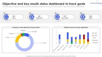
The slide showcases an overview of OKR objective and key results dashboard which enables you to track goals. It covers users, objectives , companys overall progress and departmental OKRs.
People who downloaded this PowerPoint presentation also viewed the following :
Objective And Key Results Status Dashboard To Track Goals with all 10 slides:
Use our Objective And Key Results Status Dashboard To Track Goals to effectively help you save your valuable time. They are readymade to fit into any presentation structure.









FAQs for Objective And Key Results Status Dashboard
So for OKR dashboards, you definitely want clear objective tracking with progress bars - makes it way easier to see where you stand. Visual stuff beats spreadsheets every time, trust me on that one. Timeline visibility is huge too, plus you'll want filtering options by team or person. Oh, and don't skip the comments section! Context gets lost so fast otherwise. Keep it simple though - I've seen too many dashboards that look impressive but nobody actually uses them. The whole point is checking it regularly, not just having something pretty to show off.
Honestly, the best way is tracking completion rates and how fast you're moving on each goal. Don't manually update spreadsheets every week - that's soul-crushing work nobody deserves. Set up automatic tracking instead. Your dashboard needs percentage completion, trend lines, and those red/yellow/green alerts for stuff that's falling behind. Here's what most people miss though: track both the end result AND the steps leading up to it. Like "demos scheduled" plus "deals closed." Real-time updates are clutch, and you've gotta review weekly with the team. Otherwise it's just pretty charts that sit there doing nothing.
Honestly, start with progress bars - they're like the holy grail of dashboards because you instantly know where things stand. Color code everything with green/yellow/red so problems jump out immediately. Put your biggest metrics right up front with huge numbers that don't require squinting. I'd totally skip fancy animations though, they just annoy people when they're trying to work quickly. Add some trend arrows or tiny graphs too since flat numbers are pretty useless without context. The real test? If someone can't grasp the situation within 3 seconds, you've overcomplicated it.
Weekly updates are your sweet spot - gives you real progress without turning into a chore. I'd sneak in daily check-ins too if possible, just quick glances to stay on top of things. Trust me, it becomes second nature way faster than you'd expect. Don't go monthly though, that's a mistake I've seen teams make. You lose all that momentum and honestly? The whole point of OKRs is keeping that pressure on. Start weekly and adjust from there based on what clicks with your team.
So for OKR dashboards, there's a bunch of decent options out there. Weekdone, 15Five, and Lattice are built specifically for this - they handle all the tracking automatically which is nice. But honestly? Google Sheets or Airtable work great too if you've got a smaller team. Monday.com has some solid templates as well. Here's the thing though - I've watched so many teams get stuck picking the "perfect" tool when they should just start with something simple. Whatever your team will actually use is way better than some fancy platform that sits empty. Start basic, then move up if you need those automated features later.
Set up regular check-ins where everyone updates their progress right in the dashboard. Makes everything visible - people actually stay on track when they know others can see their stuff. Weekly dashboard reviews during standup work great (way better than those rambling status meetings tbh). Notifications help too, just gentle reminders to update things. The trick is building it into your normal routine instead of only remembering it exists when quarterly reviews come around. Don't let it become this separate thing you do - weave it into how you already work.
Honestly, the biggest mistake is cramming every possible metric onto one screen. Trust me, I've seen dashboards that look like airplane cockpits - nobody wants that mess. Pick what actually matters for your goals and ditch the rest. Keep updates simple too, because if it's a pain to maintain, your team will abandon it faster than a bad Netflix show. Red/yellow/green lights work way better than fancy charts for quick status checks. You want people to understand everything in like 5 seconds. Start basic and only add stuff if you really need it.
So basically an OKR dashboard shows everyone what other teams are doing and how it all connects. Marketing can see how their stuff helps sales hit targets. Engineering sees how their work fits the big company goals. Think of it like a GPS for your whole company - pretty helpful actually. Teams start working together more because they finally get the full picture instead of just their little corner. Oh, and definitely do regular check-ins with other departments using the dashboard. You'll catch misalignment issues way earlier that way.
Look, user feedback is what separates dashboards people actually use from expensive digital paperweights. Ask your team monthly what's confusing them or what metrics they're missing. Different roles need different views - your sales team cares about totally different stuff than engineering does. Quick surveys work great, or just grab people for 10-minute chats. The key thing? Actually fix what they complain about, otherwise they'll stop telling you anything useful. I've seen so many beautiful dashboards gathering dust because nobody asked users what they needed in the first place.
Honestly, visual dashboards are a game-changer for tracking OKRs. You can spot what's working and what's tanking without scrolling through endless spreadsheets. Progress bars with colors make it super obvious - green means you're crushing it, red means panic mode. Charts show trends over time, so you'll catch problems before they get worse. Heat maps are cool too, they highlight patterns across different teams. I started with basic bar charts showing completion percentages - took like 5 minutes to set up but saved hours of confusion later. Your whole team gets the big picture instantly.
So connecting your OKR dashboard to whatever PM tool you're using is actually pretty clutch. It automatically shows how your daily work ties to bigger goals - no manual updates needed (because seriously, ain't nobody got time). Real-time visibility means you can catch when people are spinning their wheels on stuff that doesn't matter. Plus reporting becomes way easier since everything flows through automatically. I'd probably start with your current tool and see which OKRs are getting the most project love. Sometimes you'll be surprised by what's actually getting attention vs what you think is.
Honestly, just make your OKR dashboard the go-to for every performance chat. Pull it up during team meetings and walk through each objective together - way better than giving vague "you're doing great" feedback. The progress bars are clutch for spotting trends quickly. When you're looking at actual data on key results, conversations get way more specific about what's working and what isn't. It keeps everyone on the same page too. I've found it turns those abstract goals into stuff you can actually talk about, which makes performance reviews feel less awkward.
Honestly, focus on five main things. Completion percentage shows if you're actually hitting targets. Confidence scores are huge - they tell you when goals are unrealistic before you get those awful "wait, we're screwed" moments. Check-in frequency matters too because it shows whether teams actually care about their OKRs or just pretend during reviews. Milestone completion rates give you early warnings when stuff's going wrong. Same with tracking blockers - super helpful for catching problems early. I probably sound like a broken record about early detection, but seriously, build your dashboard around these and you'll spot issues while you can still fix them.
Your team's culture totally drives how they'll use an OKR dashboard. Hierarchical places need role permissions and formal workflows. Flat organizations? They want everything open and collaborative. Some teams love public goals and leaderboards - others think that's embarrassing and won't touch it. Visual stuff matters too. Detail-loving teams want charts and metrics, while others just want simple progress bars. Oh and survey your people first about transparency and competition comfort levels - learned that one the hard way. Then customize everything to match how they actually work, not how you think they should.
Okay so for qualitative stuff on your OKR dashboard - red/yellow/green indicators are your best friend. Skip the essay writing though, nobody's reading paragraphs on a dashboard. Instead, throw in actual quotes or examples like "Customer said the new feature saved them 2 hours weekly" rather than some vague "satisfaction improved" nonsense. Keep each description under 2 sentences max. I learned this the hard way after creating dashboards that looked like novels. Make your format consistent so people know where to look for context without hunting around. Short, scannable, and meaningful - that's it.
-
The customer care of SlideTeam is very responsive. I was having a payment issue and they fixed it for me in no time.
-
I downloaded some of the presentations for work. They were simple to modify and saved me a lot of time and effort.