

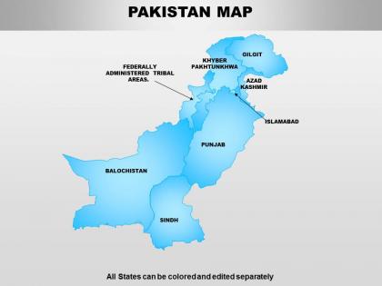
Pakistan powerpoint maps




Try Before you Buy Download Free Sample Product
 Impress Your
Audience
 100%
Editable
 Save Hours
of Time


Ensure efficiency with our Pakistan Powerpoint Maps. Get greater output from your thoughts.
People who downloaded this PowerPoint presentation also viewed the following :
Pakistan powerpoint maps with all 64 slides:
Display a go getting attitude with our Pakistan Powerpoint Maps. They allow you to focus on the advantages.


FAQs for
Oh man, Pakistan's map history is wild - you've got the 1947 Partition, then those wars with India in '65 and '71. The East Pakistan/Bangladesh split in '71 is huge. Kashmir's where it gets really messy though, different maps show the disputed areas totally differently depending on who made them and when. The Soviet-Afghan thing in the 80s changed the border regions too. Honestly, grab maps from like three different decades if you can - the differences are pretty striking. You'll spot all the major shifts way easier that way.
So basically Pakistan's maps have changed like crazy since 1947 - mostly because of all the political drama and border fights. Early ones were pretty rough since they didn't have much tech back then. Now they're super detailed with satellites and all that GPS stuff. The Kashmir situation is honestly a mess though - every map shows it differently depending on who made it and what their politics are. They keep updating borders after each conflict with India (1965, 1971, you know the drill). Modern maps have way more detail for cities and terrain that just wasn't possible before. Just heads up - always check when a Pakistan map was made because territorial stuff varies wildly by era.
Honestly, maps in Pakistan are way more meaningful than you'd expect. Each province - Punjab, Sindh, Balochistan, Khyber Pakhtunkhwa - has these distinct boundaries that basically reinforce their own languages and traditions. It's wild how much a simple border line can represent! Regional maps help communities stay connected to their ancestral lands, especially for groups like the Baloch, Pashtun, and Sindhi people. My cousin who studied there always said the regional context matters more than outsiders realize. So if you're doing anything Pakistan-related, definitely consider which region you're dealing with first.
Dude, those provincial boundaries literally drive everything in Pakistani politics. Punjab vs the smaller provinces over water rights? Classic boundary drama. Balochistan fighting the feds over who gets what from their resources? Same thing. It's wild how lines drawn decades ago still cause so much beef today. People really identify with their province too - like, those borders matter for ethnic and linguistic stuff way more than you'd think. Honestly whenever there's political drama in Pakistan, just check which provinces are beefing. The map explains basically everything about why they're fighting.
So Pakistan's topography is wild - you've got the Himalayas and Karakoram mountains up north with K2 and everything. The Indus River cuts right through the middle, then there's the Thar Desert on the India border. Don't forget the coastal areas by the Arabian Sea and that huge Balochistan plateau. Most farming happens in the Punjab plains, which makes sense since it's way more fertile than the rest. Honestly, the elevation changes are insane - like you'll go from sea level to massive peaks, and it totally messes with climate patterns and building anything there.
Dude, those interactive maps are actually crazy when you look at how Karachi's just exploded over the years. You can stack different layers - population stuff, where they're building new housing, infrastructure - and literally watch Lahore or Islamabad spread out from the center. What's wild is toggling between different time periods. You'll spot how those informal settlements always pop up near industrial areas, or how new roads basically dictate where cities grow. Start with satellite shots from different decades, then throw census data on top. Your city's got stories to tell, trust me.
Physical maps show the actual landscape - like mountains, rivers, and deserts with different colors for elevation. Political ones are all about borders, provinces, and cities instead. You'll see the Himalayas and Indus River clearly on physical maps, plus that massive Thar Desert. Political maps highlight Pakistan's four provinces and major cities like Karachi. Oh, and Kashmir shows up as disputed territory which... yeah, that's a whole thing. Physical maps are perfect if you need terrain info. Go political if you want administrative stuff and boundaries. Depends what you're actually trying to figure out, really.
So there's actually tons of ways teachers use Pakistan maps! Physical ones show mountains and rivers, political ones highlight provinces and cities like Karachi. Wall maps are classic - kids love pointing stuff out. Workbooks make them label everything from the Indus River to major landmarks, which honestly works pretty well. Digital maps are where it's at though - students can zoom around and explore online versions. I'd mix both approaches if I were you. Traditional printed maps plus the interactive digital stuff gives students good hands-on practice with Pakistan's geography. Works way better than just one method.
So Pakistan's population is wild when you look at the maps. Karachi, Lahore, and Islamabad are absolutely packed while Balochistan is basically empty - mountain regions will do that I guess. The Indus River creates this huge population strip running through Punjab and Sindh. People gravitate toward jobs and water, which totally makes sense. You can actually see migration patterns just by looking at where everyone clusters up. Oh, and don't make my mistake of assuming land area equals people - always check density first if you're planning something there.
So basically, Pakistan's whole mapping system got built around those ancient trade routes. The Silk Road, Grand Trunk Road, Khyber Pass - cartographers in 1947 used them as their starting points. Makes total sense when you think about it. Cities like Lahore, Karachi, and Peshawar became the main mapping centers because they were already major trading hubs. The British had done most of the heavy lifting mapping these commercial routes (for their own profit, obviously), so Pakistan just inherited all those detailed surveys. Honestly, if you're diving into Pakistani geography, just remember that trade cities became the backbone of the entire grid system.
Honestly, it's a nightmare trying to map conflict zones. Boundaries shift every few days, infrastructure gets blown up or rebuilt constantly, and people are fleeing so population centers move around. You can't exactly send surveyors into active war zones either. Satellite imagery helps but even that's tricky - whose version of contested territory do you show? Government sources will claim one thing while locals report something totally different. I'd use multiple satellite feeds, check with humanitarian groups for ground truth, and slap clear dates plus disclaimers on everything. The maps basically become outdated before you finish them.
So basically Pakistan's mapping game has gotten crazy good with GPS and GIS tech. Survey of Pakistan ditched those old paper maps for digital ones using satellite imagery - honestly way more accurate now. They're using it for everything from city planning in Karachi to crop mapping in Punjab. The GIS stuff lets them stack different data layers like population and infrastructure, which is pretty cool. Oh and if you need current maps for your project, definitely check out Pakistan Space Commission's digital mapping stuff - they've got the newest tech-integrated ones. Way better than what they had before.
Dude, maps are everything for disaster stuff in Pakistan. You can spot the danger zones - floods along the Indus, earthquakes up north, cyclones hitting the coast. Super helpful for planning escape routes and figuring out where to put emergency supplies. The geological details show you exactly where landslides might happen, which honestly saves lives. After disasters hit, you need maps to see what got damaged and plan rebuilding. Oh, and use recent maps because things change fast there - new buildings, population shifts, all that. Trust me, outdated maps are worse than useless.
Honestly, thematic maps are your best bet for this stuff. You can map out poverty rates, literacy, income - basically any socioeconomic indicator across all four provinces using colors or symbols. It's crazy how clear the regional differences become when you see everything laid out geographically like that. Start simple with just one indicator first (trust me on this). Once you're comfortable with the mapping tools, you can layer multiple datasets to spot patterns - like maybe education levels tracking with economic development in certain areas. Just make sure you're pulling from solid sources like Pakistan Bureau of Statistics. The visual impact is honestly pretty striking when it all comes together.
Honestly, they're like totally different things. Tourist maps are all about the fun stuff - where to eat, sleep, and what cool places to visit like Hunza Valley or Skardu. Administrative ones? Just boring government boundaries and which official controls what area. Nobody wants to know about tehsil divisions when they're trying to find a good restaurant, you know? Tourist maps also make everything way simpler - they'll show you the main roads without all the confusing details. Plus they use those colorful little icons that actually help. For planning your trip, definitely go with tourist maps. Way more useful.
-
Best way of representation of the topic.
-
Qualitative and comprehensive slides.