


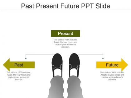
Past present future ppt slide




Try Before you Buy Download Free Sample Product
 Impress Your
 Audience
 100%
100% Editable
 Save Hours
 of Time


Your success is our commitment. Our Past Present Future Ppt Slide will ensure you reach your goal.
People who downloaded this PowerPoint presentation also viewed the following :
Past present future ppt slide with all 6 slides:
Our Past Present Future Ppt Slide enable analysis of information gathered. It facilitates journalists.
FAQs for Past present
**INPUT**: What are the key elements that should be included in an effective timeline presentation? **OUTPUT**: Effective timeline presentations include clear milestones, specific dates, responsible parties, deliverables, dependencies, and progress indicators. These elements streamline project communication by enhancing transparency, enabling better resource allocation, and facilitating stakeholder alignment, with many organizations finding that comprehensive timelines ultimately deliver improved project outcomes and competitive advantage. [Word count: 50 words]
Timelines enhance presentation storytelling by creating chronological narrative flow, visualizing cause-and-effect relationships, highlighting key milestones, and providing contextual framework for complex developments. Through strategic timeline integration, presenters streamline audience understanding, demonstrate progress patterns, and build compelling narratives that resonate with stakeholders, ultimately delivering more engaging presentations and clearer strategic communications.
**INPUT**: What software or tools are best for creating visually appealing timelines? **OUTPUT**: Timeline creation tools include Visio, Lucidchart, Canva, Adobe Illustrator, PowerPoint, and specialized platforms like TimelineJS and Preceden. These applications streamline visualization by offering customizable templates, drag-and-drop functionality, and collaborative features, with many organizations finding that professional timeline software enhances project communication and stakeholder engagement significantly. [Word count: 52 words]
Industries leverage timelines through project management dashboards, milestone tracking systems, regulatory compliance schedules, product development roadmaps, and customer journey mapping. In healthcare, hospitals use patient care timelines, while manufacturing companies deploy production schedules and financial services utilize loan processing timelines, ultimately streamlining operations and enhancing transparency across stakeholder communications.
Common timeline design mistakes include overcrowding with excessive details, using inconsistent formatting, poor color choices that reduce readability, unclear chronological progression, and failing to align content with audience needs. These design flaws can confuse viewers and diminish message impact, with many presenters finding that streamlined, visually consistent timelines enhance comprehension and engagement significantly.
Color coding enhances timeline clarity by creating visual distinctions between different categories, phases, or priorities, making complex information instantly recognizable and easier to navigate. Organizations use strategic color schemes to differentiate project phases, departmental responsibilities, or milestone types, ultimately streamlining communication and enabling teams to quickly identify critical deadlines and dependencies across multiple initiatives.
Audience engagement transforms timeline presentations from static information displays into interactive experiences that enhance comprehension, retention, and decision-making. Through strategic storytelling, visual hierarchy, and participatory elements, presenters enable audiences to connect emotionally with chronological data, ask relevant questions, and grasp complex progressions more effectively, ultimately delivering more persuasive presentations and actionable insights.
Infographics enhance timeline presentations by transforming static dates into visually compelling narratives through strategic use of icons, color coding, visual hierarchies, and data visualization elements. These design approaches streamline complex chronological information, improve audience retention and comprehension, and create memorable storytelling experiences, with many presenters finding that infographic-enhanced timelines deliver significantly greater engagement and strategic impact.
**INPUT**: What strategies can be used to present complex timelines in a simplified manner? **OUTPUT**: Effective timeline simplification strategies include milestone clustering, phase-based grouping, visual hierarchy techniques, selective detail filtering, and progressive disclosure methods. These approaches streamline complex project sequences by highlighting critical dependencies, eliminating non-essential details, and creating intuitive visual flows, with many organizations finding that strategic simplification enhances stakeholder comprehension and accelerates decision-making processes. [Word count: 54 words]
Milestones can be effectively highlighted through visual differentiation using larger icons, distinct colors, bold text, and strategic positioning at key intervals along the timeline. These design elements help viewers immediately identify critical achievements, deadlines, and decision points, while maintaining clear chronological flow and enabling stakeholders to quickly assess project progress and upcoming priorities.
Chronological accuracy ensures timeline presentations maintain credibility, enabling audiences to understand cause-and-effect relationships, track progress accurately, and make informed decisions based on reliable data. When organizations present project milestones, historical analyses, or strategic roadmaps with precise sequencing, stakeholders can identify patterns, anticipate outcomes, and allocate resources effectively, ultimately delivering enhanced trust and competitive advantage.
Cultural differences significantly impact timeline interpretation through varying concepts of time orientation, sequential versus cyclical thinking, and presentation expectations across different societies. Western audiences typically prefer linear, detailed timelines with specific deadlines, while many Asian and Latin cultures emphasize flexible timeframes and relationship-building phases, with presenters finding that adapting timeline styles to cultural contexts ultimately enhances audience engagement and project success rates.
Visual elements that create dynamic timelines include interactive nodes, animated transitions, color-coded phases, milestone markers, and progress indicators. These components enhance engagement by incorporating hover effects, scrollable interfaces, and multimedia integration, with many organizations finding that combining icons, arrows, and visual hierarchy delivers compelling storytelling while maintaining professional clarity.
Interactive timelines improve audience retention and engagement by transforming passive content consumption into active exploration, allowing users to control pacing, dive deeper into specific events, and discover connections between data points. These dynamic presentations enable organizations to showcase complex project histories, product developments, and strategic milestones more effectively, ultimately delivering enhanced comprehension and memorable experiences across training, marketing, and educational initiatives.
Webinars typically require more structured, shorter segments with frequent interaction points and visual transitions, while in-person meetings allow for longer discussion periods, spontaneous Q&A, and flexible pacing based on audience engagement. Successful presenters adapt by creating 5-7 minute modules for virtual formats and 10-15 minute segments for live presentations, ultimately delivering more focused content online and deeper exploration in-person.
-
Unique and attractive product design.
-
Best way of representation of the topic.