


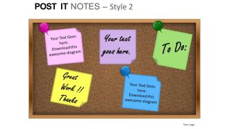
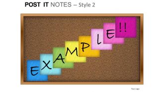
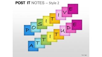
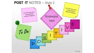
Post it notes style 2 powerpoint presentation slides





Try Before you Buy Download Free Sample Product
 Impress Your
 Audience
 100%
100% Editable
 Save Hours
 of Time


Ease the bit with our Post It Notes Style 2 Powerpoint Presentation Slides. Let your thoughts go at a canter.
People who downloaded this PowerPoint presentation also viewed the following :
Post it notes style 2 powerpoint presentation slides with all 9 slides:
Put out the data on our Post It Notes Style 2 Powerpoint Presentation Slides. Substantiateyour ideas with the facts.

FAQs for Post it notes style 2
Dude, Post-it style slides are a game changer! Complex info becomes way easier to digest when you break it into bite-sized chunks. People won't get overwhelmed by walls of text. Limited space forces you to focus on what actually matters - no fluff allowed. Your audience stays engaged because it feels more interactive than boring bullet points. Honestly, I wish more people would ditch the traditional slide format. Plus it just looks cleaner and more organized. Try mapping out your 3-5 key points first, then build from there. Trust me on this one.
Post-it slides are honestly genius for keeping people awake. The sticky note look breaks up all that text so your audience doesn't zone out. Way less scary than formal bullet points too - feels more like you're just sharing random thoughts instead of being all corporate-y. I'd definitely use different colors for different stuff, like blue for problems and yellow for solutions or whatever. People actually pay more attention when they see this format. Something about it just works better than regular slides, probably because we're all used to covering our desks in colorful notes anyway.
Honestly, Post-it slides are clutch for brainstorming and quick team updates. Perfect when you've got multiple ideas to show at once - like project milestones or feedback from different people. I always use them in workshops because they feel way more collaborative than those boring bullet point slides (you know the ones). They work great for process steps too, where each sticky note is its own thing. Oh, and pros/cons lists! Just keep your text super short and punchy. If you're trying to fit whole paragraphs on there, you're missing the point. The bite-sized approach is what makes them actually work.
Match your Post-it colors to the vibe you want. Yellow's great for creative stuff, blue builds trust, green says "growth" or success. Red? Only when something's urgent - it's kinda aggressive otherwise. Orange brings energy but honestly, sometimes I just grab whatever looks nice together lol. The trick is being intentional instead of random. Stick with the same colors throughout so people start connecting them to your themes without realizing it. Don't go crazy though - 3 or 4 colors max or you'll overwhelm everyone.
Honestly, just use PowerPoint - I know it sounds basic but you can tweak the shapes and colors however you want. Plus adding that slight tilt effect is super easy. Canva's pretty good too if you're feeling lazy and want something ready-made. Their free stuff should cover what you need. Oh, and Figma if you're already using it for other things - gives you way more control over shadows and textures. The magic trick though? Drop shadow and rotate each note like 2-3 degrees. Makes them look actually scattered instead of perfectly lined up. Just make one template then copy it a bunch.
Those Post-it style slides are genius for retention - they work because our brains love chunking info into smaller pieces. People actually remember about 65% more when you ditch those awful wall-of-text slides. The sticky note format is perfect since we already think of Post-its as "important stuff to remember." Keep one main idea per note and maybe use different colors to group related concepts together. I mean, think about it - would you rather read a dense paragraph or a few colorful notes? It's basically how you'd naturally organize thoughts anyway.
Start with actual sticky notes - seriously, grab some and jot down your ideas first. Then go digital with bright yellow and black text (classic combo that works). One idea per slide, keep it short. If it doesn't fit on a real Post-it, cut it down. Go for handwritten fonts or simple ones that look casual. Honestly? A little messiness makes it feel more authentic, but don't overdo it. Leave white space around the edges like real notes have. The whole point is making it look natural, not polished.
Post-it style slides totally work for different formats! Just gotta adjust the sizing. Webinars need bigger text since everyone's squinting at laptop screens - I learned this the hard way when my "sticky notes" looked like hieroglyphics to viewers. Live events? You can go smaller since people are closer to those massive screens. Test everything beforehand though. Can't stress this enough - do a screen share test to make sure text is readable and colors don't look washed out. Oh, and make sure your yellow actually looks yellow and not some weird beige situation.
So for Post-it slides, I'm totally obsessed with "Fly In" and "Appear" animations - they actually look like someone's slapping notes on a board. The "Wipe" effect is *chef's kiss* for this style. When you're removing notes, throw in some exit animations to show how you're moving through ideas. Oh, and group related notes so they animate together - makes way more sense. Just don't go crazy with the timing or it'll look like a seizure-inducing mess. Keep your animation types consistent throughout (boring but necessary). Practice the timing out loud though - that's where most people screw it up.
Ugh, the worst thing people do is cram way too much text on each note. Like, seriously - keep it to 5-7 words max or nobody in the back can read it. Don't go nuts with colors either, maybe stick to 2-3 that actually mean something (yellow for problems, blue for solutions, whatever). I hate when people use tiny Post-its too - you lose all that visual punch. Oh and align them properly! Nothing looks more amateur than crooked notes scattered everywhere. Keep your sizes consistent and give them some breathing room so they actually stand out.
Post-it slides work great when you layer them over your main visuals instead of competing with them. I usually stick them on screenshots or charts to highlight stuff or add quick commentary - way more personal than those boring callout boxes. Before/after comparisons look amazing this way too. Start with whatever your main image is, then figure out where you actually need the emphasis. Don't go crazy though - like 2-3 sticky notes max or it gets messy. The annotated look is honestly so much better than standard presentations.
Honestly, Post-it Notes aren't a thing everywhere - they're pretty Western. Some people in Asia or Africa might just stare at your slides confused about the whole sticky note look. Yellow's tricky too since it can mean warning signs or bad luck in certain places instead of "hey, creative idea!" That handwritten font could backfire in formal business settings. Looks kinda unprofessional, you know? I'd definitely run it by local coworkers first. Maybe prep a boring backup version just in case people seem lost.
Look, it totally depends who you're presenting to. Startups and creative types? They'll eat up that casual Post-it aesthetic - feels super collaborative. But I've watched C-suite executives physically recoil at handwritten fonts lol. Traditional corporate folks might think you're being lazy or unprofessional. Academic crowds are weird - they want substance but don't mind some visual flair. My advice? Test it on a small group first if you're not sure. When in doubt, save the sketchy style for internal brainstorms instead of client meetings. You don't want to tank a presentation over font choice.
So basically treat each Post-it like you're actually scribbling down a quick thought - maybe 3-7 words tops. Group similar stuff together and use different colors for categories or whatever feels right. Don't cram everything in though, white space actually looks way better than you'd think. I'm telling you, sketch it out with real Post-its first because what looks good in your head doesn't always work on the slide. The whole point is keeping it simple, so fight that urge to squeeze in every detail. It's like doing a brainstorm session - messy is fine, overcomplicated isn't.
Oh this is actually super easy! Just make text boxes in PowerPoint and style them like sticky notes - different colors for each person or topic. During brainstorming sessions, everyone can type their ideas right onto the slide, then you drag them around to group stuff together. The comment feature works great too for real-time input during virtual meetings. Honestly, I've seen some teams go overboard with fancy templates, but a simple Post-it shape that people can duplicate works perfectly fine. Way better than trying to read everyone's handwriting on actual sticky notes anyway!
-
Qualitative and comprehensive slides.
-
Nice and innovative design.