


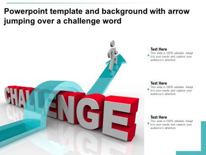
Powerpoint template and background with arrow jumping over a challenge word




Try Before you Buy Download Free Sample Product
 Impress Your
 Audience
 100%
100% Editable
 Save Hours
 of Time


Our Powerpoint Template And Background With Arrow Jumping Over A Challenge Word are topically designed to provide an attractive backdrop to any subject. Use them to look like a presentation pro.
People who downloaded this PowerPoint presentation also viewed the following :
Powerpoint template and background with arrow jumping over a challenge word with all 2 slides:
Use our Powerpoint Template And Background With Arrow Jumping Over A Challenge Word to effectively help you save your valuable time. They are readymade to fit into any presentation structure.
FAQs for Powerpoint template and background with arrow jumping over
Key design principles for PowerPoint templates with arrows include consistent styling, clear directional flow, appropriate sizing relative to content, strategic color coding, and maintaining visual hierarchy throughout slides. These elements work together by guiding audience attention systematically, reducing cognitive load during presentations, and ensuring seamless information flow, with many organizations finding that well-designed arrow templates significantly enhance comprehension and engagement rates.
Arrows in PowerPoint templates enhance message clarity by directing audience attention, establishing logical flow between concepts, simplifying complex relationships, and highlighting key connections that might otherwise be missed. Through strategic arrow placement, presenters create visual pathways that guide viewers through data sequences, process steps, and cause-and-effect relationships, ultimately delivering more comprehensible and persuasive presentations.
High-contrast schemes like navy-white, dark gray-light blue, and black-gold combinations work best for arrow designs, ensuring visibility across projection environments. These strategic color pairings enhance readability while maintaining professional aesthetics, with many organizations finding that consistent, brand-aligned arrow colors streamline presentations and deliver stronger visual impact during stakeholder communications.
Different arrow styles significantly influence audience perception, with solid arrows conveying directness and certainty, dashed arrows suggesting possibilities or interim steps, and curved arrows indicating flow or process evolution. These visual choices shape comprehension and engagement, with many presenters finding that strategic arrow selection enhances message clarity, guides attention more effectively, and ultimately delivers stronger audience understanding and retention.
Arrows in PowerPoint infographics serve as process flows, timeline progressions, cause-and-effect relationships, priority hierarchies, and directional emphasis for key data points. These visual elements streamline complex information by guiding viewer attention, connecting related concepts, and illustrating business workflows, with many organizations finding that strategic arrow placement significantly enhances audience comprehension and presentation impact.
**INPUT**: Can the placement of arrows alter the flow of information in a presentation? **OUTPUT**: Arrow placement significantly influences information flow by directing audience attention, establishing logical sequences, creating visual hierarchies, and guiding narrative progression throughout presentations. Strategic arrow positioning enables presenters to control pacing, emphasize key transitions, and streamline complex processes, with many organizations finding that thoughtful directional elements enhance audience comprehension and retention rates. **Word count: 54 words**
Use arrows strategically by limiting them to 3-5 per slide, employing consistent colors that align with your brand palette, and varying sizes to create visual hierarchy. Through thoughtful placement and subtle animations, presenters can guide audience attention seamlessly while maintaining clean aesthetics, with many finding that strategic arrow usage enhances comprehension without creating visual clutter.
Common mistakes include using too many arrows that clutter slides, choosing inconsistent arrow styles throughout presentations, making arrows too small to see clearly, and using poor color contrast that reduces visibility. These design errors distract audiences from key messages, with many presenters finding that limiting arrows to essential pathways, maintaining consistent styling, and ensuring adequate size and contrast ultimately delivers clearer communication and more professional presentations.
Animated arrows improve engagement by directing audience attention to key points, creating visual flow between concepts, and maintaining viewer focus through dynamic movement. These visual elements help presenters guide discussions more effectively, reduce cognitive load by highlighting critical information sequentially, and transform static slides into interactive experiences, ultimately delivering clearer communication and stronger audience retention.
Arrows strategically direct audience focus by highlighting key information, creating visual pathways between related concepts, emphasizing sequential processes, and drawing attention to critical data points or conclusions. Through effective arrow placement, presenters streamline information flow, reduce cognitive load, and enhance message retention, with many finding that well-designed directional elements significantly improve audience engagement and comprehension rates.
Cultural interpretations of arrows vary significantly across regions, with some cultures reading right-to-left or associating specific directions with negative connotations, while others prioritize circular over linear progression models. These differences can impact global presentations by creating confusion or unintended messaging, with many international organizations finding that culturally-neutral design elements and consistent directional flows ultimately enhance cross-cultural communication and audience engagement.
Consistency in arrow design requires establishing standardized color palettes, uniform sizing scales, consistent stroke weights, matching visual styles, and systematic positioning guidelines across all template slides. These design principles streamline presentation creation by ensuring visual cohesion, enhancing professional credibility, and reducing formatting time, with many organizations finding that standardized arrow libraries ultimately deliver stronger brand recognition and more polished stakeholder communications.
Arrows effectively indicate relationships and hierarchies in data visualizations through directional flow indicators, progressive sizing, color coding, and strategic positioning to show cause-and-effect or organizational structures. These visual elements streamline complex data interpretation by guiding viewer attention through logical sequences, highlighting dependencies between variables, and clarifying multi-level hierarchies, ultimately delivering clearer insights and faster decision-making across business presentations.
Several tools can assist in creating custom arrow designs, including PowerPoint's built-in Shape tools, Adobe Illustrator for vector graphics, Canva for user-friendly design elements, and specialized plugins like Office Timeline. These design solutions streamline arrow creation by offering customizable templates, scalable vector formats, and professional styling options, with many presenters finding that combining multiple tools delivers more polished, brand-consistent visual elements.
Arrows complement textual content by directing attention to key points, illustrating relationships between concepts, and creating visual hierarchy that guides audience understanding. Through strategic placement and design, arrows help presenters emphasize critical information, show process flows, and connect disparate elements, ultimately delivering clearer communication and enhanced audience engagement across professional presentations.
-
Easily Editable.
-
Understandable and informative presentation.
-
I discovered this website through a google search, the services matched my needs perfectly and the pricing was very reasonable. I was thrilled with the product and the customer service. I will definitely use their slides again for my presentations and recommend them to other colleagues.
-
The content is very helpful from business point of view.
-
Great designs, Easily Editable.
-
Nice and innovative design.
-
Nice and innovative design.