


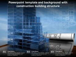
Powerpoint template and background with construction building structure





Try Before you Buy Download Free Sample Product
 Impress Your
 Audience
 100%
100% Editable
 Save Hours
 of Time


Our Powerpoint Template And Background With Construction Building Structure are topically designed to provide an attractive backdrop to any subject. Use them to look like a presentation pro.
People who downloaded this PowerPoint presentation also viewed the following :
Powerpoint template and background with construction building structure with all 2 slides:
Use our Powerpoint Template And Background With Construction Building Structure to effectively help you save your valuable time. They are readymade to fit into any presentation structure.
FAQs for Powerpoint template and background with
For your construction template, grab colors that match your company branding—blues, grays, orange work great. Set up slides for timelines, budgets, site photos, and safety stuff. Timeline slides are clutch since literally everyone obsesses over schedules. Don't get fancy with fonts, keep them readable. White space is your friend so things don't look messy. Oh, and save it as a master template so your whole team isn't reinventing the wheel every time. Makes presentations way more consistent and you'll look more professional to clients.
Honestly, color choice can make or break how professional you look. I'd go with oranges and yellows if you want that energetic, safety-focused vibe. Blues and grays are solid for showing you're reliable and know your stuff technically. Earth tones work too - they just feel practical, you know? Avoid going too flashy or you'll look like a used car salesman, but don't be boring either. Stick to maybe 2-3 colors that actually work together. Oh, and definitely check that your text shows up clearly on whatever screen you're using.
Honestly, progress photos are your best bet - the whole before/during/after thing really works. Equipment shots look solid too, plus any architectural renderings you've got. Site photos are amazing even when they're messy (mud actually makes it look more real). Your own project photos beat generic stock images every time - you know, those cheesy hard hat shots everyone uses. Make sure the lighting's decent though. Oh, and definitely include some shots that show the scale of what you're doing. People love seeing the actual transformation happening.
Think of your template like telling a story - you need that flow from project overview to challenges, solutions, timeline, then results. Otherwise people get totally lost jumping between random slides. I've watched so many presentations crash and burn because there's no logical thread connecting everything! Start with your foundation (project scope), walk through the process step by step, then boom - show off the final results. It's honestly just like how construction actually works in real life. This way everyone can follow along and your decisions make sense in context. Just pick whatever template fits your specific project type and you'll be golden.
Look, start with the obvious stuff - project overview, timeline, budget breakdown, team roles. The timeline slide is honestly what everyone's gonna grill you about anyway. Add safety protocols and risk management too. Oh, and definitely include progress tracking metrics so you can show you're actually on top of things. Stakeholder contact info is clutch - people always forget who to bug about what. Throw in a Q&A slide at the end. Keep it simple, one main point per slide or you'll lose them. Just grab a basic template and tweak it for whatever type of project you're doing.
Yeah, animations can totally help with construction presentations! I love doing smooth timeline reveals or those dramatic before/after shots - clients eat that stuff up. Just don't go crazy with it though. You'll look like you're trying way too hard if everything's spinning and bouncing around. Stick with simple fade-ins and basic transitions. Use them to highlight your key points - budget breakdowns, milestones, that sort of thing. Oh and here's what I learned the hard way: if any animation takes more than 2 seconds, ditch it. Nobody's got time for that. Keep it clean and you'll look way more professional.
Dude, definitely go with bar charts for budgets and Gantt charts for timelines - way better than boring pie charts for construction stuff. Orange, blue, and gray colors look super professional. Make your text huge because I swear, half the people in those meetings sit in the back and squint the whole time. Only put one main point per slide or it gets messy fast. Your data needs to actually tell a story about progress or costs, not just random numbers everywhere. Oh, and always lead with your biggest wins first - that's what grabs attention.
Honestly, templates are lifesavers. You'll knock out a presentation in like 20 minutes instead of wrestling with design for hours. They come with decent layouts and industry graphics already built in. Way cheaper than hiring someone too – I learned that the hard way last year. Sure, they're not totally unique to your company, but most clients don't really notice if you've got solid content. I mean, they're there for your expertise, not your PowerPoint skills. Just grab a good template and swap in your colors and logo. Unless you've got super specific branding needs or tons of free time, don't overthink it.
Honestly, just make templates that can flip between executive and technical versions. Stakeholders want the pretty stuff - budgets, timelines, progress bars. They don't care about bolt specs or whatever technical rabbit hole you're down. Your team needs the nitty-gritty though - safety protocols, drawings, all that detailed stuff. Build it modular so you can swap content blocks around. Have placeholder sections ready for both high-level summaries and deep technical dives. Trust me, it's way better than starting from scratch every time you go from boardroom to job site. I learned this the hard way after rebuilding the same presentation like five times.
Honestly, icons are a game-changer for construction presentations. All that technical stuff gets way less overwhelming when you throw in some visuals - safety icons, equipment symbols, timeline graphics, whatever fits your project phases. For finding them, I always hit up Flaticon or Noun Project first since they're free. IconFinder's worth the money if you want something more polished though. Oh, and here's the thing everyone screws up - pick ONE style and stick with it. Don't mix those cartoon-looking ones with realistic icons. It'll look like a mess. Trust me, your audience will actually pay attention instead of zoning out on slide three.
Honestly, just swap out the pictures and language to match your project type. Residential stuff needs cozy home shots and family-friendly wording - think permits, foundation, framing phases. Commercial is all about ROI and business results with longer timelines. The visuals make a huge difference though - kitchen pics vs sleek office spaces completely change how it feels. Oh and definitely adjust those timeline slides since commercial takes way longer. I'd start by picking 3-4 main differences between your project types, then tackle those slides first. Way easier than redoing everything at once.
Ditch the bullet points and go with Gantt charts instead - way better for construction timelines. Break it into separate slides for each phase (foundation, framing, all that). Color-code everything so people can see which tasks depend on others. PowerPoint's timeline thing in SmartArt actually works pretty well, though it's not the prettiest. Mark your milestones with real dates, not vague stuff. Always pad your schedule because construction projects are basically guaranteed to run late. Oh, and throw in some progress bars showing current status - clients eat that up since they can actually see how you're doing against the original plan.
Dude, case studies are absolute gold for construction presentations. They transform boring buzzwords into actual proof - like showing how you cut 3 weeks off Project X instead of just saying "we're efficient." Honestly, people eat up stories way more than generic promises anyway. Plus you're building credibility by proving you've delivered before. The trick is picking 2-3 solid examples that match what your audience actually cares about. Don't just grab random projects - make them relevant to their specific pain points and you'll have them hooked.
Go with .pptx files - they play nice with everything. Stick to boring fonts like Arial or Calibri unless the template comes with font files you can actually install. Trust me on this one, I've seen too many presentations where someone's "gorgeous" custom font turned into Times New Roman disaster. High-res graphics are good but don't go crazy or you'll crash older PowerPoint versions. Oh, and make sure it's either 16:9 or 4:3 dimensions. Always test in both PowerPoint and Google Slides beforehand - saves you from last-minute panic.
Honestly, you gotta track what's working after each presentation. I keep a quick feedback log - sounds nerdy but it helps. Notice which slides got people confused or sparked good questions. Text-heavy slides are the worst (trust me on this one). Try noting if clients love certain chart types or if your timelines need better visuals. Don't change everything at once though - tweak one thing, see how it goes, then move to the next. Oh and contractions make everything sound less robotic, which is probably obvious but worth mentioning. The patterns you'll spot will totally change how you build templates.
-
Great designs, really helpful.
-
Editable templates with innovative design and color combination.
-
Top Quality presentations that are easily editable.
-
Very unique, user-friendly presentation interface.
-
Helpful product design for delivering presentation.