

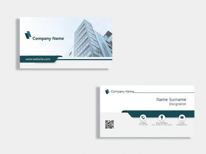
Building construction business card template




Try Before you Buy Download Free Sample Product
 Impress Your
 Audience
 100%
100% Editable
 Save Hours
 of Time


Our Building Construction Business Card Template are topically designed to provide an attractive backdrop to any subject. Use them to look like a presentation pro.
People who downloaded this PowerPoint presentation also viewed the following :
Building construction business card template with all 1 slides:
Use our Building Construction Business Card Template to effectively help you save your valuable time. They are readymade to fit into any presentation structure.
FAQs for Building construction
Okay so definitely include your name, job title, company, phone, email and website - those are non-negotiables. If you've got a logo, throw that on there too. LinkedIn might be worth adding depending on your field. Honestly, I'd skip the physical address unless clients actually need to find you. White space is clutch - don't try to fit everything and the kitchen sink on one tiny card! Keep fonts readable (nobody's got time to decode microscopic text) and stick to maybe 2-3 colors max. Oh, and print a test batch first before going all-in on 500 cards.
Dude, color psychology is huge for business cards. Blue screams trust and professionalism - that's why every bank uses it. Red's all about energy and urgency. Green works perfectly for finance or anything eco-friendly. Black? Pure luxury vibes. Orange is where it gets weird though - super energetic but can look tacky if you go overboard. I learned that the hard way once. Don't just pick whatever looks pretty to you. Think about what feeling you want clients to have when they grab your card. Match it to your industry's vibe.
Honestly, just go with something clean like Helvetica or Arial - they're easy to read when tiny. If you're in something stuffy like law or finance, maybe Times New Roman works better. But seriously, skip anything fancy or script-y because people shouldn't need a magnifying glass to figure out your email. I'd do at least 8-10pt for the main stuff. Oh, and don't mix more than two fonts or it looks like a ransom note. Pick one and roll with it - boring beats unreadable every time.
Think of your business card as a tiny billboard that screams "this is who we are!" Start with your brand colors and fonts – people should recognize your vibe instantly. Creative types can get wild with shapes or textures (just make sure it still fits in a wallet, ha). Professional services? Clean lines and nice paper stock say "we've got our stuff together." Even weird details like paper texture tell your story. Oh, and here's what actually helps: write down your top 3 brand values first. Then look at every design choice and ask if it backs those up.
Dude, whitespace is everything on business cards. Your eyes need somewhere to rest, you know? I've seen way too many cards that look like someone threw up text all over them - total mess. Give your name and contact info room to breathe with decent margins and space between sections. Don't crowd your logo either. Honestly, most people are scared of empty space, but that's what makes cards look expensive instead of like you designed them at Kinko's. If you're thinking "this looks too bare," you're probably almost there.
Look, when someone hands you a metal business card or one shaped like a tiny pizza slice, you're definitely not tossing it. Standard rectangles just get lost in the pile, you know? Die-cut shapes work great if they actually match what you do - I've seen some pretty clever ones. Textured paper feels nice too. Just don't go overboard like that restaurant owner who made mini cutting boards (though honestly, I still remember him years later, so maybe it worked?). The trick is picking something that fits your vibe, not just being random about it.
Don't go smaller than 0.5 inches or it'll be impossible to read. Your resolution needs to be at least 300 DPI - trust me on this one, pixelated logos look amateur. Top left or center usually works best for placement. Just don't make it huge and overwhelming. Give it some breathing room so your contact info isn't all squished together. Oh, and if your logo has tiny details, definitely test print first because those little elements tend to vanish or get blurry. Vector files are your friend here - they'll scale perfectly no matter what size you need. Way better than trying to stretch a jpeg and having it look terrible.
Honestly, digital business cards blow printed ones out of the water. You can throw in clickable links, videos, your social profiles - even interactive stuff like maps. The coolest part? Update them instantly without dealing with reprinting costs (which adds up fast, trust me). Since you're not stuck with paper constraints, go wild with animations or embed your whole portfolio. I mean, you can literally link straight to your calendar for bookings. Way more engaging than handing someone a piece of cardstock. Start simple though - pick a basic template, then figure out what interactive features you'd actually use for networking.
You definitely need your name, job title, company, phone, and email - those are non-negotiable. Website URL is pretty standard too. Physical address depends on your situation honestly - if people actually visit your office, include it. But with everyone working remotely these days, it's not always crucial. Maybe throw in one social media handle if it's actually business-related (not your personal Instagram lol). Don't go overboard though. I've seen business cards so packed with info that you need a magnifying glass to read anything. Focus on whatever ways your clients prefer to reach you.
Hey! So for QR codes on business cards - definitely put yours in a corner or on the back so it doesn't clash with your main info. Size matters too, make it at least 0.8 inches or people won't be able to scan the damn thing. I learned this the hard way lol. Link it to something actually useful like your portfolio or LinkedIn, not just your basic contact info since that's already on the card. Oh, and test it before you print a bunch! Nothing's more embarrassing than handing out cards with dead codes. Keep some white space around it so phone cameras can pick it up easily.
Honestly, just match your industry's energy. Finance or law? Keep it super clean - black text, classic fonts, nothing flashy. But if you're in something creative like design, that's where you can actually have fun with colors and weird shapes. Healthcare should feel calm and trustworthy - blues and greens are your friend there. Here's what I'd do first though: check out what your successful competitors are using. It's basically free research, right? Your card needs to scream your industry before they even see your job title.
Ok so basically you want vector graphics, not regular images - they scale way better. Also pick fonts that don't get tiny and impossible to read when you shrink the card down. I learned this the hard way lol. Instead of setting fixed sizes for everything, use flexible spacing that adjusts proportionally. That way if someone wants mini cards or decides to blow it up for a poster later, it actually works. Oh and definitely test it at different sizes first! Trust me, what looks good at full size can look terrible small. Keep your contrast strong too - light gray text is nobody's friend.
Honestly, everyone's going super minimal now - tons of white space and really bold fonts. QR codes are finally having their moment (about time!), linking straight to portfolios or LinkedIn. Sustainable stuff is big too, like recycled paper. I'm seeing way more textured finishes and matte black with metallic accents looks sick. Oh, and people are ditching the boring rectangle shape completely. If you're redoing yours, clean typography is clutch. Definitely throw a QR code on there since people actually use them now instead of just staring at them confused lol.
Dude, swapping in your own graphics literally makes all the difference. Those templates are so boring until you add your logo and maybe a headshot. I always tell people to grab industry-specific icons too - like if you're a photographer, throw in a camera somewhere. Just make sure everything's high-res or it'll look terrible when printed (learned that the hard way). Your logo should replace those weird placeholder graphics first, then maybe add your photo if that's your vibe. Even a subtle background pattern helps. It's crazy how much more professional it looks once it's actually *yours*, you know?
Adobe Illustrator or InDesign are your best bet if you've got Creative Suite - they're what pros use for print stuff. Canva Pro works great too and it's way easier to learn. Figma's actually pretty decent for this, especially if your team already knows it. Oh, and Affinity Designer is solid if you don't want to spend Adobe money. Just make sure whatever you pick can spit out high-res PDFs with bleeds. Trust me, learned that one the hard way when my first batch came back looking weird at the edges.
-
Designs have enough space to add content.
-
Great designs, Easily Editable.
-
Design layout is very impressive.