


Product Capability Comparison Powerpoint Ppt Template Bundles





Try Before you Buy Download Free Sample Product
 Impress Your
 Audience
 100%
100% Editable
 Save Hours
 of Time


Our Product Capability Comparison Powerpoint Ppt Template Bundles are topically designed to provide an attractive backdrop to any subject. Use them to look like a presentation pro.
People who downloaded this PowerPoint presentation also viewed the following :
Product Capability Comparison Powerpoint Ppt Template Bundles with all 22 slides:
Use our Product Capability Comparison Powerpoint Ppt Template Bundles to effectively help you save your valuable time. They are readymade to fit into any presentation structure.







FAQs for Product Capability Comparison Powerpoint
Start with the basics - pricing, core features, and how well it plays with your existing tools. Speed and uptime matter big time (learned that one the hard way). Your team's gonna hate you if the learning curve is brutal, so factor that in. Security and support quality are non-negotiables. Oh, and don't get distracted by flashy features that look cool but won't actually help your specific situation. Set up a simple comparison chart using the same criteria for everything. Makes it way easier when you're presenting to the higher-ups.
Honestly, visualizing your data is a game changer for product comparisons. Those endless spreadsheet rows? Total nightmare to work through. Heat maps will save your sanity - they instantly show which products crush it in different areas. I used to waste so much time staring at capability matrices trying to make sense of everything. Now I just glance at a chart and the whole picture clicks. Bar charts work great too, especially when you're comparing like 3-5 key features. Way better than drowning in numbers all day.
Lead with what makes you different right away - don't bury your best stuff in boring feature lists. Do side-by-side comparisons so people can actually see the gaps between you and competitors. Pick 3-5 things that really matter to them, then show specific examples. I swear, most presentations just drone on about features without any context. Always connect your capabilities back to how they'll solve real problems. Like, don't just say "we have this cool feature" - explain why it's actually better than what they're dealing with now.
Honestly, it's all about who you're talking to. Technical teams want the nitty-gritty - performance specs, how things integrate, feature breakdowns. Executives? They just care about ROI and cost savings. Start talking API response times and watch their eyes glaze over lol. Sales prospects need to see how you'll fix their actual problems. Internal folks usually want adoption rates and user satisfaction stuff. I learned this the hard way after bombing a presentation to leadership with way too much technical detail. Just match your metrics to what they actually need for their decisions.
Honestly, I'd start with whatever analytics you've already got running - there's probably good stuff buried in there. Survey tools like Typeform or SurveyMonkey work great for getting structured feedback from users. But here's the thing - pairing that with actual usage data from Mixpanel or Amplitude gives you way better insights than just one approach. Airtable's perfect for keeping everything organized (I'm obsessed with it lately). If you're drowning in data, Tableau's solid, though Google Sheets with pivot tables does the job too. The combo approach is definitely worth it.
Honestly, real customer stories work way better than just comparing features on paper. Like, show how Company X crushed their workflow issues with Product A, but Company Y struggled and had to switch to Product B instead. Numbers help too - actual time saved, money cut, problems fixed. People relate to concrete examples so much more than boring capability lists. Your customer success team probably has tons of stories you could use (just change the names obviously). Trust me, stakeholders eat this stuff up compared to dry spec comparisons.
Don't overpromise stuff you can't actually pull off - that's what kills you later. Skip the endless feature lists too. Focus on solving real problems for your people instead. Oh and never trash talk competitors (honestly just makes you look desperate). Stick to facts and let your strengths do the talking. Compare apples to apples, not some cherry-picked nonsense. Always have proof ready. Be honest about limitations upfront too - your credibility's everything here.
Yeah, user reviews are tricky - they'll mess with how you see a product's actual capabilities. Happy customers oversell everything while frustrated ones trash stuff they probably didn't set up right. Look for patterns instead of getting caught up in individual rants (some people really do complain about everything, it's wild). Find reviews from people using it like you plan to. Cross-check what they're saying against the real specs too. Don't let one person's terrible experience ruin your whole evaluation - that's how you miss out on good products.
So competitive analysis is like doing homework on your rivals before launching anything. You're basically figuring out what everyone else offers, where they suck, and what gaps you can jump into. Think of it like scoping out the competition before a big game - except way more spreadsheets involved, lol. It helps you nail down your unique selling points and spot opportunities others missed. Plus you'll understand what customers expect since they're already using competitor products. My advice? Pick 3-5 direct competitors and build a feature matrix comparing everything side-by-side. Makes the whole picture way clearer.
Dude, nobody cares about your fancy feature list - they want to know what problems you're solving. Start with "here's what you can do now that you couldn't before" instead of boring technical specs. Show them before/after screenshots or quick demos they'll actually recognize from their day-to-day work. Charts showing time saved work great too. I mean, bullet points literally put people to sleep. Always connect each thing back to business value - like, will this save them hours or make their boss happy? Lead with the "so what" and let features back up that story.
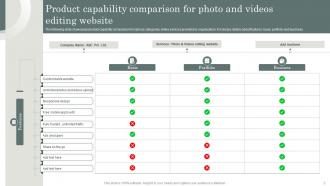
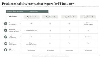
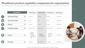
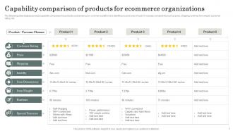
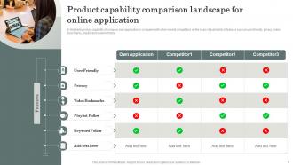
So for comparison slides, I'd go with a basic grid - your product on the left, competitors across the top. Green checks for "yes," red X's for "no," yellow for partial stuff. Don't try to cram everything in there though, it's just visual chaos. Pick your 5-7 strongest points instead of listing every tiny feature. Make the text big enough so people in back can actually read it (learned that one the hard way). Skip the fancy animations - they're distracting. Lead with your best advantages, then drop your absolute killer feature at the end. Trust me, that's what they'll remember walking out.
Honestly, skip the boring feature lists and tell stories instead. Start with real customer scenarios, then walk through how each option handles it. Interactive polls are clutch - have people vote on what matters most to them. I swear, nothing kills a room faster than someone just reading specs off slides. Keep a scorecard visible so they can track everything. Oh, and definitely encourage questions throughout, even interruptions. People get way more engaged when they can jump in. You'll probably find the Q&A stuff ends up being the most valuable part anyway.
Okay so for tech stuff, you're gonna want metrics like speed, uptime, security scores - basically anything proving it actually works and won't crash on them. Consumer products are way different though. Brand perception, purchase intent, satisfaction scores matter more since people buy that stuff with their feelings, not spreadsheets. Here's the thing - tech buyers need logical proof it won't screw them over. Consumer buyers? They just want to feel good about it. Honestly took me forever to figure this out when I started. Figure out if your audience thinks or feels their way through purchases, then match your metrics to that vibe.
Honestly, you gotta tailor your whole approach based on what each industry actually cares about. Healthcare folks obsess over compliance and patient outcomes - that's their world. Manufacturing? They want efficiency and whether your stuff plays nice with their existing systems. Retail's all about customer experience these days. Talk to a few prospects in each space first though - I learned this the hard way. What you think matters vs. what keeps them up at night can be wildly different. Once you know their real pain points, build your comparison around those specifics. Oh, and definitely use their lingo - sounds way more legit.
Honestly, you want to zero in on stuff your competitors literally can't do. That's where the magic happens. Build your comparison charts around those unique things first - skip the boring features everyone has. Think about it this way: what are your "only we can..." statements? Use real numbers and actual customer wins instead of fluffy benefits. I'd also frame everything around specific pain points your features solve. Way more powerful than just listing capabilities. The goal is making someone go "damn, this fixes exactly what I need" when they see what makes you different.
-
I had them make a presentation for an office retirement party. They were very helpful in understanding what we wanted and delivered the perfect presentation. Highly recommended!
-
I am extremely pleased with these PPT slides that we used for our event. They were easy to modify and came out great in all aspects!