


Product Launch KPI Performance Dashboard




Try Before you Buy Download Free Sample Product
 Impress Your
 Audience
 100%
100% Editable
 Save Hours
 of Time


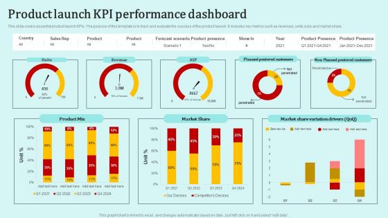
This slide covers essential product launch KPIs. The purpose of this template is to track and evaluate the success of the product launch. It includes key metrics such as revenues, units sold, and market share.
People who downloaded this PowerPoint presentation also viewed the following :
Product Launch KPI Performance Dashboard with all 10 slides:
Use our Product Launch KPI Performance Dashboard to effectively help you save your valuable time. They are readymade to fit into any presentation structure.








FAQs for Product Launch
KPI dashboards deliver real-time visibility, centralized data analysis, improved decision-making speed, enhanced accountability, and streamlined performance monitoring across departments. These tools enable organizations to identify trends quickly, allocate resources more effectively, and respond to market changes proactively, with many businesses finding that dashboard implementation ultimately drives measurable improvements in operational efficiency and competitive positioning.
Organizations ensure real-time KPI dashboard visibility through automated data integration, cloud-based analytics platforms, API connections, and streamlined data pipelines that eliminate manual updates. By implementing these technologies, companies across sectors like manufacturing, retail, and financial services can monitor performance metrics instantly, enabling faster decision-making, improved operational efficiency, and enhanced competitive responsiveness in dynamic market conditions.
Marketing KPI dashboards should prioritize lead generation metrics, conversion rates, customer acquisition costs, return on ad spend, and brand awareness indicators. These metrics enable marketing teams to track campaign effectiveness, optimize budget allocation, and demonstrate ROI impact across channels, with many organizations finding that combining acquisition and retention metrics delivers comprehensive performance visibility and strategic decision-making capabilities.
Industries customize KPI dashboards by prioritizing metrics aligned with their core operational objectives, regulatory requirements, and customer expectations. Retail organizations focus on inventory turnover and conversion rates, while healthcare institutions emphasize patient outcomes and compliance metrics, and manufacturing companies track production efficiency and quality control, ultimately enabling sector-specific decision-making and competitive advantage.
Data visualization transforms KPI dashboards by converting complex datasets into intuitive charts, graphs, heat maps, and trend lines that enable instant comprehension and pattern recognition. Through strategic visual elements, organizations streamline decision-making processes, identify performance gaps more rapidly, and enhance stakeholder engagement, with many executives finding that well-designed visualizations significantly accelerate strategic responses and operational adjustments.
Organizations balance comprehensive data with dashboard simplicity by implementing layered information architecture, prioritizing critical metrics on main views, and using progressive disclosure techniques. Through role-based customization and interactive drill-down capabilities, teams can access essential KPIs immediately while maintaining deeper analytics availability, with many finding that strategic filtering and visual hierarchies ultimately deliver both usability and analytical depth.
Common pitfalls include displaying too many metrics, using unclear visualizations, lacking data accuracy, ignoring user needs, and failing to align KPIs with strategic objectives. These design flaws overwhelm decision-makers and reduce dashboard effectiveness, with many organizations finding that focusing on 5-7 key metrics, ensuring real-time data integration, and regular stakeholder feedback ultimately delivers actionable insights and improved performance tracking.
KPI dashboards drive strategic decision-making by providing real-time visibility into performance metrics, identifying trends and patterns, and highlighting areas requiring immediate attention or investment. Through centralized data visualization, executives can quickly assess operational efficiency, track progress against strategic goals, and allocate resources more effectively, with many organizations finding that dashboard-driven insights accelerate response times and improve competitive positioning.
Effective KPI dashboard tools include Tableau, Power BI, Google Data Studio, Qlik Sense, and Looker, each offering robust visualization and real-time data integration capabilities. These platforms streamline dashboard creation through drag-and-drop interfaces, automated data refreshing, and customizable analytics, with many organizations finding that cloud-based solutions deliver faster deployment and enhanced collaboration across departments.
KPI dashboard success is measured through user adoption rates, decision-making speed improvements, data accuracy levels, and achievement of targeted business outcomes. Organizations typically track metrics like dashboard utilization frequency, time-to-insight reductions, and whether key performance indicators show measurable improvements, with many finding that successful dashboards ultimately enhance operational efficiency and strategic decision-making across departments.
User feedback mechanisms include surveys, usability testing sessions, focus groups, A/B testing, and analytics tracking of user behavior patterns. These approaches enhance dashboard design by identifying navigation pain points, optimizing data visualization clarity, and streamlining report generation workflows, with many organizations finding that regular feedback cycles ultimately deliver more intuitive interfaces and faster decision-making capabilities.
KPI dashboards should be updated based on business needs and data criticality, with real-time updates for operational metrics, daily updates for sales and customer data, and weekly or monthly updates for strategic indicators. Many organizations find that automated, frequent updates enhance decision-making speed and accuracy, while manual quarterly reviews ensure strategic alignment and competitive advantage.
Mobile-friendly KPI dashboards significantly enhance remote team performance by providing real-time access to critical metrics, enabling faster decision-making, and maintaining alignment across distributed workforces. These platforms streamline communication, reduce response times, and improve accountability, with many organizations finding that mobile accessibility increases team engagement by up to 40%, ultimately delivering better project outcomes and operational efficiency.
Integration with other software enhances KPI dashboard functionality by enabling real-time data synchronization, automated reporting, and comprehensive analytics across multiple business systems. Through API connections and cloud-based platforms, organizations streamline data collection from CRM, ERP, and financial systems, ultimately delivering unified insights, reducing manual data entry, and enabling faster strategic decision-making across departments.
Future trends influencing KPI dashboard evolution include artificial intelligence for predictive insights, real-time streaming analytics, natural language processing for conversational queries, augmented analytics with automated pattern detection, and mobile-first responsive designs. These technologies enhance decision-making by delivering faster insights, reducing manual analysis, and enabling executives to access critical performance data seamlessly across devices, ultimately providing competitive advantages through more agile business responses.
-
I've been looking for a good template source for some time. I'm happy that I discovered SlideTeam. Excellent presentations must try!
-
“One of the best experiences with SlideTeam for my presentation.Everything on time, communication is efficient and price is reasonable. All good in one place.”