


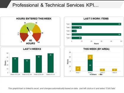
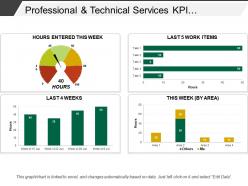
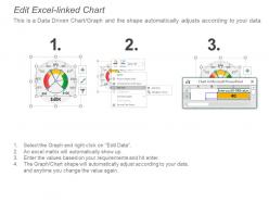
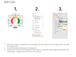
Professional and technical services kpi dashboard snapshot showing timesheet




Try Before you Buy Download Free Sample Product
 Impress Your
 Audience
 100%
100% Editable
 Save Hours
 of Time


Handle diversions that arise with our Professional And Technical Services Kpi Dashboard Snapshot Showing Timesheet. Get back on course at the earliest.
People who downloaded this PowerPoint presentation also viewed the following :
Professional and technical services kpi dashboard snapshot showing timesheet with all 6 slides:
Increase awareness of important information with our Professional And Technical Services Kpi Dashboard Snapshot Showing Timesheet. Highlight crucial inputs.
FAQs for Professional and technical services kpi dashboard
Effective KPI dashboard components include real-time data visualization, customizable metrics displays, automated alerts and notifications, interactive filtering capabilities, and mobile accessibility features. These elements streamline performance monitoring by enabling instant insights, reducing manual reporting tasks, and facilitating data-driven decisions, with many organizations finding that well-designed dashboards ultimately enhance operational efficiency and strategic alignment.
Businesses can determine relevant KPIs by analyzing industry benchmarks, regulatory requirements, customer expectations, and core operational processes specific to their sector. Financial services typically focus on risk metrics and compliance ratios, while retail emphasizes conversion rates and inventory turnover, with many organizations finding that combining leading and lagging indicators delivers the most comprehensive performance insights.
Leading KPI dashboard tools include Tableau, Power BI, Qlik Sense, Looker, and Sisense, each offering robust customization capabilities through drag-and-drop interfaces, real-time data integration, and flexible visualization options. These platforms enable organizations to streamline performance monitoring, enhance decision-making through automated reporting, and deliver personalized executive insights, with many companies finding significant improvements in operational efficiency and strategic alignment.
KPI dashboards should be updated based on data criticality and business needs, with real-time updates for operational metrics, daily updates for sales performance, weekly updates for project tracking, and monthly updates for strategic indicators. Many organizations find that automated, frequency-matched updates enhance decision-making speed and accuracy, while reducing manual reporting burdens and ultimately delivering more responsive business intelligence.
Data visualization transforms KPI dashboards by converting complex datasets into intuitive charts, graphs, heat maps, and trend lines that enable instant pattern recognition and decision-making. Through strategic visual design, organizations streamline performance monitoring, enhance stakeholder communication, and accelerate response times to critical metrics, with many executives finding that visual dashboards deliver significantly faster insights than traditional reporting methods.
Organizations ensure data integrity within their KPI dashboards by implementing automated validation protocols, establishing standardized data collection procedures, and conducting regular accuracy audits across all sources. Through real-time monitoring systems, companies streamline error detection, enhance reporting consistency, and maintain reliable metrics, with many financial institutions and healthcare organizations finding that these practices ultimately deliver improved decision-making capabilities.
Common KPI dashboard mistakes include overcrowding with excessive metrics, poor visual hierarchy, irrelevant data inclusion, lack of real-time updates, and unclear target definitions. These design flaws confuse stakeholders by obscuring critical insights, delaying decision-making processes, and reducing user adoption across organizations, ultimately undermining the dashboard's strategic value and operational effectiveness.
KPI dashboards can be tailored through customized metrics, role-based access controls, department-specific visualizations, personalized alerts, and flexible reporting frameworks that align with unique operational goals. Sales teams might focus on conversion rates and pipeline metrics, while HR departments track employee satisfaction and retention rates, with many organizations finding that targeted dashboards enhance decision-making efficiency and cross-departmental accountability.
Leading indicators predict future performance and include metrics like sales pipeline value, employee engagement scores, and customer acquisition rates, while lagging indicators measure past results such as revenue, profit margins, and customer satisfaction scores. These complementary metrics enable organizations to balance forward-looking strategic planning with historical performance analysis, ultimately delivering comprehensive business intelligence that enhances decision-making across departments.
Real-time data integration enhances KPI dashboard value by providing immediate visibility into performance metrics, eliminating data delays, and enabling rapid response to emerging trends or issues. This continuous data flow allows organizations to make informed decisions quickly, identify opportunities or problems as they occur, and maintain competitive advantage through timely strategic adjustments.
User-friendly KPI dashboard approaches include intuitive navigation design, customizable layouts, mobile optimization, interactive filtering options, and clear visual hierarchies with consistent color coding. These design strategies enhance user adoption by reducing cognitive load, enabling personalized experiences, and streamlining decision-making processes, with many organizations finding that simplified interfaces significantly improve executive engagement and data utilization rates.
KPI dashboards enhance decision-making by providing real-time visibility into performance metrics, identifying trends and patterns, and highlighting areas requiring immediate attention. These strategic tools enable executives to make data-driven decisions quickly, allocate resources more effectively, and adjust strategic priorities based on actual performance, with many organizations finding that centralized dashboards significantly improve operational efficiency and competitive positioning.
**INPUT**: What metrics should be prioritized for a sales performance KPI dashboard? **OUTPUT**: Sales performance KPI dashboards should prioritize revenue metrics, conversion rates, pipeline velocity, customer acquisition costs, and lead-to-close ratios. These metrics enable organizations to streamline forecasting, enhance territory management, and optimize resource allocation, with many sales teams finding that combining leading and lagging indicators ultimately delivers improved quota attainment and competitive advantage. **Word count: 54 words**
Cultural differences significantly impact KPI interpretation through varying communication styles, risk tolerance levels, time orientations, and performance measurement preferences across regions. Global organizations increasingly find that localizing dashboard presentations, incorporating cultural context into metric definitions, and training cross-cultural teams enhances data comprehension, ultimately delivering more accurate insights and strategic alignment.
Future trends in KPI dashboard development include AI-powered predictive analytics, real-time data streaming, mobile-first design, voice-activated interfaces, and automated anomaly detection. These technologies streamline decision-making by delivering instant insights, enhancing accessibility, and minimizing manual monitoring, with many organizations finding that predictive capabilities ultimately provide significant competitive advantage in increasingly data-driven markets.
-
Top Quality presentations that are easily editable.
-
Innovative and Colorful designs.