


Project Planner With Duration And Cost Location Project Management Bundle




Try Before you Buy Download Free Sample Product
 Impress Your
 Audience
 100%
100% Editable
 Save Hours
 of Time


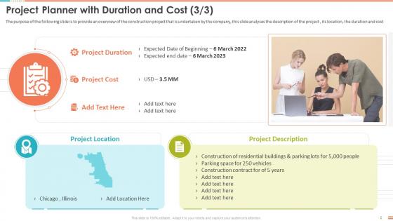
The purpose of the following slide is to provide an overview of the construction project that is undertaken by the company, this slide analyses the description of the project , its location, the duration and cost.
People who downloaded this PowerPoint presentation also viewed the following :
Project Planner With Duration And Cost Location Project Management Bundle with all 6 slides:
Use our Project Planner With Duration And Cost Location Project Management Bundle to effectively help you save your valuable time. They are readymade to fit into any presentation structure.





FAQs for Project Planner With Duration And Cost Location
So you'll definitely want task lists with deadlines and some kind of visual timeline - Gantt charts work great. Resource tracking is huge too, like who's assigned to what and budget stuff. Progress bars showing completion percentages are super helpful. Oh, and don't forget risk assessment sections! I swear, half the templates out there look amazing but miss the obvious stuff. Status updates for stakeholders are clutch. Priority levels that you can customize make life easier. Dependencies between tasks matter more than people think. Start simple with these basics - you can get fancy later once everything's working smoothly.
Honestly, visual stuff is a total game-changer for project management. Color coding lets people instantly see what's urgent (red) versus what's done (green). Progress bars and icons beat walls of text every time. Your team won't have to squint at spreadsheets anymore trying to figure out who's doing what. Gantt charts show dependencies really well too - though they can look intimidating at first. Status meetings get way shorter because everyone can see project health at a glance. Definitely add visual indicators to your next template.
Honestly, templates are lifesavers for avoiding those "oh crap, I totally forgot about X" moments. You know how you'll be cruising along on a project, then suddenly realize you needed someone's approval like two weeks ago? Templates make you think through all that stuff upfront. They're also huge for preventing scope creep - everything's defined from day one so clients can't randomly add features. Resource planning becomes way easier too. I mean, I used to wing it every time and always ended up scrambling. Now I just grab my go-to template and tweak it. Way less stressful.
You really should customize those templates to fit your industry - it saves so much hassle later. Like construction crews need permit milestones, but marketing teams care more about campaign deadlines and creative reviews. Healthcare projects? They've got compliance stuff that tech startups never touch. I learned this the hard way on a project last year. When your template already includes the typical phases and deliverables for your field, nobody's scrambling to adapt some generic format. Just pick your 3-4 most common project types and build around those. Trust me, it's worth the upfront work.
So timeline viz is like having a roadmap for your project - shows when stuff needs to happen and how it all connects. Super helpful for catching bottlenecks early and seeing if anyone's gonna be swamped. Plus stakeholders stop bugging you with "when's this done?" every five minutes lol. Way easier to explain progress visually than drowning people in spreadsheet hell. Honestly, just grab a basic Gantt chart template to start. Don't overthink it - you can make it fancier once your team actually uses the thing.
Yeah, pretty much any PM methodology works with templates. Agile/Scrum are obvious ones - great for sprint planning and user stories. Waterfall templates are solid for those step-by-step projects with clear checkpoints. Honestly, Kanban boards are my go-to though - something about the visual workflow just clicks for me. You can even get fancy with PRINCE2 or Six Sigma if that's your team's thing. The trick is don't try to jam your methodology into some generic template that doesn't fit. Just pick whatever your team already knows and build from there.
Honestly, digital templates are game-changers for remote teams. Everyone can jump in and see what's happening without those annoying "which version are we using?" conversations. No more digging through email chains either - thank god. Templates keep everyone on the same page about deadlines and who's handling what. Most have built-in notifications too, so people actually know when stuff gets updated. The trick is getting your whole team to stick with ONE template consistently. Otherwise you're back to chaos. Pick something simple to start and make sure everyone's actually using it.
So here's what actually works - build your budget tracking right into your project timeline instead of keeping them separate. Map budget items to specific milestones with planned vs actual cost columns. Trust me, I tried managing budgets in different spreadsheets once and it was a complete mess to keep everything synced up. Set up alerts when you hit like 80% of your budget thresholds. Always pad things with 10-15% extra because something always goes sideways. Track both your actual costs and time expenses - that second part trips people up. Oh, and make budget reviews a weekly thing so it becomes automatic, not this big stressful event you avoid.
So basically, small business templates are super straightforward - just task lists, deadlines, maybe a simple Gantt chart. Enterprise stuff though? Total different beast. You're dealing with multiple departments, budget tracking, compliance reports, the whole nine yards. I made the mistake of using an enterprise template for my 5-person team once - what a headache! Small biz templates prioritize getting things done fast. Enterprise versions handle all the bureaucratic stuff that big companies need. Just match it to your team size and you'll be fine. Don't get distracted by fancy features you won't use.
Oh nice! Project planner templates are great for tracking metrics without making it a huge pain. I'd start with the basics - timeline stuff (hitting deadlines), budget variance, and task completion rates. Resource utilization is huge too. Honestly, milestone progress is my favorite because it actually keeps people excited about moving forward. Team workload distribution helps avoid burnout situations. Quality metrics and stakeholder satisfaction are solid picks if those matter for your project. The cool thing? Templates automate most of this data collection. Pick 3-4 that actually matter to you first, then add more later.
Focus on three main things: visual stuff, making it easy to understand, and screen reader compatibility. High contrast colors work best - plus bigger fonts, at least 12pt. Don't just use color to show important info, throw in some icons or labels too. Break complicated tasks into smaller pieces and ditch the fancy jargon for plain English. Clean layouts are your friend here. Honestly, this makes everything better for everyone, not just people with disabilities. Screen readers need proper headings and alt text for images. Oh, and test one template with your team first - they'll definitely let you know what's broken!
Stick to clean fonts and lots of white space - makes everything way easier to read. I'd go with maybe 2-3 colors tops because more than that gets chaotic fast. Good visual hierarchy is clutch though - use different font sizes to show what matters most. Oh and those clear section breaks? Total game changer for organizing content. I've watched people throw in like 8 different fonts and it looks absolutely terrible. Start simple with a basic template, then add visual stuff slowly instead of cramming everything in right away. Trust me on this one.
Dude, those risk management sections in project templates are actually clutch. You're basically forced to think about what'll go sideways before it does - and trust me, it will. I used to skip that part thinking it was just extra paperwork, but now I always fill out the potential roadblocks and backup plans. Makes you look way more prepared when stuff hits the fan. Your team won't be running around panicking because you've already thought through the worst-case scenarios. Stakeholders eat that stuff up too.
User feedback is your best friend for improving those templates. People will tell you straight up what's confusing or what they keep skipping - that's pure gold right there. I've watched templates get completely overhauled just because someone mentioned they couldn't find a spot for budget tracking (seems obvious now, right?). You can add missing sections, streamline the messy parts, or even create different versions for different team types. The trick is actually asking for input through quick surveys or just watching how people use them. Then you've gotta act on it instead of letting those suggestions collect dust.
Honestly, start with bigger buttons - can't tell you how annoying it is trying to tap tiny links on mobile. Cut down those long forms too, use dropdowns instead of making people type everything out. Put your most important stuff right at the top since phone screens are so cramped. I'd also make sections collapsible so people aren't scrolling forever. The text size thing is huge - if I have to pinch to zoom, I'm probably just gonna wait til I'm back at my desk. Oh and definitely test it on your actual phone first, not just the browser preview thing. Trust me on that one.
-
Great product with highly impressive and engaging designs.
-
Attractive design and informative presentation.