


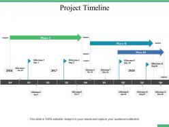
Project timeline ppt professional design inspiration





Try Before you Buy Download Free Sample Product
 Impress Your
 Audience
 100%
100% Editable
 Save Hours
 of Time


Highlight the intelligence folks have displayed with our Project Timeline Ppt Professional Design Inspiration. Be able to applaud the jubilant.
People who downloaded this PowerPoint presentation also viewed the following :
Project timeline ppt professional design inspiration with all 5 slides:
Build an excellent foundation with our Project Timeline Ppt Professional Design Inspiration. They help build a concrete base.
FAQs for Project timeline ppt
Effective project timeline presentations include clear milestone markers, task dependencies, resource allocation details, progress indicators, and risk assessment points. These elements streamline project communication by providing stakeholders with comprehensive visibility into deliverables, deadlines, and potential bottlenecks, with many organizations finding that well-structured timelines enhance team coordination and ultimately deliver improved project outcomes.
Visual design enhances project timeline understanding by using color coding, clear typography, milestone markers, progress indicators, and intuitive layouts that make complex schedules immediately digestible. Through strategic visual hierarchy and consistent formatting, teams can quickly identify critical paths, resource allocations, and potential bottlenecks, ultimately streamlining project coordination and reducing miscommunication across departments.
Blue-to-green gradients, sequential color progressions, and high-contrast combinations are most effective for chronological timeline presentations. These schemes enhance visual flow by guiding viewers naturally through temporal sequences, with many project managers finding that cooler blues for past events transitioning to warmer greens for future milestones creates intuitive comprehension and professional credibility.
Choosing the right timeline format depends on your project complexity, audience needs, and presentation goals, with linear timelines working best for sequential processes, circular formats highlighting cyclical projects, and Gantt charts excelling for complex, multi-track initiatives. Consider your stakeholders' familiarity with project management tools, the level of detail required, and whether you're emphasizing chronological flow versus resource dependencies, with many project managers finding that simpler formats enhance stakeholder engagement while detailed Gantt charts better serve operational teams.
Common mistakes include overcrowding slides with excessive detail, using inconsistent formatting across timeline elements, neglecting to highlight critical milestones, and failing to align timelines with audience expertise levels. These design pitfalls often confuse stakeholders and dilute key messages, with many project managers finding that clean, structured presentations with clear visual hierarchy ultimately enhance decision-making and secure stronger project buy-in.
Icons and imagery enhance project timeline clarity by creating visual hierarchies, representing different project phases, and establishing instant recognition patterns for stakeholders. Through strategic visual elements, teams streamline communication across departments, reduce interpretation errors, and accelerate decision-making processes, with many organizations finding that visual timelines improve project comprehension and stakeholder engagement significantly.
Typography significantly enhances project timeline legibility through strategic font selection, appropriate sizing, consistent hierarchy, and optimal spacing between elements. Clear, sans-serif fonts paired with sufficient contrast and well-structured text layers enable stakeholders to quickly navigate complex project phases, milestones, and dependencies, ultimately delivering improved comprehension and more effective project communication across teams.
Animation and transitions enhance timeline presentations by using subtle fade-ins for milestones, smooth horizontal scrolling between phases, and progressive reveal techniques that guide audience attention naturally. These creative elements streamline information delivery by maintaining visual hierarchy, emphasizing critical deadlines, and creating logical flow patterns, with many organizations finding that strategic animation ultimately improves audience engagement while preserving professional credibility.
Tools for creating visually appealing project timeline presentations include Microsoft PowerPoint, Canva, Prezi, Lucidchart, Smartsheet, and specialized platforms like Timeline Maker Pro. These solutions streamline project visualization by offering customizable templates, drag-and-drop functionality, and collaborative features, with many project managers finding that professional timeline designs enhance stakeholder engagement and deliver clearer communication outcomes.
Project timeline updates during presentations should occur at major milestone completions, scope changes, resource shifts, and when critical path adjustments emerge. The frequency depends on project complexity and stakeholder expectations, with many organizations finding that bi-weekly or monthly updates maintain transparency while avoiding information overload, ultimately delivering better project visibility and stakeholder confidence.
Interactive elements like clickable milestones, progress animations, and real-time status updates help maintain audience attention during timeline presentations. Strategic use of visual storytelling through color-coded phases, milestone celebrations, and stakeholder spotlights keeps viewers invested, with many project managers finding that incorporating brief video updates and interactive dashboards significantly increases stakeholder participation and project buy-in.
Incorporating feedback improves project timeline presentations through stakeholder surveys, design reviews, usability testing, and iterative refinements based on audience comprehension. Organizations across industries streamline their project communications by analyzing viewer responses, adjusting visual hierarchy and data density, ultimately delivering clearer timelines that enhance decision-making and project alignment.
Timeline presentation requirements vary significantly across industries, with technology emphasizing agile sprints and rapid iterations, healthcare focusing on regulatory compliance and patient safety milestones, and construction highlighting sequential phases and resource dependencies. These sector-specific approaches enable organizations to communicate project progress effectively to stakeholders, with many finding that industry-tailored timelines enhance decision-making and strategic alignment.
Balancing detail and simplicity in timeline presentations involves strategic layering, using visual hierarchies to highlight key milestones, phases, and dependencies while minimizing text-heavy descriptions. Through color coding, progressive disclosure techniques, and milestone groupings, project managers can streamline complex schedules into digestible formats, ultimately delivering clarity for stakeholders while maintaining comprehensive project oversight and accountability.
Effective timeline presentations require layered communication strategies, starting with high-level milestones for executives while providing detailed breakdowns for project teams and technical stakeholders. Begin with visual hierarchy using color coding and clear phase distinctions, then offer supplementary drill-down views that accommodate different audience needs, ultimately ensuring all stakeholders understand dependencies, critical paths, and their specific involvement levels.
No Reviews