


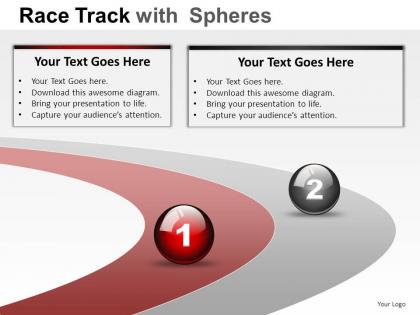
Race track with spheres powerpoint presentation slides




Try Before you Buy Download Free Sample Product
 Impress Your
 Audience
 100%
100% Editable
 Save Hours
 of Time


Competition in the presentation world can be brutal. Get the edge through world class Race Track With Spheres Powerpoint Presentation Slides for all of your presentation needs.
People who downloaded this PowerPoint presentation also viewed the following :
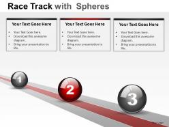
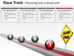
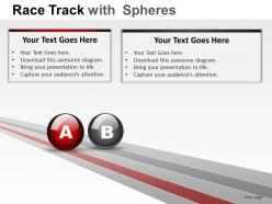
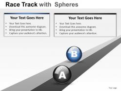
Race track with spheres powerpoint presentation slides with all 28 slides:
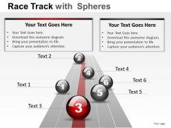
Dissect the information with our Race Track With Spheres Powerpoint Presentation Slides. Identify the key components.
FAQs for Race track with spheres
Race track spheres feature dynamic circular layouts, 3D visual depth, interactive navigation paths, seamless content flow, and engaging spherical animations that create immersive viewer experiences. These innovative design elements streamline complex data presentation by enhancing visual storytelling, improving audience retention, and delivering memorable presentations, with many organizations finding that spherical formats significantly boost engagement rates compared to traditional linear slide structures.
Race track spheres enhance audience engagement by creating dynamic visual pathways that guide attention through complex processes, comparative data, and sequential workflows in an intuitive, circular format. These engaging designs streamline information delivery across sectors like project management, sales funnels, and strategic planning, with many presenters finding that the spherical elements maintain viewer focus while delivering clearer comprehension and stronger retention.
Race track spheres benefit strategic presentations showcasing competitive positioning, market analysis, process workflows, and performance comparisons across multiple departments or business units. These visual elements enhance executive dashboards, quarterly reviews, and project milestone presentations by creating clear pathways between interconnected concepts, with many organizations finding that the circular flow effectively demonstrates continuous improvement cycles and competitive advantages.
Race track spheres facilitate clearer data storytelling by visualizing cyclical processes, comparative metrics, and multi-stage workflows through intuitive circular formats that guide audience attention naturally. These dynamic visual elements streamline complex information presentation, enabling presenters to demonstrate interconnected data relationships, progress tracking, and performance comparisons more effectively, ultimately delivering enhanced audience comprehension and more compelling business narratives.
Race track spheres can be extensively customized through color schemes, fonts, logos, icons, and visual elements that reflect your organization's brand guidelines and corporate identity. These presentation templates enable seamless integration with existing brand assets, allowing companies across industries like automotive, sports marketing, and corporate training to maintain consistent visual messaging while delivering dynamic, engaging content that reinforces brand recognition and professional credibility.
**INPUT**: What are some tips for effectively integrating race track spheres into an existing PowerPoint template? **OUTPUT**: Effective integration involves matching sphere colors to your template's palette, aligning sizes with existing visual elements, maintaining consistent spacing throughout slides, and ensuring spheres complement rather than compete with your content hierarchy. These visual elements streamline complex process flows by creating intuitive pathways, enhancing audience comprehension, and delivering professional presentations that maintain brand consistency while improving information retention across diverse business contexts.
Race track spheres visually represent competitive analysis by positioning competitors as circular elements along curved pathways, clearly showing market positioning, performance gaps, and competitive distances between companies. This dynamic layout enables presenters to demonstrate market leaders, followers, and laggards through spatial relationships, while the spherical design emphasizes movement and strategic positioning, ultimately delivering intuitive competitive insights that traditional charts cannot achieve.
PowerPoint's built-in 3D models, SmartArt graphics, and shape tools effectively create race track sphere visuals, while specialized software like Adobe Illustrator, Canva Pro, and SketchUp enhance design complexity before importing. These tools streamline the creation process by offering customizable templates, advanced rendering capabilities, and seamless PowerPoint integration, with many presentation designers finding that combining native PowerPoint features with external graphics delivers professional, engaging race track sphere presentations.
Race track spheres simplify complex data by transforming linear information into circular, visually intuitive formats that highlight relationships, progression stages, and interconnected processes. This spherical approach enables audiences to quickly grasp data flow patterns, identify bottlenecks or opportunities within cyclical business processes, and understand how different metrics influence each other, ultimately delivering enhanced comprehension and faster decision-making across presentations.
Common pitfalls include overcrowding spheres with excessive text, using inconsistent sizing that confuses hierarchy, selecting poor color contrasts that reduce readability, and failing to align elements properly within the circular format. These design missteps can undermine message clarity and audience engagement, with many presenters finding that strategic simplification, consistent visual standards, and purposeful sphere placement ultimately deliver more impactful presentations and stronger stakeholder comprehension.
Race track spheres support new product introductions by providing a circular visual framework that demonstrates product journey stages, development phases, market entry points, and competitive positioning in one cohesive flow. This presentation format enables businesses to showcase how new offerings integrate with existing portfolios, target different customer segments, and create strategic market advantages, while helping audiences visualize the complete product lifecycle and implementation timeline effectively.
Colors and design elements in race track spheres create visual hierarchy, guide audience attention, and enhance data comprehension through strategic contrast, consistent branding, and intuitive flow patterns. These design choices streamline information processing by establishing clear pathways, highlighting key performance metrics, and maintaining engagement, with many organizations finding that well-designed spherical presentations ultimately deliver more impactful communications and stronger audience retention.
Race track spheres effectively highlight project milestones by visually mapping key achievements along a circular timeline, enabling presenters to showcase progress phases, critical deadlines, and completion percentages in an engaging format. This approach transforms traditional project tracking into dynamic visual storytelling, with many project managers finding that the spherical progression clearly demonstrates momentum, helps stakeholders quickly identify bottlenecks, and ultimately delivers enhanced project transparency and stakeholder engagement.
**INPUT**: What audience feedback has been received regarding race track spheres compared to traditional slides? **OUTPUT**: Audience feedback regarding race track spheres consistently highlights improved engagement, clearer process visualization, enhanced flow comprehension, and stronger retention compared to traditional linear slides. Presenters across industries, including project management, sales processes, and training departments, report that audiences find the circular format more intuitive for understanding cyclical workflows, ultimately delivering better presentation outcomes and increased audience participation.
Race track spheres excel in industries requiring process visualization and cyclical workflow representation, including manufacturing, logistics, healthcare, financial services, and project management consulting. These versatile presentation elements effectively illustrate continuous improvement cycles, supply chain operations, patient care pathways, and strategic planning processes, with many organizations finding that the spherical format enhances audience engagement while clearly demonstrating interconnected business relationships.
-
Design layout is very impressive.
-
Unique and attractive product design.