


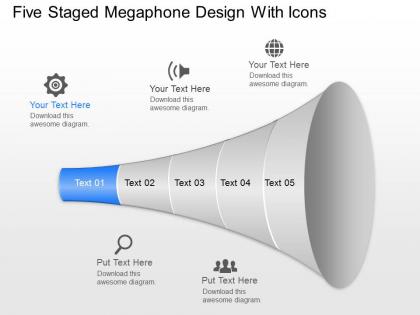
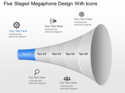
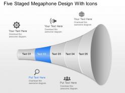
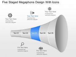
Rg five staged megaphone design with icons powerpoint template




Try Before you Buy Download Free Sample Product
 Impress Your
 Audience
 100%
100% Editable
 Save Hours
 of Time


Foster aggressive growth with our Rg Five Staged Megaphone Design With Icons Powerpoint Template. Be at the forefront of the coming boom.
People who downloaded this PowerPoint presentation also viewed the following :
Rg five staged megaphone design with icons powerpoint template with all 8 slides:
Call their bluff with our Rg Five Staged Megaphone Design With Icons Powerpoint Template. Display capability for determined action.
FAQs for Rg five staged megaphone design with
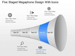
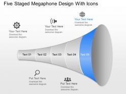
A five-staged megaphone design visually represents progressive communication amplification, making it ideal for showcasing product launches, marketing campaigns, awareness strategies, and cascading organizational announcements. This template enables presenters to demonstrate how messages gain momentum through sequential stages, with many organizations finding that the megaphone metaphor effectively illustrates strategic communication flows and audience reach expansion.
Icons enhance megaphone stage comprehension by providing instant visual recognition, reducing cognitive load, and creating memorable associations for each phase. Through strategic icon placement, organizations streamline complex processes into digestible visual elements, enabling audiences to quickly grasp stage relationships and sequential flow, ultimately delivering clearer presentations and improved stakeholder understanding.
Marketing agencies, corporate communications teams, educational institutions, consulting firms, and project management offices benefit most from five-staged megaphone templates. These sectors leverage the visual framework to streamline campaign launches, policy rollouts, training programs, and strategic initiatives, with many organizations finding that the structured approach enhances message clarity and audience engagement across complex communication processes.
A megaphone design enhances presentation communication by creating visual hierarchy, directing audience attention to key messages, amplifying important concepts, and establishing clear information flow through its expanding structure. This design approach enables presenters to systematically build their narrative, guide viewers through complex ideas with intuitive visual cues, and ensure critical information resonates effectively with audiences.
Effective megaphone designs typically use bold, high-contrast colors like red, orange, or blue paired with clean, minimalist styling to maximize visual impact and readability. These color choices work particularly well in corporate presentations, marketing campaigns, and educational materials, with many organizations finding that strategic color combinations enhance message clarity, improve audience engagement, and ultimately deliver stronger communication outcomes across diverse business contexts.
Best practices for integrating visuals with text in five-staged megaphone templates include maintaining consistent icon sizing, using complementary color schemes, ensuring adequate white space, aligning text hierarchically, and balancing visual weight across stages. These design principles streamline audience comprehension by creating clear information flow, reducing cognitive load, and enhancing message retention, with many marketing and communications teams finding that strategic visual-text integration ultimately delivers more impactful presentations and stronger audience engagement.
Presenters can customize the megaphone design by modifying colors to match brand palettes, replacing generic icons with company-specific symbols, adjusting fonts to align with brand typography, and incorporating logos or brand elements into each stage. These customization options enable organizations to maintain visual consistency across presentations while leveraging the template's structured communication flow, ultimately delivering branded content that resonates with their audience and reinforces corporate identity.
Announcements, promotional campaigns, policy changes, product launches, and urgent communications are most effective with megaphone structures, as they emphasize hierarchy and amplification. This visual approach enhances messaging clarity by guiding audiences through staged information flow, with organizations in marketing, corporate communications, and training finding that megaphone designs significantly improve message retention and audience engagement.
A five-staged megaphone design adapts seamlessly to both in-person and virtual presentations through scalable visuals, clear stage progression, and flexible formatting that maintains impact across different display sizes. This versatile template enables presenters to effectively communicate multi-phase strategies, marketing funnels, and communication workflows, with many organizations finding that consistent visual hierarchy enhances audience engagement regardless of presentation format.
Common mistakes include overcrowding stages with excessive text, using inconsistent icons that don't align with content themes, poor color contrast that reduces readability, and failing to maintain logical flow between the five stages. These design pitfalls can overwhelm audiences and dilute your message's impact, with many presenters finding that simplified text, cohesive iconography, and strategic color usage ultimately deliver clearer communication and stronger audience engagement.
Visual representations like megaphone designs enhance audience engagement by creating emotional connections, improving information retention, and simplifying complex concepts through intuitive imagery. These designs deliver significantly higher comprehension rates compared to traditional bullet points, with many organizations finding that visual storytelling approaches reduce cognitive load, accelerate decision-making processes, and ultimately create more memorable presentations that drive action.
PowerPoint's built-in shape tools, SmartArt graphics, icon libraries, custom color schemes, and text formatting options enable creating personalized five-staged megaphone templates from scratch. Additionally, SlideTeam's pre-designed templates, Microsoft's template gallery, and third-party design resources streamline the process, with many organizations finding that combining these tools delivers professional presentations while maintaining brand consistency and visual impact.
Animation effects can enhance megaphone designs by incorporating sequential reveals, pulsing icons, directional movements, and zoom transitions that mirror natural communication flow. These dynamic elements guide audience attention through each stage, emphasize key messages through motion, and create visual momentum, with many presenters finding that strategic animation transforms static announcements into compelling, memorable experiences that significantly boost engagement.
Users consistently praise the five-staged megaphone design for its visual clarity, intuitive flow, and professional appearance in presentations. Many professionals in marketing, project management, and strategic planning find that it effectively communicates complex processes, enhances audience engagement, and streamlines information delivery, ultimately improving presentation outcomes and stakeholder comprehension.
Cultural differences significantly impact design interpretation through varying color associations, symbolic meanings, directional preferences, and communication styles across different regions and audiences. The megaphone symbol, while universally recognized for amplification, may carry different connotations—from leadership authority in hierarchical cultures to collaborative communication in egalitarian societies—requiring presenters to adapt visual elements for maximum cross-cultural effectiveness and engagement.
-
Professional and unique presentations.
-
Easy to edit slides with easy to understand instructions.