


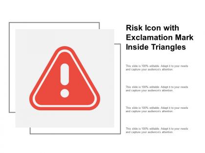
Risk icon with exclamation mark inside triangle




Try Before you Buy Download Free Sample Product
 Impress Your
 Audience
 100%
100% Editable
 Save Hours
 of Time


Guard against injury with our Risk Icon With Exclamation Mark Inside Triangle. Enlighten folks on the correct action to adopt.
People who downloaded this PowerPoint presentation also viewed the following :
Risk icon with exclamation mark inside triangle with all 5 slides:
Our Risk Icon With Exclamation Mark Inside Triangle have an ethereal effect. It ensures complete fascination.
FAQs for Risk icon with exclamation
Effective risk icons in presentations include clear visual metaphors like warning triangles or exclamation marks, high contrast colors such as red or orange, simple geometric shapes for instant recognition, scalable designs that remain legible at different sizes, and universal symbols that transcend language barriers. These elements work together by ensuring immediate audience attention, conveying urgency without confusion, and maintaining professional credibility, with many organizations finding that consistent risk iconography across presentations enhances stakeholder understanding and decision-making speed.
Color in risk icons significantly influences audience perception through psychological associations, with red conveying immediate danger, yellow indicating caution, and green suggesting safety or low risk. These color choices enable organizations to communicate risk levels instantly across industries like healthcare, manufacturing, and finance, while ensuring consistent interpretation that streamlines decision-making processes and enhances operational safety protocols.
Financial services, healthcare, insurance, construction, and manufacturing industries benefit most from utilizing risk icons in their presentations. These sectors frequently communicate complex risk assessments, compliance requirements, and safety protocols to stakeholders, with many organizations finding that visual risk indicators streamline decision-making processes and enhance regulatory reporting clarity.
Risk icons can be tailored through distinct visual elements like color coding, symbolic imagery, and contextual graphics that immediately communicate specific risk categories. Financial risks might use red warning triangles with dollar signs, operational risks could feature gear or process symbols, while reputational risks incorporate brand or communication imagery, enabling organizations to create intuitive visual systems that enhance risk assessment clarity and streamline stakeholder understanding across departments.
Custom risk icons should follow clear visual hierarchy, consistent styling, universal symbolism, appropriate color coding, and scalable simplicity to ensure immediate recognition across platforms. These design principles work by establishing intuitive meaning through familiar symbols, maintaining visual consistency with existing brand elements, and delivering optimal clarity at various sizes, with many organizations finding that standardized icon systems significantly enhance risk communication and decision-making speed.
Cultural differences significantly influence risk icon interpretation through varying color associations, symbolic meanings, directional reading patterns, and religious considerations. While red signals danger universally, colors like yellow may represent caution in Western cultures but prosperity in Asian markets, with many multinational organizations finding that localized icon design enhances user comprehension and reduces safety miscommunication across diverse global operations.
Risk icons enhance visual storytelling by creating immediate recognition of potential challenges, simplifying complex risk concepts into digestible visuals, and establishing consistent narrative threads throughout presentations. These visual elements enable presenters to guide audiences through risk scenarios more effectively, with many organizations finding that strategic icon placement improves stakeholder comprehension and decision-making outcomes.
Risk icons and infographics enhance audience understanding by transforming complex data into visual narratives, standardizing risk levels through consistent symbols, and enabling rapid pattern recognition across datasets. This strategic combination streamlines information processing, reduces cognitive load, and delivers clearer decision-making frameworks, with many organizations finding that visual risk communication significantly improves stakeholder engagement and comprehension rates.
Common mistakes include using inconsistent icon styles, overcrowding slides with too many risk symbols, choosing icons that don't clearly represent specific risk types, and failing to maintain proper sizing hierarchy. These design errors can confuse audiences and dilute your message, with many presenters finding that strategic icon placement, consistent visual themes, and clear risk categorization ultimately enhance comprehension and stakeholder engagement.
Animation with risk icons significantly enhances audience engagement by creating visual interest, improving information retention, and drawing immediate attention to critical warnings or alerts. These animated elements help organizations communicate complex risk scenarios more effectively across presentations and training materials, with many companies finding that motion graphics increase comprehension rates and ensure important safety messages resonate more powerfully with viewers.
Risk icons create immediate emotional awareness by triggering cognitive biases like loss aversion and availability heuristic, making potential threats more psychologically salient than abstract descriptions. These visual cues enhance decision-maker focus on mitigation strategies, with many executives finding that icon-based risk presentations accelerate consensus-building and strategic planning processes.
Risk icons can be effectively integrated into existing presentation templates by establishing consistent color coding, standardizing placement near relevant data points, creating legend systems for quick reference, and maintaining visual hierarchy that supports slide flow. Through strategic positioning in headers, sidebars, or callout boxes, organizations streamline risk communication across departments while enhancing stakeholder comprehension, ultimately delivering clearer decision-making frameworks and more professional presentations.
Healthcare organizations like Mayo Clinic use risk icons in patient safety presentations to visually categorize threat levels, while financial firms such as Goldman Sachs employ them in risk assessment reports to instantly communicate portfolio vulnerabilities. These visual indicators streamline decision-making by enabling stakeholders to quickly identify critical areas, prioritize responses, and allocate resources effectively, ultimately delivering clearer communication and faster strategic responses.
User feedback refines risk icon designs through usability testing, cognitive load assessments, comprehension studies, and accessibility evaluations across diverse user groups. Organizations conduct A/B testing with different icon variations, analyze user interaction patterns, and gather input from stakeholders in healthcare, finance, and manufacturing sectors, ultimately delivering more intuitive visual communication that enhances decision-making accuracy.
**INPUT**: What tools or software are best for designing high-quality risk icons? **OUTPUT**: Professional risk icon design tools include Adobe Illustrator, Figma, Sketch, Canva Pro, and Iconify, each offering comprehensive vector capabilities, symbol libraries, and scalability features. These platforms streamline icon creation by providing pre-built templates, customizable elements, and export flexibility, with many organizations finding that vector-based tools ultimately deliver consistent branding and seamless integration across digital platforms. [Word count: 60]
No Reviews