


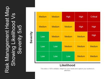
Risk management heat map showing likelihood vs severity 5x5 powerpoint shapes




Try Before you Buy Download Free Sample Product
 Impress Your
 Audience
 100%
100% Editable
 Save Hours
 of Time


Display a wide range of outputs with our risk management heat map showing likelihood vs severity 5x5 PowerPoint shapes. Distinct color combinations are shown here to display low, medium and high-risk factors. Graphic of the block is shown here in this diagram. Use this PPT layout to develop on the evaluation, identification, and prioritization of risks followed by coordinated and efficient application of devices to minimize, monitor, and control the possibility or consequence of unfortunate events or to maximize the accomplishment of opportunities. It's simpler to understand a business concept through a PPT exhibition as it provides ideas and theories in a comprehensive way. Gather your onlookers with our risk management heat map showing likelihood vs severity 5x5 PowerPoint shapes and show determination to endure great results. Our Risk Management Heat Map Showing Likelihood Vs Severity 5x5 Powerpoint Shapes are guaranteed to click. They are certain to generate applause.
People who downloaded this PowerPoint presentation also viewed the following :
Risk management heat map showing likelihood vs severity 5x5 powerpoint shapes with all 5 slides:
Commemorate historical events with our Risk Management Heat Map Showing Likelihood Vs Severity 5x5 Powerpoint Shapes. Highlight the favorable impact they have had.

-
Great experience, I would definitely use your services further.
-
Appreciate the research and its presentable format.
-
Innovative and attractive designs.
-
Out of the box and creative design.