


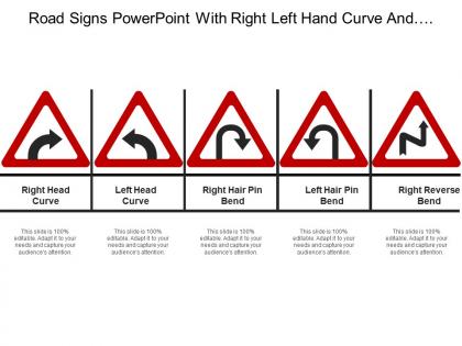
Road signs powerpoint with right left hand curve and right reverse bend




Try Before you Buy Download Free Sample Product
 Impress Your
 Audience
 100%
100% Editable
 Save Hours
 of Time


Impress folks enough to be considered a favorite with our Road Signs Powerpoint With Right Left Hand Curve And Right Reverse Bend. You will emerge as a dark horse.
People who downloaded this PowerPoint presentation also viewed the following :
Road signs powerpoint with right left hand curve and right reverse bend with all 5 slides:
Create impressive conditions with our Road Signs Powerpoint With Right Left Hand Curve And Right Reverse Bend. Folks are guaranteed to experience awe.
FAQs for Road signs powerpoint with right left hand curve and
So road signs do three big things - they control traffic, warn you about stuff coming up, and help you figure out where you're going. Stop signs and speed limits tell you what's required. Warning signs are for curves, construction, school zones, that kind of thing. Then there's all the directional stuff showing exits and distances. Honestly, we'd be screwed without them - imagine trying to navigate somewhere new! I never really thought about it until I got lost in some tiny town once where half the signs were missing. You don't realize how much you depend on them.
So there's this thing called the Vienna Convention from 1968 that most countries follow for road signs - except America obviously does whatever it wants lol. But you'll see the same patterns everywhere: red means stop/don't do this, yellow warns you about stuff, blue gives info. Countries tweak the basics for their own needs through their transport departments. The genius part is using symbols instead of words since nobody needs to read Korean to understand a stop sign. Colors and shapes do the heavy lifting. If you're working on any signage stuff, definitely look up those Vienna Convention rules - they're actually pretty smart.
So basically, road signs use color and shape as this instant visual code before you even read anything. Red = stop or don't do something, yellow warns you about hazards coming up, green gives directions. Same with shapes - octagons are always stop signs, triangles warn you, rectangles give info, circles show regulations. Honestly, whoever came up with standardizing this globally was pretty smart. Your brain picks up on these visual cues way faster than actually reading words, which is why it works so well for keeping traffic moving safely. Makes driving in different countries way less confusing too.
Honestly, digital signs are so much better because they actually change based on what's happening right now. Like if there's an accident ahead, you'll see real travel times instead of just guessing. Static signs just sit there with the same old info whether it's relevant or not. The digital ones can flash or change colors when something urgent comes up too. Oh, and they adjust brightness automatically which is nice - I hate squinting at dim signs at night. You get info that actually matters for your drive instead of generic stuff that might not even apply.
Dude, road signs are such a mess right now. Budget's always tight and nobody wants to spend money on boring infrastructure stuff. Most cities are dealing with signs that are literally falling apart or so faded you can't read them. Then you've got weather damage, vandals, and constantly changing traffic rules that mean more updates. The crazy part? A lot of places still track everything on paper or crappy old systems, so they don't even know what needs fixing until residents start complaining. Honestly if you're working on this, get a digital tracking system going first - it'll save you so much headache down the road.
Yeah, so basically older drivers and people with vision problems need bigger signs placed closer to read them properly. Your contrast sensitivity gets worse as you age, plus you need more light - those green highway signs become way harder to spot fast. I never really thought about it until my dad started having trouble seeing exit signs at night, you know? Someone with poor vision can't make out details from nearly as far as someone with perfect eyesight. Short sentences work better sometimes. If you're ever designing roads or whatever, just follow those MUTCD guidelines for letter size and where to put signs - they actually did the research on stopping distances and reaction times.
Honestly, road signs are lifesavers for pedestrians. Crosswalk signs warn drivers to actually pay attention - which half of them don't anyway. Pedestrian signals tell you when it's safe to cross. Speed limit signs keep cars from flying through neighborhoods where people walk. School zones are obviously huge for protecting kids. "No Turn on Red" signs prevent those nasty intersection accidents. Oh, and when you're walking somewhere unfamiliar? Quick tip - scan the signs first to get a feel for traffic patterns before you start wandering around.
Oh totally! Your brain just processes what it knows, right? Red doesn't mean "stop" everywhere, and some places read right-to-left which messes with arrow directions. Plus certain cultures prefer text over little pictures - or the other way around. I actually think it's super cool from a design angle, like how do you make something universally clear? But yeah, if you're doing international stuff, definitely test it with locals first. Maybe get someone from that culture to look it over before you launch anything.
Yeah, road signs are getting crazy smart now! LED displays change messages instantly, plus there's sensors detecting traffic and weather conditions. Solar-powered ones even dim and brighten themselves automatically. Some places are testing signs that sync with your phone's GPS for custom directions - honestly feels a bit Big Brother to me but whatever. The variable highway boards are everywhere now, and those speed limit signs that light up when you're speeding? Super annoying but they work. My area just got some pilot program going. It's all happening way faster than I expected.
Yeah, those signs actually work pretty well! Studies show they cut highway accidents by 15-30% when they're placed right. But here's the thing - timing matters. Those "Sharp Curve Ahead" warnings are great, but only if you see them early enough to actually slow down. Construction zones and speed limit signs are the real MVPs for preventing crashes. Your brain picks up on these warnings even when you're zoned out (which honestly happens to all of us). Just don't let yourself get "sign fatigue" - that's when you start tuning them out after seeing a million of them.
Dude, road signs are like your backup GPS when your phone dies or you're in some dead zone with zero bars. They tell you distances, confirm you're going the right way, warn you about exits coming up. Without them I'd be screwed in rural areas - honestly those backwoods roads all look the same to me. Heavy traffic is when you really need those overhead signs for quick lane decisions. Try counting how many times you actually look at signs next time you drive somewhere new. You'll be surprised how much you depend on them being readable and not blocked by trees or whatever.
Honestly, sign placement can make or break whether someone actually sees your warning. Put them where drivers are already looking - clear sightlines, nothing blocked by trees or whatever. Height's obvious but timing matters more than people think. Too far ahead and they'll forget by the time they hit the hazard. Too close and there's no time to react. I always tell people to drive through at normal speed before you commit to anything. You'll catch problems you'd never notice just walking around the site. Trust me on that one.
So regulatory signs are the ones that'll actually get you a ticket - stop signs, speed limits, no parking zones, that kind of stuff. You legally have to follow those. Informational signs? They're just being helpful with directions or warnings, but cops won't pull you over for ignoring them. Honestly, I think of regulatory ones as the boss telling you what to do, while informational signs are more like your friend giving suggestions. Both help keep things safe, but only the regulatory ones can hit your wallet if you don't listen.
Oh this is actually pretty straightforward! Better contrast is huge - white text on dark blue beats gray on gray any day. Bigger fonts and clearer symbols help too. Audio beacons at intersections are great for blind drivers, plus tactile rumble strips mark important spots. Most crosswalk buttons have Braille now, which is cool. The thing is, accessible design usually makes things better for everyone anyway - it's not just about compliance. Oh and definitely test with actual disabled drivers first, not just assume it'll work. ADA guidelines are your friend here.
Yeah so road signs definitely have environmental downsides. Mining aluminum and steel takes tons of energy, plus all that reflective plastic sheeting isn't great either. Installation's pretty rough too - diesel trucks, digging, concrete footings, the whole mess. But honestly? Signs last like 10-15 years and actually help traffic flow better, which cuts down on all that idling and detour emissions. Some companies are getting smarter about it now - recycled aluminum, solar LED signs, that kind of thing. If you're picking signs for something, just ask about their recycling programs. Oh, and maybe go digital for temporary stuff instead.
-
Easy to edit slides with easy to understand instructions.
-
Visually stunning presentation, love the content.