


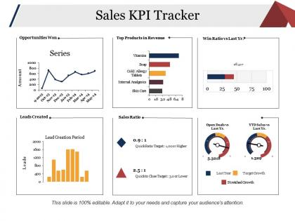
Sales kpi tracker presentation examples




Try Before you Buy Download Free Sample Product
 Impress Your
 Audience
 100%
100% Editable
 Save Hours
 of Time


Our Sales Kpi Tracker Presentation Examples have great chemistry. They make a good pair with your views.
People who downloaded this PowerPoint presentation also viewed the following :
Sales kpi tracker presentation examples with all 5 slides:
Handle baseless disputes with our Sales Kpi Tracker Presentation Examples. Get folks to admit errors in their argument.
FAQs for Sales kpi
Just stick to the big ones that actually matter - revenue, conversion rates, pipeline value, and how fast deals close. Deal size and sales cycle length help you spot trends too. Activity stuff like calls and demos can work, but honestly half the time they're just fluff numbers. If you're showing this to executives, definitely include customer acquisition cost and lifetime value since they're obsessed with profitability. Keep it to maybe 6-8 max though. People's eyes glaze over with too many charts. Pick whatever tells your story best.
Honestly, charts and graphs are a lifesaver for sales data - people can spot trends instantly instead of staring at boring spreadsheet rows. Color coding is clutch for showing what's crushing it vs what needs work. Progress bars give you that quick "health check" feeling too. I always use consistent colors for each metric so people don't get lost following along. Icons help guide eyes to the important stuff first. The whole point? Making complex numbers tell a story without making everyone's brain hurt. Trust me, nobody wants to decode spreadsheets in meetings.
Honestly, your KPIs are pretty useless without benchmarks - they're just random numbers otherwise. Say you hit a 15% conversion rate... is that good? Bad? You literally can't tell without comparing it to industry standards or your past performance. It's like trying to navigate without knowing where you actually are. Benchmarks also make your reports way more interesting to present. Stakeholders love seeing clear wins and gaps. I'd start with last quarter's numbers or just Google some industry averages for your sector - gives you instant context to work with.
Okay so definitely group your KPIs by category - revenue stuff, activity metrics, conversion rates. Put your biggest numbers up front because that's what the bosses want to see immediately. I made this mistake once and buried our win rate on like slide 6... never again lol. Make sure you're using the same time periods for everything, and throw in some trend arrows so people can see what's going up or down. Keep related metrics on the same slide if you can swing it. Oh and always give context first - your audience needs to get the "so what" within 30 seconds or they'll zone out.
Dude, don't cram a million metrics on one slide - instant death. Tell a story with your numbers instead of just dumping data everywhere. Generic benchmarks are useless too, honestly. Who cares about "industry average" when your situation is totally different? Show trends over time rather than random snapshots. And here's the thing - always explain what you're actually doing about the data. People need to walk away knowing "so what?" not just staring at charts wondering what any of it means.
Okay so basically turn your KPI stuff into actual stories. Like start with something punchy - "Remember when our conversion rates totally crashed in Q2?" Then walk through what happened, what you did about it, how it turned out. Before/after comparisons work really well for this, people eat that up. Think of your metrics as plot points in a story that's heading somewhere. Throw in transitions like "Here's where it got weird" when you hit the interesting data. Oh and don't just dump numbers - always end with what it actually means for what you're doing next. Way more engaging than boring charts.
Dude, real-time data is a game changer for sales presentations. Your audience actually pays attention when they're seeing live numbers instead of stale reports from last month. You can catch weird patterns immediately - like conversion rates tanking every Tuesday at 3pm (seriously, that stuff happens). When someone inevitably asks "what about this week though?" you've got the answer right there instead of doing that awkward "I'll get back to you" thing. Just set up automated feeds so your dashboards stay current. Makes you look way more on top of things.
Read the room first - that's everything. Executives want the big stuff: revenue growth, conversion rates, pipeline health. They're thinking strategy and bottom line. Your sales team? Totally different story. Show them individual performance, activity numbers, what's actually killing their deals. That's the actionable stuff they can use tomorrow. Trust me, executives will check out if you start talking call volumes, and your team will glaze over during ROI breakdowns. I always make two versions of my deck now. Before any meeting, just ask yourself: what decisions will these people actually make with this data? It'll save you from those awkward blank stares.
Honestly, line charts are your best friend for tracking trends over time. Bar charts work great when you're comparing different teams or time periods. Gauge charts are solid for showing progress toward targets too. Skip pie charts - they're basically worthless for sales data unless you're doing market share stuff. Waterfall charts are actually pretty cool for breaking down what's driving revenue changes, though I forget about those half the time. Just match your chart to whatever story you're trying to tell. Start simple with lines and bars for your main metrics, then you can get creative with the other stuff later.
Honestly, I'd go with weekly or bi-weekly updates depending on how fast your deals move. Daily is way too much - you'll drive yourself crazy checking numbers constantly. Monthly? That's asking for trouble because problems will snowball before you catch them. Short sales cycles need weekly check-ins. Longer B2B stuff can handle every two weeks just fine. The main thing is being consistent so everyone knows what to expect. Oh, and definitely set up some automated pulls if you can. Manually updating spreadsheets every week gets old fast, trust me.
Honestly, the trick is making performance visible without being weird about it. Show everyone's progress against targets and celebrate the wins - people love seeing their names on leaderboards when they're doing well. Focus more on trends and improvements rather than just raw numbers though, because calling someone out in front of the whole team is awkward for everyone. Visual dashboards work great for this stuff. You want these meetings short but consistent. I'd maybe throw in some friendly competition between teams? Always wrap up by recognizing who crushed it and giving clear next steps for improvement.
Honestly, just go with Google Data Studio first - it's free and does everything you need for basic sales dashboards. If you're already using Microsoft stuff at work, Power BI might make sense instead. Tableau looks amazing but costs a ton, so unless your boss is throwing money around, I'd skip it for now. Data Studio connects super easily to Google Sheets too, which is nice. You can always upgrade later if you outgrow it, but most people never actually need those fancy advanced features anyway.
Honestly, stick to like 3-5 KPIs that actually move the needle on revenue. Conversion rates, deal size, pipeline velocity - that stuff. Nobody wants to stare at 15 different charts trying to figure out what's going on. Simple bar charts work great, and save all the detailed breakdowns for backup slides. I've sat through way too many presentations where people just zone out because there's too much info on one slide. Clean dashboard up front, then you'll have the nitty-gritty ready if someone starts asking specific questions. Trust me on this one.
Tell the big story first - are we winning or not? That's what they actually want to know before diving into conversion rates and stuff. Bar charts work way better than spreadsheets full of numbers, and those red/yellow/green indicators are honestly perfect for executives. Clean slides are everything - they'll zone out if you cram too much on there. Show trends over time instead of just snapshots from last week. Always tie it back to business impact, ditch the marketing jargon, and focus on outcomes. Oh, and end each section by telling them exactly what you need from them.
So basically, dig into your historical sales data to find patterns that'll help predict what's coming. Seasonal stuff, conversion rates, how fast deals move through your pipeline - all gold. I'm honestly obsessed with this kind of analysis, it's like having a crystal ball! Focus on the KPIs that actually correlate with revenue. Win rates by deal size are super telling. Lead quality scores can be great early indicators too. Don't overcomplicate it though - pick your top 3-5 predictive metrics and build rolling forecasts from there. Way more accurate than guessing.
-
Visually stunning presentation, love the content.
-
Very unique, user-friendly presentation interface.