


Scoreboard Powerpoint Ppt Template Bundles




Try Before you Buy Download Free Sample Product
 Impress Your
 Audience
 100%
100% Editable
 Save Hours
 of Time


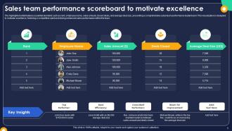
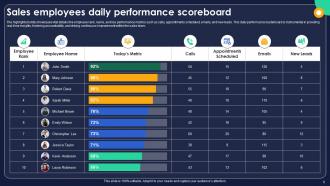
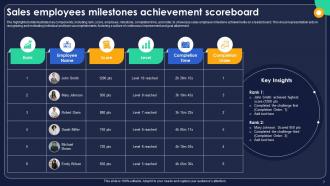
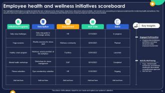
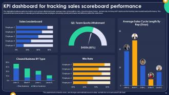
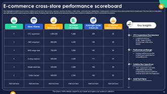
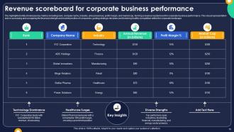
Introducing our dynamic Leaderboard PowerPoint PPT template, the ultimate tool for showcasing achievements and fostering healthy competition. Elevate presentations with vibrant visuals of Top Scores and Competitive Rankings, thanks to our seamless Leaderboard Software integration. Engage your audience with real time updates and a sleek design that captures attention effortlessly. Whether you re spotlighting individual accomplishments or comparing team performances, this template is your go to solution. The Global Leaderboard feature ensures a comprehensive view of accomplishments across borders, fostering a spirit of friendly rivalry. Elevate your presentations, motivate your team, and visually communicate success with our Leaderboard PPT the key to transforming data into impactful narratives.
People who downloaded this PowerPoint presentation also viewed the following :
Scoreboard Powerpoint Ppt Template Bundles with all 28 slides:
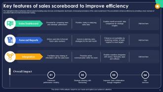
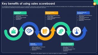
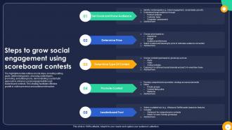
Use our Scoreboard Powerpoint Ppt Template Bundles to effectively help you save your valuable time. They are readymade to fit into any presentation structure.

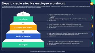
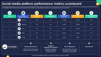
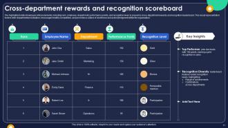
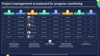










FAQs for Scoreboard Powerpoint
So for scoreboards, big readable fonts are key - people gotta see the numbers from way back. Bold team names and high contrast colors that actually pop. If it's digital, real-time updates obviously. Don't forget space for clock/period info. Honestly? I've seen some super fancy ones that are actually worse than basic designs because there's too much going on. Simple usually wins. Oh and test it from where people will actually be sitting - what looks good up close might be trash from the bleachers. Throw your logo somewhere but keep it subtle.
Honestly, customization makes or breaks it. You want your scoreboard to actually fit your audience, not look like some random template everyone's seen before. Being able to tweak colors and fonts means it feels like *yours* - way more polished. I've definitely seen rigid templates that just looked awkward and pulled focus from the actual data, which is annoying. You don't need a million options though. Too many choices gets overwhelming fast. Just enough flexibility to match your brand and highlight what matters most to your viewers. Start with your brand colors and see what you can do from there.
Dude, color choice is everything for scoreboards. White text on dark backgrounds works best - way easier on the eyes during those marathon games. I'd throw in your brand colors for team names or key highlights, but seriously don't go overboard. Saw this one scoreboard that looked like a unicorn exploded on it. Nightmare fuel. Red for penalties, green for lead changes - that kind of consistent coding helps people follow along without thinking too hard. Keep it to 3-4 colors tops and definitely test on different screens first.
Honestly, just swap out the boring generic stuff for what actually matters in your field. Healthcare? Track patient satisfaction. Retail needs inventory turnover rates. Manufacturing companies obsess over safety incidents and how efficiently they're producing. SaaS is all about churn and monthly recurring revenue - trust me on that one. Pick your brand colors, whatever looks good to you. The real trick is nailing down those 3-5 metrics that everyone absolutely needs to see right away. Don't overthink it though. Focus on what genuinely impacts your bottom line and you're golden.
Dude, digital scoreboards are so much better than paper ones. You can change scores instantly instead of scribbling things out - saves tons of time when games get crazy. Customizing is super easy too, like adding team logos or throwing it up on a big screen. The best part? Save templates for different sports and just reuse them. No more scrambling for clean scorecards or trying to read someone's chicken scratch handwriting (seriously, why is everyone's handwriting so bad?). Just start with Excel or Google Sheets - they're free and you can pull them up anywhere. Way easier than you'd think.
Okay so scoreboard templates are actually pretty cool - they connect straight to your data sources and update automatically. No more typing numbers during your presentation like some kind of maniac. Just link it to whatever you're using (spreadsheets, databases, APIs) and set how often you want it to refresh. Honestly, the setup takes a bit but then it's totally hands-off. Your audience sees changes happen in real time, which keeps them way more engaged. Match your refresh rate to how fast your actual data changes though - no point updating every second if scores only change hourly.
Yeah, most scoreboard templates work fine with the usual suspects - PowerPoint, Google Slides, Keynote. You can just copy/paste or import them straight in. If you're doing live streaming stuff, some templates actually work with OBS too, which is kinda neat for tournaments. HTML templates let you embed them on websites, or you can hook them up to Excel/Google Sheets for auto updates. Oh, and definitely check the file format first - learned that one the hard way when I downloaded something that wouldn't open in what I needed it for.
High contrast is your best friend here - dark text on light backgrounds works great. For the font size, go bigger than you think you need. Like, if people are 50+ feet away, make those key numbers at least 3-4 inches tall. I see this mistake all the time where people make text way too small and then get frustrated when nobody can read it from the back. Stick to 2-3 colors max and skip the fancy backgrounds - they just make everything harder to read. Oh, and definitely test it out by walking back to see how it looks from where your audience will be standing.
Honestly, animations make such a huge difference for scoreboards. Your viewers get way more invested when they see those numbers flip up or counters animate - it's like that little dopamine hit you get from watching things move smoothly. Static scoreboards are just boring in comparison. The trick is keeping transitions subtle so they help instead of being distracting (nobody wants seizure-inducing effects, right?). Smooth fades between game states also prevent those weird jarring jumps that confuse people. I'd start simple with basic fade-ins for score updates and see what works.
Don't cram everything onto one slide - your audience will just tune out. Also watch your color contrast because nobody wants to squint at pale yellow text on white backgrounds. Font size matters too, think about the person stuck in the back row. I swear some of these fancy templates are more distracting than helpful, like someone went overboard with the design. Clean beats flashy every time. Label your categories clearly and definitely test how it looks projected beforehand - screens can be weird. Only add visual stuff if it actually helps tell your story, otherwise keep it simple.
Oh totally, culture plays a huge role in scoreboard design. Red screams "danger" to us but means luck in China - learned that the hard way once. Green's tricky too, could be money or envy depending who's watching. If you're presenting to Arabic speakers, remember text flows right-to-left. Date formats are another headache - is it March 2nd or February 3rd? Some cultures love busy, detailed layouts while others want everything super clean. Honestly, just run your template by someone local first. You'll dodge so many weird moments.
So basically, sports scoreboards are all about the rush - live scores, clock ticking down, stats that change every play. Makes sense since fans want that instant drama, right? But corporate ones? Totally different beast. You'll want stuff that shows progress over time - monthly revenue, customer satisfaction trends, project milestones. Those quarterly reports aren't exactly nail-biters lol. The trick is matching the energy level. Sports metrics flip constantly and get people hyped. Your work dashboard should focus on bigger picture wins that actually mean something to your team. Don't just throw random numbers up there either.
Dude, you've gotta make your scoreboard interactive or people will just zone out. Add real-time MVP voting, expandable player stats, maybe some polls during timeouts. People eat that stuff up when they feel like they're actually participating, not just staring at numbers. Oh and prediction leaderboards are huge right now - everyone wants to compete with their friends. Trivia that connects to the game stats works well too. Honestly just pick one or two features to start with and see what people actually use. You can always add more later based on what gets them clicking.
High contrast is your best friend here - people need to actually read those scores from the nosebleeds. Go big with your fonts too, because squinting sucks whether you're in the stands or watching on your phone. Skip the fancy backgrounds that make numbers disappear. Oh, and definitely test everything in grayscale first - if it looks good there, you're golden. Don't forget about colorblind folks when picking team colors. For digital stuff, clean HTML helps screen readers do their thing. Honestly, simple beats flashy every time with scoreboards.
Honestly, user feedback is a game changer for scoreboard templates. People will straight up tell you when something's broken or confusing - way better than guessing what they need. I've watched templates go from total disasters to actually useful just because someone said "this metric is useless, show me X instead." Quick surveys work great. Chat widgets too. The trick is making feedback super easy to give. You'll figure out which data points they actually care about and how they want things laid out. Plus you catch workflow issues early instead of having to redesign everything later.
-
I discovered this website through a google search, the services matched my needs perfectly and the pricing was very reasonable. I was thrilled with the product and the customer service. I will definitely use their slides again for my presentations and recommend them to other colleagues.
-
Excellent work done on template design and graphics.