


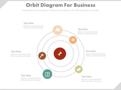
Six staged orbit diagram for business powerpoint slides




Try Before you Buy Download Free Sample Product
 Impress Your
 Audience
 100%
100% Editable
 Save Hours
 of Time


Find the essentials at hand with our Six Staged Orbit Diagram For Business Powerpoint Slides. They are all effectively equipped.
People who downloaded this PowerPoint presentation also viewed the following :
Six staged orbit diagram for business powerpoint slides with all 4 slides:
Our Six Staged Orbit Diagram For Business Powerpoint Slides have a block buster effect. Demand for your ideas will grow exponentially.
FAQs for Six staged orbit diagram for
So there are six main parts: injection, phasing, circularization, rendezvous, docking, and deorbit. They're basically sequential steps that get your spacecraft from launch to mission end. Start with injection and circularization first - those two give you the foundation for everything else. Phasing is honestly where things get wild with all the orbital mechanics calculations, but that's the fun part if you're into that stuff. Each step has its own delta-v requirements you gotta track. The whole thing flows together once you understand how velocity changes and timing work at each stage.
Honestly, the Six Staged Orbit Diagram is pretty helpful for tracking where your project's at. Maps out six phases: initiation, planning, execution, monitoring, control, and closure. Think of it like planets circling your main goal - you're not going straight through each step once and done. You'll bounce back to earlier phases when stuff goes sideways (and it will). I like the orbit idea because it shows project management isn't this neat linear thing. Figure out what stage you're in right now, then peek ahead at what's coming. Makes planning way less chaotic.
From what I've seen, manufacturing and healthcare are crushing it with this stuff right now. Tech companies too, obviously. Manufacturing uses it for production workflows, healthcare maps out patient care - you know the drill. Retail's getting into it lately which is kinda interesting. Works best when you have those messy processes with tons of people involved and decisions everywhere. My take? Start with whatever workflow is driving everyone crazy right now. That's where you'll actually see results fast and get people bought in.
You definitely need color coding for all six stages - makes tracking way easier. Make your arrows consistent too, same thickness and direction to show the flow. Oh and please make labels big enough to actually read! I've seen so many where you're squinting like crazy. Stage numbers help a lot, plus try different line styles - solid for planned paths, dashed for actual ones, whatever works. Keep the background super clean so everything stands out. Honestly though? Have someone else look at it first. They'll catch stuff you totally missed.
Dude, the Six Staged Orbit thing is basically like having a roadmap everyone can actually see. No more of that "we're making progress" nonsense - you just point to where you are on the diagram. Stakeholders finally get it because each stage shows clear deliverables and what needs to happen next. Honestly, it's kind of genius how visual it is. Status meetings become less terrible since people ask way better questions when they can see the whole process laid out. Plus you don't get those weird expectations mismatches anymore - everyone knows exactly what's coming.
Totally! Just shrink the timeline and make it way more iterative. Map each sprint to the six stages instead of thinking about one massive orbit. Treat the stages like checkpoints, not those annoying approval gates that slow everything down. You'll cycle through them multiple times per sprint, which honestly makes things stronger. Start by looking at your current workflow - see how it fits the stages, then tighten up those feedback loops. Works great for individual user stories too. The whole thing becomes more flexible once you stop treating it like this rigid, linear process.
Don't cram everything into each stage - seriously, it turns into visual chaos. Your orbital phases need clear separation and consistent scaling throughout. Labels are crucial too (velocity vectors, transfer trajectories - people skip this constantly and it drives me nuts). Time sequences should actually make logical sense - I've seen diagrams where spacecraft basically teleport between orbits lol. Position your apogee/perigee markers correctly and throw in a legend. Honestly, just sketch it out roughly first to get the flow right, then worry about making it pretty with all the technical stuff.
So basically the Six Staged Orbit Diagram is way more flexible than those boring Gantt charts. Instead of everything moving in straight lines, it shows how project pieces actually revolve around your main goals - kinda like planets around the sun, if that makes sense. Different phases can influence each other in cycles, which is super helpful for messy projects where everything's connected. Honestly works great when you've got multiple stakeholders and regular timelines feel too restrictive. You should definitely try it on your next complicated project. Way better than staring at another linear timeline that doesn't capture how things really work.
For Six Staged Orbit Diagrams, I'd go with STK or GMAT - they're made for multi-phase trajectory stuff. GMAT's probably your best bet since it's free and NASA built it. You can prototype everything there first. Matlab/Simulink works too if you don't mind coding your own propagators. I've watched people try doing this in regular CAD software and... yeah, don't do that to yourself. Python's another option with Poliastro or Orekit if you're into open-source. Start with GMAT though - once you've got your six-stage sequence working, then maybe look at the pricier commercial tools.
Look for the gaps between those six stages - that's where your risks hide. Map out your project and you'll see the sticky spots, like going from ideas to actually building stuff, or testing to launch. Honestly, I was skeptical at first but it really works. Focus on whichever transitions look shakiest in your process, then throw more resources or backup plans at those areas. Oh, and definitely plot your last few projects on it - the patterns that show up are kinda wild. Short version: find the weak handoffs, then beef them up.
Look, feedback is what stops your Six Staged Orbit Diagram from just sitting there doing nothing. It creates these loops between stages so you can actually improve things based on real results. Later stages give you insights that help tweak the earlier ones - and this is honestly where most people screw up because they think it's just step 1, 2, 3 instead of this whole cycle thing. The feedback helps you catch bottlenecks and figure out what's actually working. Oh, and definitely set up specific checkpoints when you transition between stages. Otherwise you're just shooting in the dark, which... yeah, doesn't end well.
Split up the six orbital stages between different team members so everyone can work at the same time. You absolutely need someone managing the handoffs though - I've seen projects fall apart without that coordination role. Make sure everyone gets how their piece connects to what comes next. Digital tools where people can track real-time updates across orbits are clutch. Map out stage ownership first, then set up communication rules for transitions. Oh and do regular check-ins - catching problems early beats scrambling later.
Walk them through each stage one by one - jumping around will just confuse people. Color code everything and make your text huge (seriously, squinting audience = dead audience). Don't show the whole diagram right away, especially on Zoom calls. Reveal one stage at a time instead. Keep explanations short for each orbit. People's brains check out when you ramble about transitions. Pause after each stage for questions too - this stuff builds on itself, so if someone gets lost early, they're toast for the rest. Oh, and the back row thing? Super important if you're presenting in person.
So basically this Six Staged Orbit thing maps out your projects like they're satellites circling around your main business goals. Pretty helpful actually. Each initiative sits somewhere in the cycle - launching, picking up speed, or needing a fix. What I love about it is you won't accidentally dump all your resources into launching ten things at once (been there, total disaster). You can spot which projects need more support and which ones should probably just die already. Honestly, just throw your current stuff on there first and see what patterns emerge. The timing piece is huge for resource planning.
So with the Six Staged Orbit thing, you can track velocity at each stage plus where stuff gets stuck - those bottlenecks are killer for timelines. Cycle times and resource allocation are huge too. Honestly, seeing the visual is like watching traffic build up before it becomes a nightmare. Completion rates per stage will show you which parts consistently slow things down (usually it's the same culprit every time). The cool part? You'll get way better at predicting how long future projects actually take. My advice - start small with just 2-3 metrics so your team doesn't get overwhelmed.
-
I discovered this website through a google search, the services matched my needs perfectly and the pricing was very reasonable. I was thrilled with the product and the customer service. I will definitely use their slides again for my presentations and recommend them to other colleagues.
-
Awesome use of colors and designs in product templates.