


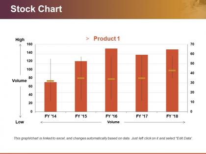
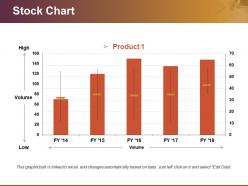
Stock chart powerpoint templates




Try Before you Buy Download Free Sample Product
 Impress Your
 Audience
 100%
100% Editable
 Save Hours
 of Time


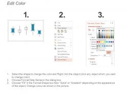
Be criteria compliant with our Stock Chart Powerpoint Templates. They ensure you adhere to every clause.
People who downloaded this PowerPoint presentation also viewed the following :
Stock chart powerpoint templates with all 5 slides:
Broadcast your views with our Stock Chart Powerpoint Templates. They will effectively transmit your message.
FAQs for Stock
Okay so first thing - make sure your axes are labeled with dates and prices, and add a legend so people know what they're looking at. Colors should match throughout the whole thing. Your title needs to actually say what time period you're covering. Oh and please don't skip gridlines! I see people do this all the time and it makes everything harder to read. Volume bars are good if they matter for your data. Font size big enough that someone in the back can see it. Honestly, adding little notes for major events really helps tell the story. Always cite your source at the bottom.
Honestly, color-coding your stock charts is a game changer. Red for losses, green for gains - everyone already knows this system, so you don't have to explain anything. Different shades show how big the changes are too. When you're showing quarterly stuff, people can spot trends super fast instead of staring at tiny numbers forever. I learned this the hard way after boring people with plain black-and-white charts once. Just pick your colors at the start and don't switch them halfway through - consistency is everything here.
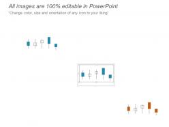
For stock charts in PowerPoint, you'll mostly see three types. Candlestick charts are your go-to - they pack in open, high, low, and close prices all at once. Line charts work well too, especially when you just want to show trends without all the noise. Bar charts (OHLC style) exist but they're kinda outdated now. Most people add volume charts below the main price chart. Honestly? Candlesticks look way more professional and actually give you useful info. I'd definitely go with those for any serious presentation.
Dude, animated charts are game-changers for presentations. Instead of showing everything at once, you reveal data bit by bit - like quarter by quarter movement. People can actually follow the story that way. Static charts? Instant snooze fest. I learned this the hard way after watching too many eyes glaze over during meetings. The step-by-step build lets you control what they focus on. You highlight those crazy turning points right when they happened chronologically. Try entrance animations that build segment by segment. Way more engaging than dumping all the data upfront.
Keep it super clean - white space is your friend. I'd go with maybe 3-4 colors tops and make sure there's good contrast so people can actually read your stuff. Arial or Calibri are boring but they work, especially when you're presenting. Honestly, less is definitely more here. Those 3D chart effects? Total cringe. Skip the gradients too - they just make everything look dated. Focus on clear labels and make your key points stand out visually. Oh, and test it from across the room first because there's nothing worse than squinting at tiny text during a presentation.
Yeah totally! Just swap out the generic company names for actual ones in your industry - like if you're doing tech, throw in Apple or Microsoft instead of "Stock A." Most templates are pretty flexible with colors and chart styles too. Candlestick charts look way more professional than basic line graphs, honestly. You can tweak the data sources to match whatever metrics matter for your sector. Oh, and make sure the timeframes actually make sense - some industries are way more volatile than others, so you don't want your charts looking crazy unrealistic.
Think of legends and annotations as subtitles for your chart - without them you're just showing people pretty colors that mean nothing. Legends tell your audience what each line or bar actually represents. Annotations are where you call out the big moments, like when earnings dropped or markets went crazy. But here's the thing - don't go overboard with annotations or your chart becomes a mess. I learned this the hard way lol. Focus on labeling your main data and maybe highlight 2-3 key points that back up whatever you're trying to prove. Less is more here.
Dude, real-time data is a total game changer for stock presentations. Instead of showing dusty old charts, you're pulling live market movements that actually matter today. Your audience gets way more engaged - it's like watching a live stream vs looking at screenshots, you know? Plus you can tackle questions about current volatility right on the spot instead of fumbling around. Honestly, nothing kills your credibility faster than outdated data when markets are going crazy. Just hook your presentation templates up to financial APIs or data feeds so everything updates automatically. Makes you look like you actually know what's happening right now.
Dude, just get a template pack - trust me on this one. You'll save yourself hours of messing around with colors and fonts that never look quite right. Professional designers already figured out all the layout stuff, so you just plug in your numbers and boom, you're done. They usually give you different chart styles too, which is clutch when your data's weird or whatever. Seriously though, I learned this the hard way after way too many late nights trying to make my charts not look like garbage. Your presentations will actually look legit instead of like something you threw together last minute.
Dude, seriously stick with simple fonts like Arial or Calibri for your charts. Those fancy decorative ones? Total disaster when you're presenting - I learned this the hard way when my boss couldn't read anything from across the room. Sans-serif fonts stay sharp even on those terrible conference projectors. Make your labels at least 12pt, titles bigger. Numbers need to be scannable fast. Oh and use the same font throughout everything so it doesn't look like you threw it together last minute. Trust me on this one.
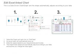
Honestly, you'll want templates that connect directly to Excel - that's where the magic happens. Update your spreadsheet and boom, PowerPoint refreshes automatically. Just make sure they're using actual financial chart types like candlestick or line charts, not some weird bar graph nonsense. I've seen so many templates that look slick but are totally useless for real analysis. The color coding should make sense too - green for gains, red for losses, that kind of thing. Oh, and definitely test the data connection first. Nothing worse than your charts breaking mid-presentation when you're trying to look professional.
So for remote stuff, you gotta make everything way bigger and bolder - fonts, data points, all of it. People are squinting at laptops with terrible lighting. Also simplify your charts more than usual since screen sharing makes everything look compressed and weird. In-person meetings are easier honestly. You can pack more info in there since everyone's looking at the same big screen. My advice? Keep two versions of your main templates saved. Trust me, you don't want to be frantically resizing slides five minutes before a call starts. Been there, not fun.
Yeah totally! Template makers usually have different levels. Beginner ones come with everything laid out already - simple charts, clear labels, even little notes explaining stuff. The advanced ones get pretty intense with multi-axis charts and tons of financial ratios. I actually use the basic templates sometimes when I'm presenting to people who aren't finance nerds like us, haha. Search for "executive summary" templates if you want something clean. The "financial analysis dashboard" ones are where things get crazy detailed. Even experienced people grab the simpler versions depending on the audience.
Ugh, don't cram everything into one chart - it just looks like a hot mess. Pick colors and fonts that actually match your slides instead of using whatever ugly default template they give you. Also check that your chart type makes sense? Like seriously, pie charts for showing trends over time are just painful to look at. Your axes need labels people can actually read, and test it in presentation mode first because what looks fine on your laptop might be tiny on the projector. Oh and never underestimate how bad people are at reading small text from across a room!
Dude, storytelling totally changes the game with stock charts. Nobody wants to stare at boring data dumps. Start with something like "Q1 was rough" then build up the drama before hitting them with your comeback story. I swear I've watched people literally nod off during chart presentations - it's painful. But add some actual narrative? Suddenly everyone's awake. Sequence your charts like chapters, throw in some callouts for the big moments. Oh and try building suspense before you drop the good news. Sounds cheesy but it actually works.
-
Very well designed and informative templates.
-
Unique and attractive product design.