


Support to bridge the gap presentation pictures




Try Before you Buy Download Free Sample Product
 Impress Your
 Audience
 100%
100% Editable
 Save Hours
 of Time


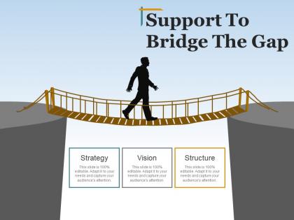
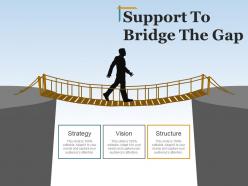
Want to show that you will be a support to all your viewers in the tough times then without thinking any further download and use our support to bridge the gap presentation pictures. We assure you that by using this risk management PPT presentation you will be able to grab the attention of a number of viewers due to the attractive and eye catchy characteristics. This support PPT presentation slideshow contains flat layouts and diagrams like a silhouettes man, a bridge, two mountains, text holders, etc. By using this risk mitigation business slides you will be able to discuss business related processes like vision, strategy, goals, etc. of the company you are working for if you are an employee. This bridge the gap PPT template presentation has been designed using high resolution and premium quality slides which will help you raise the standard of your work. So get ready for the attention without putting in a lot of efforts. Have a happy day with our Support To Bridge The Gap Presentation Pictures. All your cares will go away.
People who downloaded this PowerPoint presentation also viewed the following :
Support to bridge the gap presentation pictures with all 5 slides:
Our Support To Bridge The Gap Presentation Pictures create amusement. The audience will enjoy the fun and frolic.
FAQs for Support to bridge the
Key elements of effective visual communication include clear typography, consistent color schemes, strategic white space, compelling imagery, and logical visual hierarchy. These design principles enhance audience comprehension by reducing cognitive load, emphasizing critical messages, and maintaining engagement throughout presentations, with many organizations finding that well-designed visuals significantly improve information retention and decision-making outcomes.
Color theory significantly influences audience perception by leveraging psychological associations, enhancing information hierarchy, and creating emotional connections that support your key messages. Strategic color choices can increase comprehension by 73%, with warm colors energizing audiences while cool tones promote trust and professionalism, ultimately delivering more persuasive presentations and stronger audience engagement across diverse business contexts.
Typography enhances visual communication by establishing hierarchy, conveying tone, ensuring readability, guiding attention flow, and reinforcing brand identity. Through strategic font choices, sizing, and spacing, organizations streamline information delivery, create emotional connections with audiences, and ultimately improve comprehension rates, with many finding that consistent typographic systems significantly strengthen their overall messaging effectiveness.
Data visualizations improve audience understanding by transforming complex datasets into intuitive charts, graphs, infographics, and interactive dashboards that highlight patterns, trends, and key insights immediately. Through strategic visual design, organizations streamline communication across departments, enhance decision-making processes, and accelerate comprehension rates, with many financial services and healthcare institutions finding that visual presentations reduce meeting times while increasing stakeholder engagement and actionable outcomes.
Best practices for integrating images and graphics include using high-resolution visuals, maintaining consistent styling, aligning with brand guidelines, ensuring relevance to content, and optimizing file sizes for smooth delivery. These approaches streamline message clarity by reducing cognitive load, enhancing audience engagement, and reinforcing key points, with many organizations finding that strategic visual integration ultimately delivers more memorable presentations and improved comprehension rates.
Layout choice significantly affects presentation effectiveness by controlling visual hierarchy, information flow, and audience attention patterns. Strategic layouts enhance readability through balanced white space, logical content progression, and clear focal points, while poor layouts create cognitive overload and confusion. Organizations using well-structured layouts find audiences retain information better and respond more positively, ultimately delivering stronger business outcomes and more persuasive communications.
Storytelling enhances visual communication by creating narrative flow, establishing emotional connections, simplifying complex information through sequential progression, and providing contextual frameworks that guide audience understanding. Through compelling character development, problem-solution arcs, and data-driven narratives, organizations streamline message delivery, enhance audience engagement, and ultimately deliver more memorable presentations that drive strategic decision-making and business outcomes.
Visual communication adapts to different demographics through age-appropriate design choices, cultural sensitivity, accessibility considerations, platform preferences, and cognitive processing styles. Younger audiences respond to dynamic infographics and interactive elements, while professional demographics prefer clean charts and data visualizations, with healthcare and financial sectors finding that culturally-aware visuals significantly enhance message comprehension and engagement rates.
**INPUT**: What tools and software are most effective for creating impactful visual presentations? **OUTPUT**: Effective visual presentation tools include PowerPoint, Keynote, Canva, Prezi, and Adobe Creative Suite, each offering unique design capabilities and collaboration features. These platforms streamline content creation by providing templates, advanced graphics, and seamless integration, with many organizations finding that strategic tool selection ultimately enhances audience engagement and delivers more compelling business communications.
Presenters can ensure accessibility by incorporating high contrast colors, readable fonts, alternative text for images, captions for videos, and clear visual hierarchies. These design principles streamline information delivery across diverse audiences, with many organizations finding that accessible presentations enhance engagement for all viewers while demonstrating inclusive leadership, ultimately delivering broader reach and improved comprehension rates.
Visual elements trigger emotional responses, enhance memory encoding, reduce cognitive load, and create stronger neural pathways for information retention. Through strategic use of color psychology, visual hierarchy, and compelling imagery, organizations across sectors like healthcare, education, and marketing achieve significantly higher engagement rates, improved comprehension levels, and ultimately deliver more persuasive communications that resonate with audiences long-term.
Animations and transitions enhance presentations by guiding audience attention, emphasizing key points, and creating visual continuity between concepts, while excessive or inappropriate use can distract from core messages. Strategic implementation helps presenters maintain engagement and improve information retention, with many corporate trainers and educators finding that subtle, purposeful animations streamline complex explanations and ultimately deliver more memorable, professional presentations.
Maintaining visual consistency across slides requires establishing clear design standards including standardized fonts, color palettes, layout grids, spacing guidelines, and branded elements. These strategies streamline presentation development by ensuring uniform typography, consistent imagery placement, and cohesive visual hierarchy, with many organizations finding that template-based approaches ultimately deliver stronger brand recognition and more professional stakeholder communications.
Presenters can assess visual communication effectiveness through audience feedback surveys, engagement metrics during delivery, comprehension tests, and follow-up questions about key visual elements. Post-presentation analysis should examine which slides generated discussion, where audience attention wavered, and whether visual aids successfully conveyed complex information, with many organizations finding that systematic evaluation improves future presentation outcomes and enhances overall communication strategy.
Common pitfalls include overcrowded slides, inconsistent fonts and colors, poor image quality, excessive text, and lack of visual hierarchy. These issues overwhelm audiences and dilute key messages, with many presenters finding that streamlined designs, strategic white space, and cohesive branding significantly enhance audience engagement and message retention across business presentations.
-
Out of the box and creative design.
-
Enough space for editing and adding your own content.
-
Amazing product with appealing content and design.
-
Graphics are very appealing to eyes.