


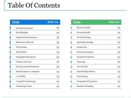
Table of contents ppt information





Try Before you Buy Download Free Sample Product
 Impress Your
 Audience
 100%
100% Editable
 Save Hours
 of Time


Increase footfalls with our Table Of Contents Ppt Information. It will be a huge draw for customers.
People who downloaded this PowerPoint presentation also viewed the following :
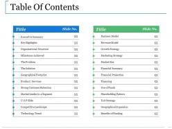
Table of contents ppt information with all 5 slides:
Counsel them with our Table Of Contents Ppt Information. Dwell on your assessment to their satisfaction.
FAQs for Table of
Key elements include section headers, slide numbers, topic hierarchies, visual indicators, and estimated timeframes for each segment. These components streamline navigation by providing clear roadmaps, enabling quick reference points, and establishing presentation flow, with many organizations finding that well-structured tables of contents enhance audience engagement and deliver more professional, organized communications.
A well-structured Table of Contents enhances audience engagement by providing clear navigation, logical flow, and immediate value preview through descriptive headings and organized sections. Strategic layouts with scannable formatting, consistent hierarchy, and compelling section titles help readers quickly identify relevant content, reducing bounce rates while encouraging deeper exploration, ultimately delivering better user experience and increased content consumption across digital and print materials.
**INPUT**: What design principles should be considered when creating a Table of Contents slide? **OUTPUT**: Key design principles include clear hierarchy, consistent formatting, strategic white space, intuitive navigation flow, and visual alignment with your presentation's overall design theme. These elements streamline audience comprehension by establishing clear expectations, reducing cognitive load, and enabling seamless section transitions, with many organizations finding that well-structured navigation ultimately enhances audience engagement and information retention. [Word count: 56 words]
A Table of Contents enhances presentation flow by providing clear roadmap navigation, establishing logical sequence expectations, enabling smooth transitions between sections, and helping audiences follow complex information architectures. This strategic structure streamlines comprehension, reduces cognitive load, and maintains engagement throughout lengthy presentations, with many presenters finding that organized content delivery significantly improves audience retention and professional credibility.
Common mistakes include overcrowding with excessive detail, inconsistent formatting and numbering, unclear or vague section titles, poor visual hierarchy, and misaligned page numbers. These design flaws undermine document navigation and professional credibility, with many organizations finding that clean, well-structured tables of contents significantly enhance user experience and document accessibility.
Visual differentiation in Table of Contents includes hierarchical typography, strategic indentation, color coding, numbering systems, and spacing variations. These design elements streamline navigation by creating clear section boundaries, distinguishing main topics from subtopics, and enhancing document accessibility, with many organizations finding that well-structured visual hierarchies ultimately deliver faster information retrieval and improved user experiences.
Color psychology in Table of Contents design influences reader navigation and comprehension by establishing visual hierarchy, conveying organizational structure, and guiding attention through strategic color choices. Through consistent color coding, designers can categorize sections, highlight priority content, and reduce cognitive load, with many publications finding that thoughtful color schemes enhance user engagement and streamline information processing across complex documents.
Interactive elements in digital Table of Contents include clickable navigation links, expandable sections, search functionality, progress indicators, and bookmark features. These technologies enhance user experience by enabling instant chapter access, dynamic filtering, and personalized navigation paths, with many organizations finding that interactive TOCs significantly reduce document navigation time while improving reader engagement and content accessibility.
Page numbers in printed Table of Contents provide instant navigation, professional credibility, enhanced accessibility for diverse readers, streamlined reference capabilities, and improved document usability. These elements work together by eliminating search time, enabling quick cross-referencing, and delivering structured information flow, with many organizations finding that numbered contents significantly enhance reader engagement and document effectiveness across reports, manuals, and presentations.
Tables of Contents should emphasize navigation and timing for webinars, featuring clickable sections and estimated durations, while in-person formats focus on engagement cues and interactive elements. For webinars, include technical checkpoints and Q&A segments, whereas live presentations benefit from discussion breaks and audience participation markers, ultimately delivering format-specific clarity that enhances audience experience.
Microsoft Word and Google Docs offer automated TOC generation through heading styles, while Adobe InDesign and Canva provide advanced formatting for professional publications. These tools streamline content organization by automatically updating page numbers, creating clickable navigation links, and maintaining consistent formatting, with many organizations finding that automated TOC features significantly reduce document preparation time while enhancing reader navigation experiences.
Tailoring a Table of Contents for diverse audiences involves adjusting section headings, terminology complexity, content depth, and organizational structure to match specific stakeholder needs and expertise levels. By creating audience-specific versions, organizations streamline information access, enhance user engagement, and improve document usability, with many companies finding that targeted navigation ultimately delivers better comprehension and faster decision-making across different user groups.
Language used in a Table of Contents significantly impacts comprehension through clear terminology, logical hierarchy, consistent formatting, parallel structure, and descriptive headings that preview content accurately. When organizations use precise, jargon-free language with intuitive section names, readers navigate documents more efficiently, locate relevant information faster, and develop better mental frameworks for understanding complex materials, ultimately enhancing user experience and information retention.
Innovative Table of Contents designs include interactive clickable navigation, visual roadmaps with icons and graphics, timeline-based structures, modular card layouts, and progressive disclosure formats that reveal content gradually. These approaches enhance audience engagement by transforming traditional bullet-point lists into dynamic navigation experiences, with many presentation creators finding that visual storytelling elements significantly improve information retention and professional impact.
The Table of Contents should be revised at key milestones throughout presentation development, including after initial outline creation, major content additions, structural changes, and final review phases. This iterative approach ensures alignment between your presentation's flow and actual content, with many presenters finding that regular TOC updates during development ultimately streamline the revision process and enhance audience comprehension.
-
Best way of representation of the topic.
-
Presentation Design is very nice, good work with the content as well.