


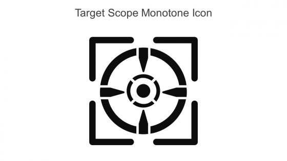
Target Scope Monotone Icon In Powerpoint Pptx Png And Editable Eps Format




Try Before you Buy Download Free Sample Product
 Impress Your
 Audience
 100%
100% Editable
 Save Hours
 of Time


This Target scope monotone icon in powerpoint pptx png and editable eps format is a 100 percent editable icon. The downloaded file will have this icon in EPS, PNG and Powerpoint pptx format and is perfect for your next project. It has a simple yet stylish design.
People who downloaded this PowerPoint presentation also viewed the following :
Target Scope Monotone Icon In Powerpoint Pptx Png And Editable Eps Format with all 6 slides:
Use our Target Scope Monotone Icon In Powerpoint Pptx Png And Editable Eps Format to effectively help you save your valuable time. They are readymade to fit into any presentation structure.





FAQs for Target Scope Monotone Icon In Powerpoint Pptx Png And
A target scope monotone icon in presentations symbolizes precision, focus, and strategic goal achievement, helping audiences immediately understand concepts related to objectives, targeting, and accuracy. This visual metaphor enhances message clarity by representing focused efforts, market targeting, or performance measurement, while the monotone design maintains professional consistency and ensures the icon complements rather than distracts from key content.
A target scope monotone icon enhances strategic goal clarity by providing immediate visual recognition, eliminating color distractions, maintaining focus on content hierarchy, and creating consistent design language throughout presentations. This streamlined approach enables presenters to guide audience attention more effectively, while ensuring strategic objectives remain prominent and memorable, with many organizations finding that simplified iconography ultimately delivers stronger message retention and clearer communication outcomes.
Target scope monotone icons are widely utilized across defense, security, gaming, sports training, and technology industries for their clear directional messaging. Financial services use them for goal-setting presentations, while project management and consulting firms leverage these icons to represent objectives, precision targeting, and strategic focus in client deliverables and internal communications.
Color choice in monotone icons significantly influences audience perception by affecting emotional response, brand recognition, and visual hierarchy within presentations. Different colors evoke distinct psychological associations, with blue conveying trust and professionalism, red suggesting urgency or importance, and green implying growth or success, ultimately enabling presenters to guide audience attention and reinforce key messaging through strategic color selection.
Using a target scope icon in business presentations creates psychological effects including enhanced focus, increased goal clarity, heightened motivation, and stronger audience engagement through visual metaphor association. This imagery triggers subconscious responses related to precision and achievement, with many organizations finding that target-based visuals significantly improve message retention, create urgency around objectives, and ultimately deliver more compelling presentations.
Target scope monotone icons integrate effectively into existing presentation templates by maintaining consistent color schemes, sizing them proportionally to text elements, and positioning them strategically near relevant content sections. These versatile icons enhance visual hierarchy through strategic placement in headers, bullet points, and process flows, while their monotone design ensures seamless brand alignment and professional consistency across slides.
Common mistakes include using oversized icons that overwhelm content, applying inconsistent styling across slides, choosing colors that clash with brand guidelines, and placing icons without clear contextual relevance to the message. These design missteps can distract audiences and dilute presentation impact, with many presenters finding that maintaining visual hierarchy, consistent sizing, and strategic placement ultimately enhances message clarity and professional credibility.
A target scope icon can be customized through color variations, line weights, geometric styling, size proportions, and background treatments to align with specific brand aesthetics. These design modifications enable organizations across industries, from financial services to consulting firms, to maintain visual consistency while leveraging the icon's strategic targeting symbolism, ultimately delivering cohesive brand experiences and enhanced professional presentation materials.
Target scope monotone icons offer focused simplicity that enhances quick comprehension and professional consistency, while complex visuals provide richer storytelling and emotional connection but may overwhelm or distract audiences. The strategic choice depends on context, with many organizations finding that monotone icons excel in corporate presentations, data dashboards, and technical documentation where clarity drives engagement, while complex visuals serve better for marketing materials and creative storytelling scenarios.
**INPUT**: What tools or software are recommended for creating target scope monotone icons? **OUTPUT**: Recommended tools include Adobe Illustrator, Figma, Sketch, Canva Pro, and Inkscape, which deliver vector-based precision, scalability, and professional consistency. These platforms streamline icon creation through customizable templates, monochrome color controls, and export flexibility, with many design teams finding that vector-based workflows ultimately enhance brand consistency and reduce production timelines across multiple marketing channels.
Understanding iconography improves presentation design by enhancing visual communication, creating consistency, reducing cognitive load, and strengthening brand identity across slides. Through strategic icon selection and placement, organizations streamline complex information delivery, enable faster audience comprehension, and maintain professional visual standards, with many finding that cohesive iconography ultimately delivers more engaging presentations and clearer messaging.
Current trends influencing presentation icon design, including target scopes, include minimalist aesthetics, monotone color schemes, scalable vector formats, universal symbolism, and accessibility-focused design principles. These approaches streamline visual communication by reducing cognitive load, enhancing cross-platform compatibility, and ensuring clarity across diverse audiences, with many organizations finding that simplified iconography delivers faster comprehension and more professional presentations.
**INPUT**: How can one assess the effectiveness of a target scope monotone icon after a presentation? **OUTPUT**: Effectiveness can be assessed through audience feedback surveys, comprehension tests, engagement metrics during icon appearance, and post-presentation recall assessments. Many presenters find that clear icons enhance message retention by 65%, streamline complex concepts, and improve audience focus, with successful implementations in corporate training, sales pitches, and educational sessions ultimately delivering stronger communication outcomes.
Target scope icons enhance data visualization by creating clear focal points, establishing visual hierarchy, highlighting key metrics, directing attention to critical insights, and simplifying complex information interpretation. These icons streamline analytical presentations by providing intuitive visual cues that guide viewers through data narratives, with many organizations finding that strategic icon usage significantly improves stakeholder comprehension and decision-making speed.
Cultural differences can significantly impact target scope monotone icon interpretation through varying color associations, directional reading patterns, symbolic meanings, and contextual references across different societies. While Western audiences might associate certain design elements with precision and focus, Eastern cultures may interpret the same visual cues differently, with many global organizations finding that localized icon testing and culturally-adaptive design approaches ultimately deliver more effective cross-cultural communication and user engagement.
-
Every time I ask for something out-of-the-box from them and they never fail in delivering that. No words for their excellence!
-
Design layout is very impressive.